
Giving Brainnwave something to grow into
Brainnwave already had an identity when I joined.
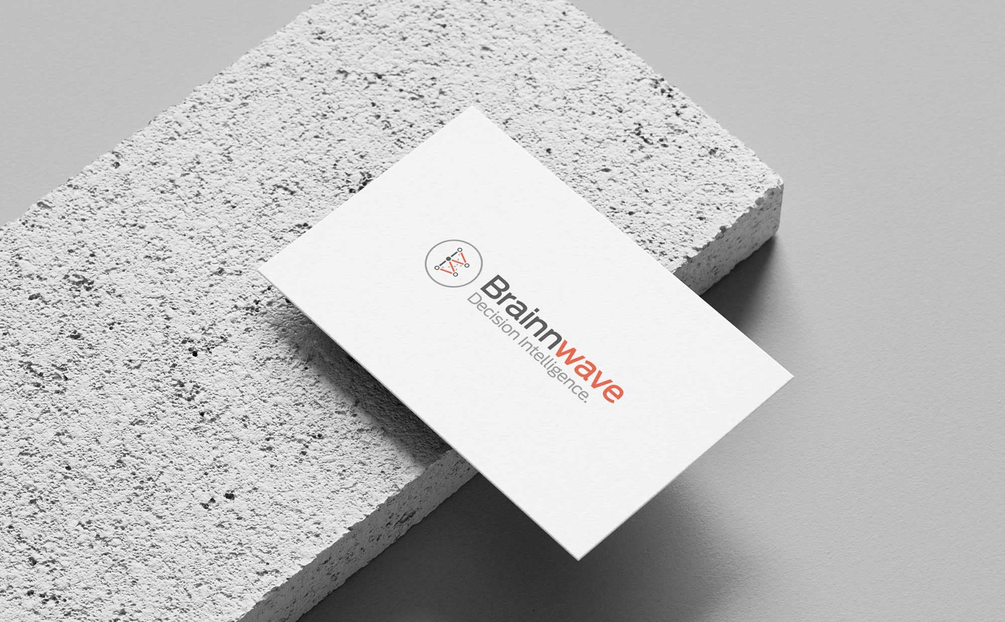
Its lowercase logo combined the two Ns and W into a wave-like device. It wasn’t terrible, but it was awkward to use, felt increasingly dated and had accumulated inconsistencies across the business.
I didn’t want to throw everything away for the sake of it.
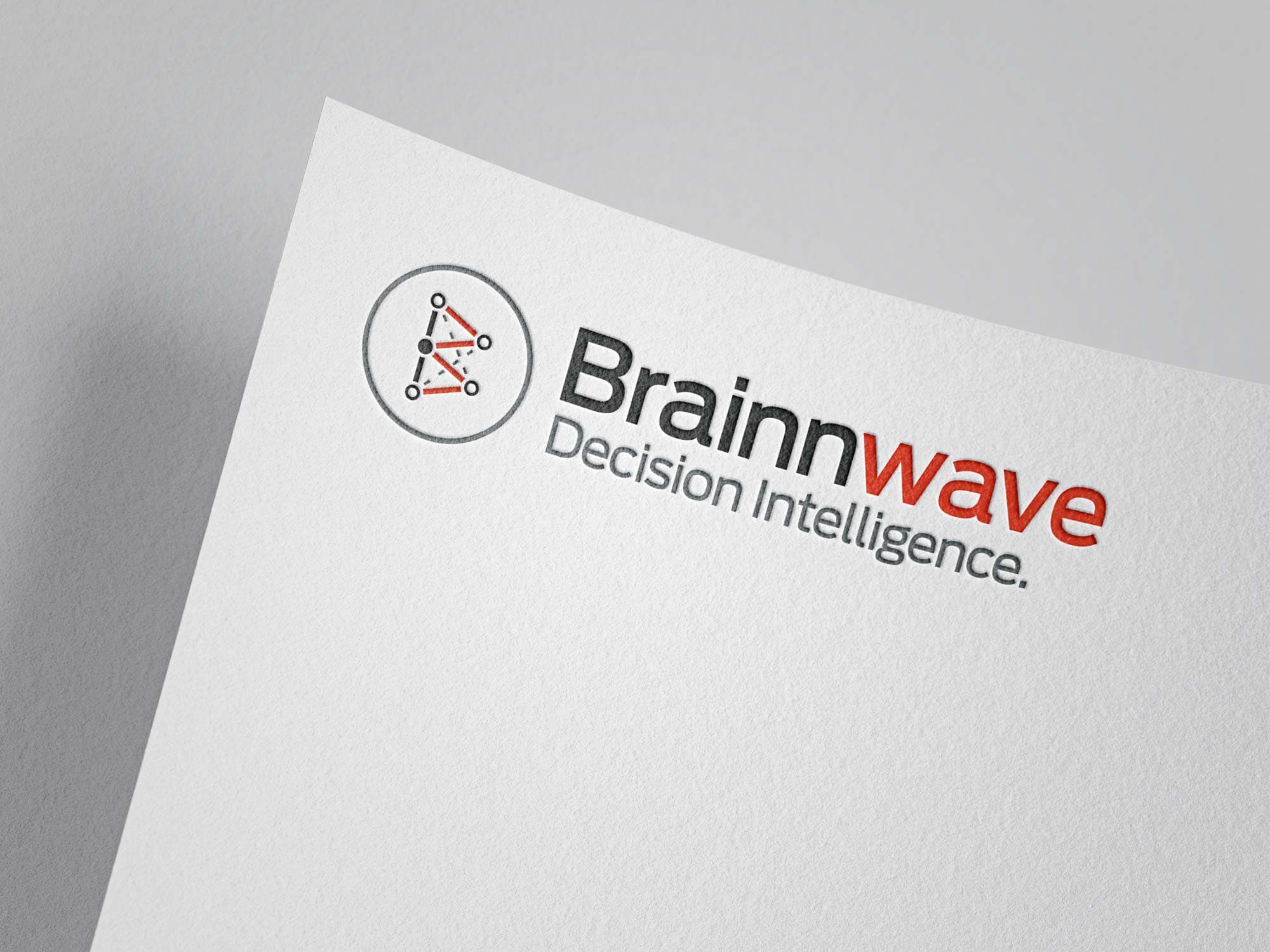
I retained the established red and grey palette, but rebuilt the identity around a much simpler idea.
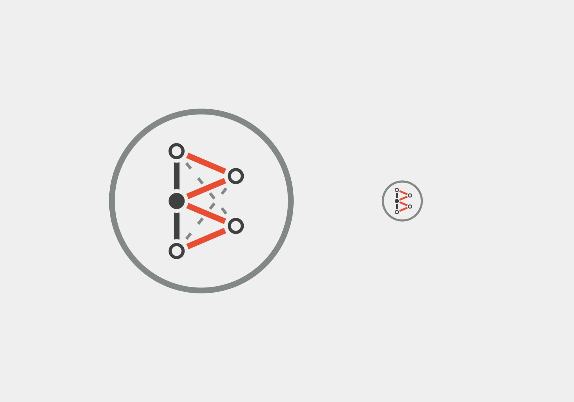
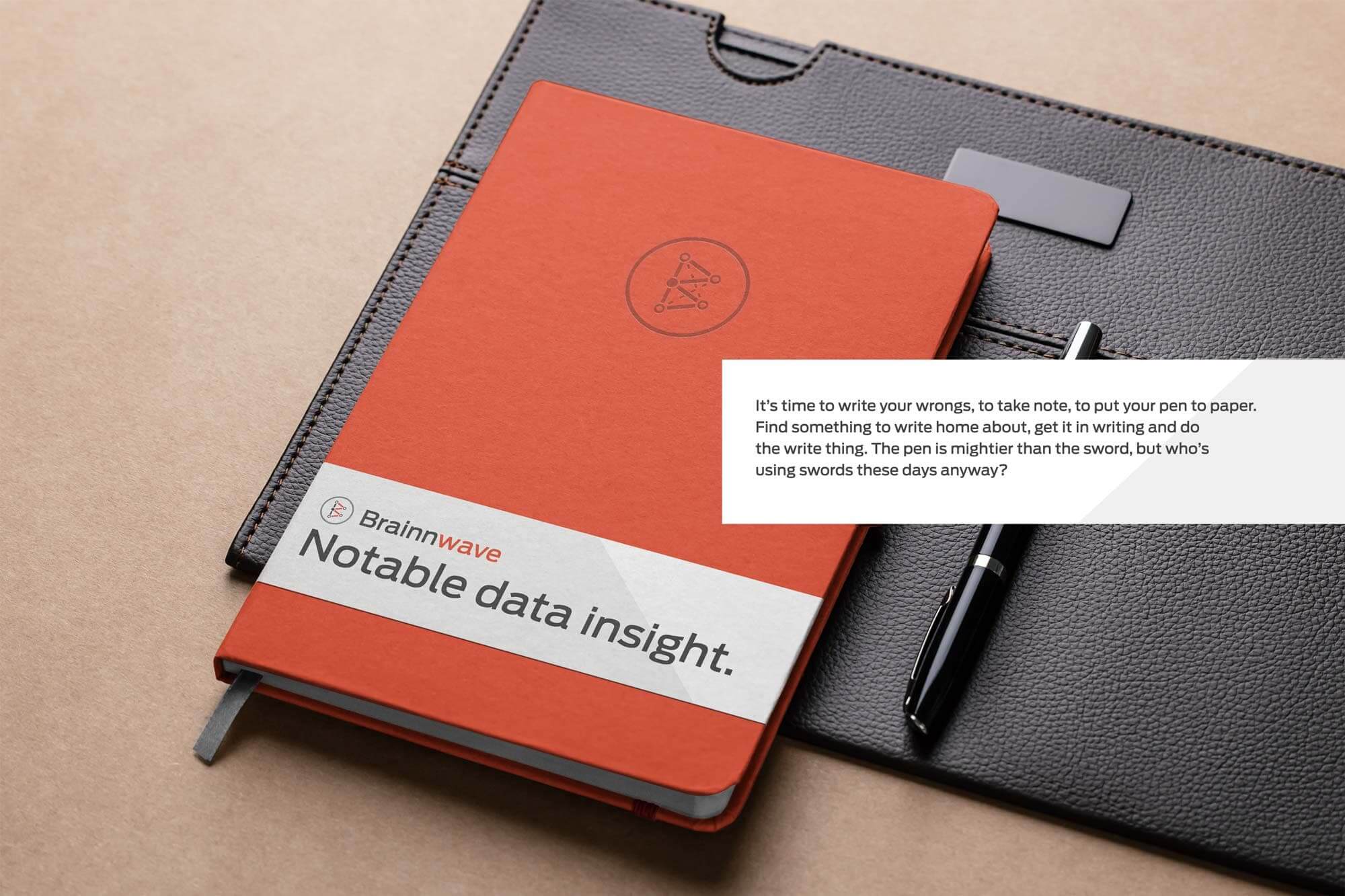
The new symbol used the B from Brainnwave, constructed from a network of connected points and lines - somewhere between a letterform, a network and a data visualisation.
It gave us something recognisable that actually related to what the company did.