Mosaic · Brand identity, creative direction, digital & product design

Giving complex data a clearer identity

Mosaic grew out of years of experimentation at Brainnwave. It gave a changing platform an identity of its own, and brought the brand, website and product closer together.

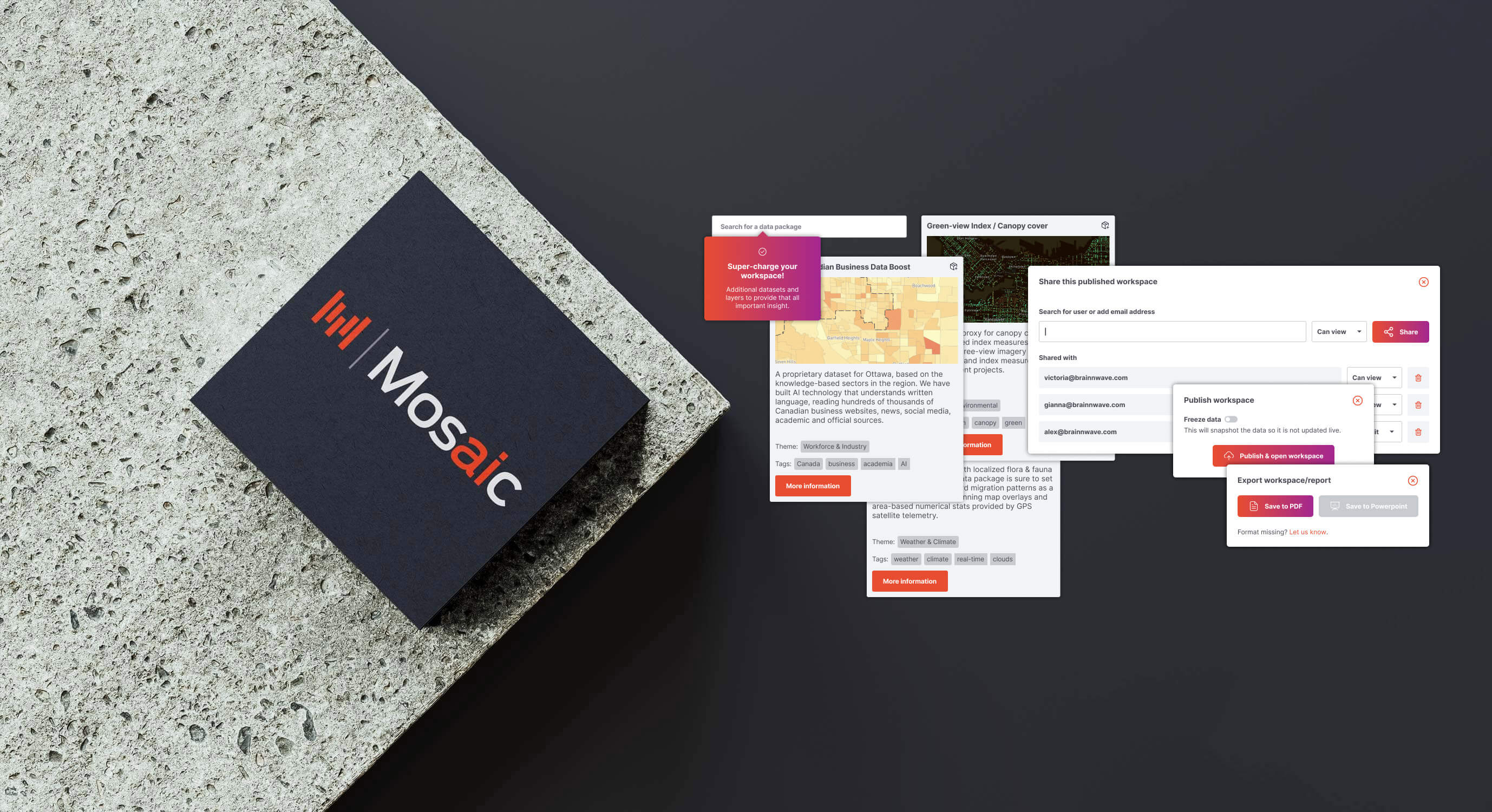
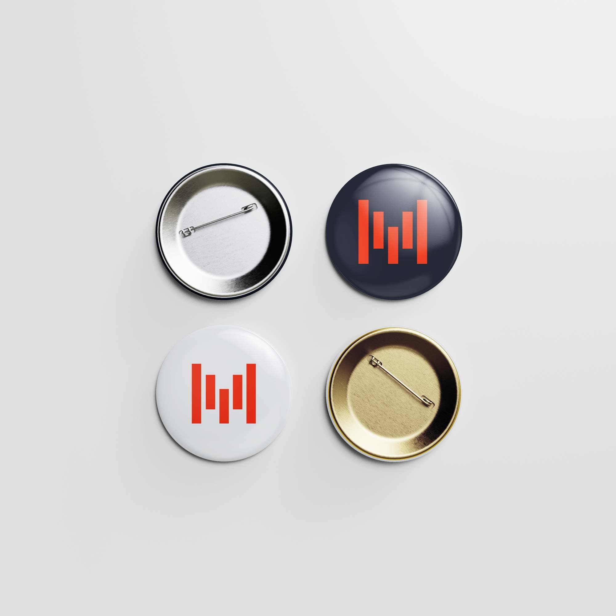
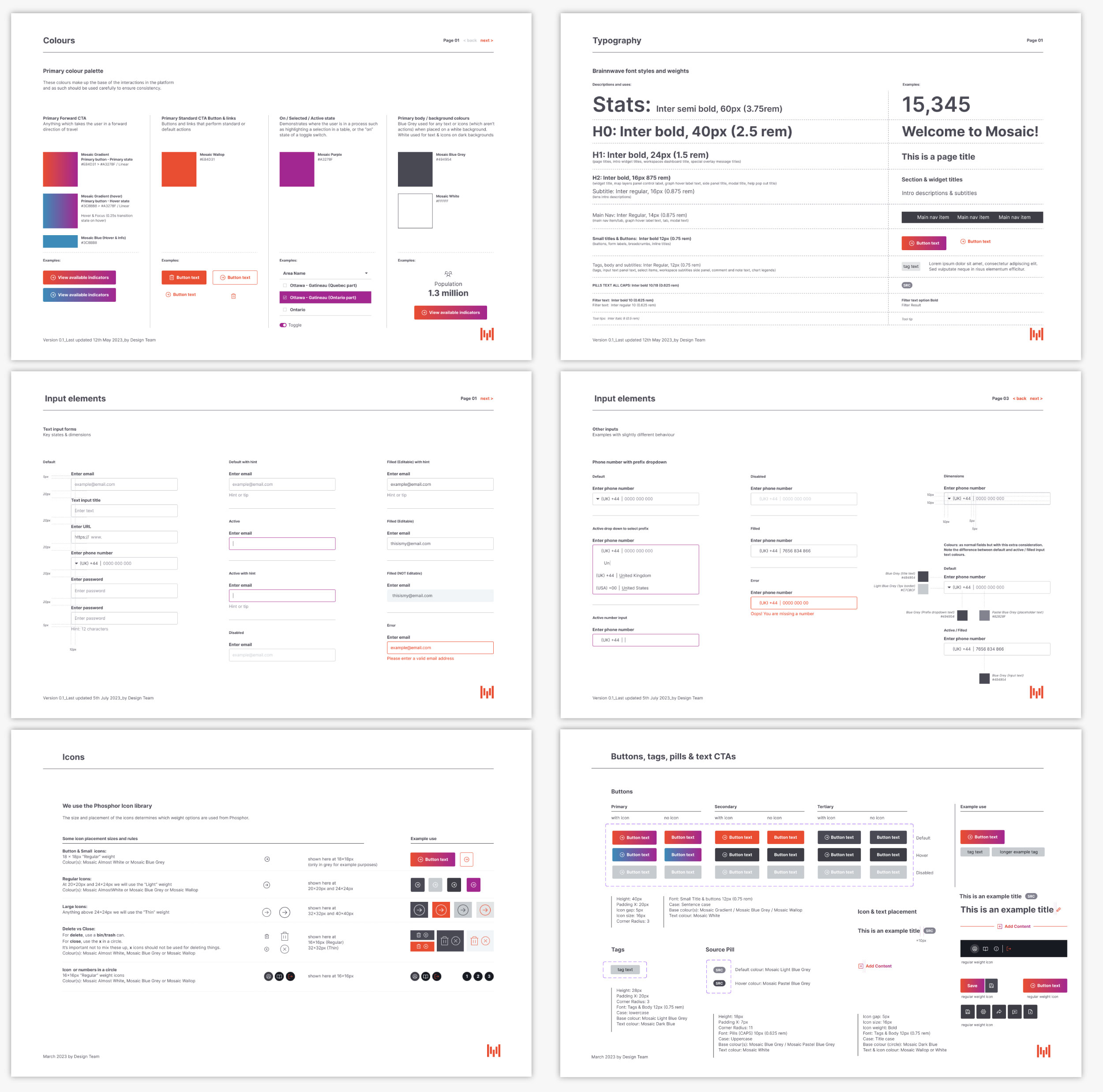
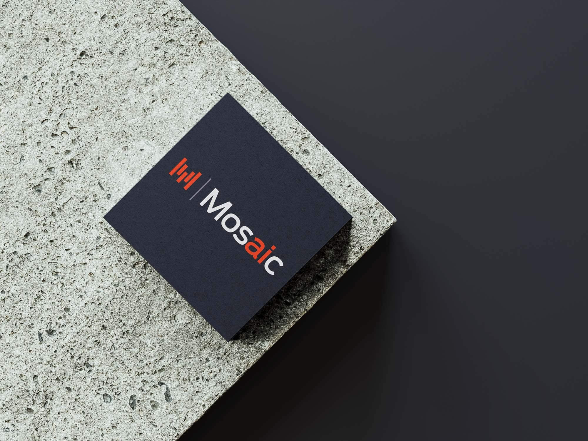
Mosaic logo and interface elements
The Mosaic logo and some interface elements

One platform. Several possible futures.

Mosaic wasn't an entirely new product.

It evolved from the data and intelligence platforms we'd been building at Brainnwave for years.

What changed was what we were trying to build with it.

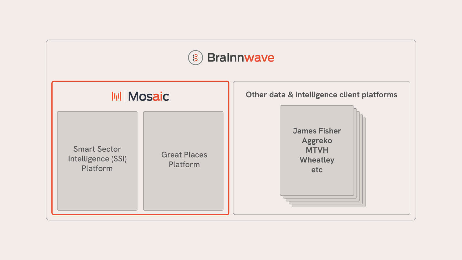
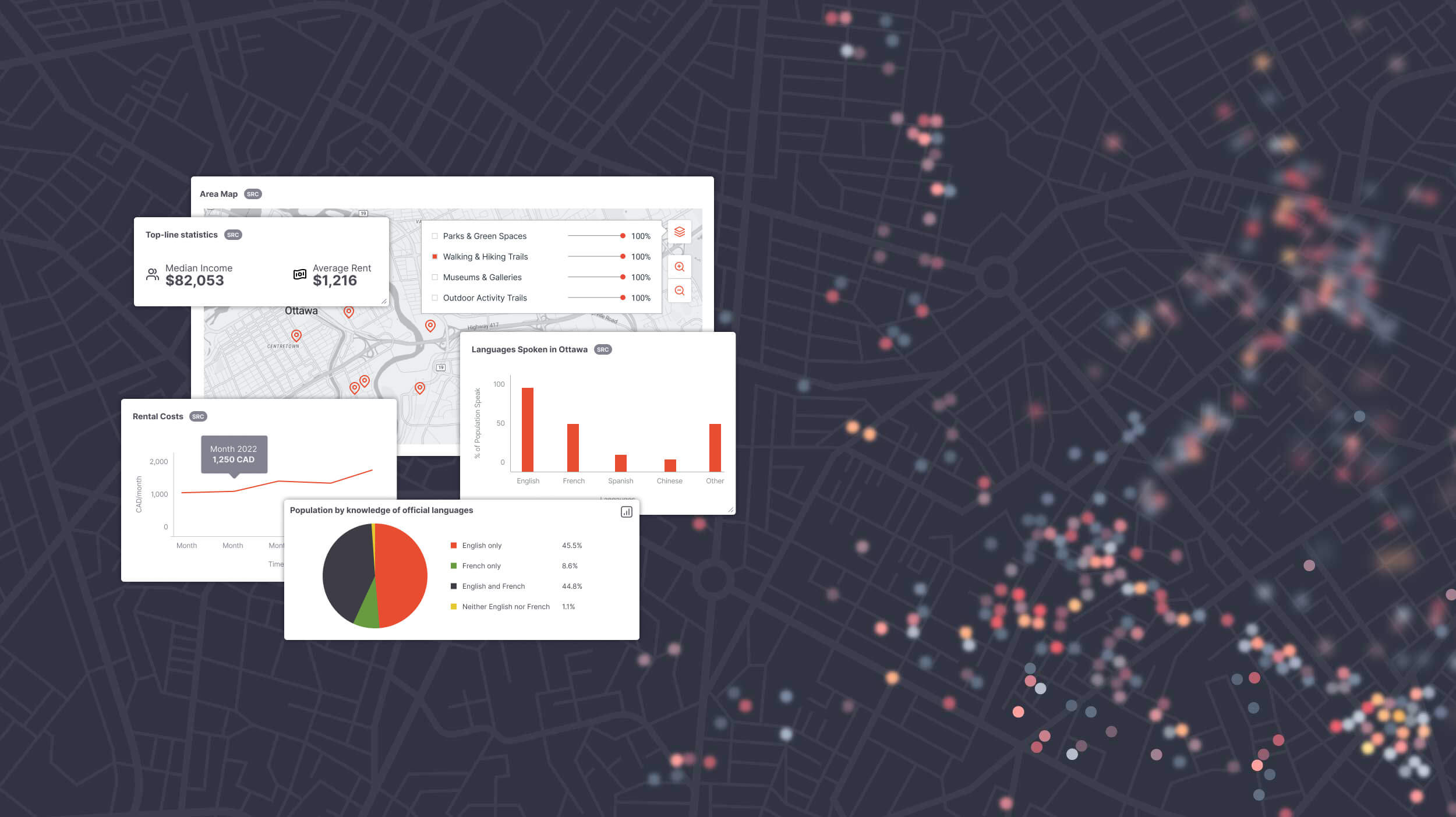
One application was Great Places, developed alongside Hatch's methodology and intended to help understand what made somewhere a good place to live and work.

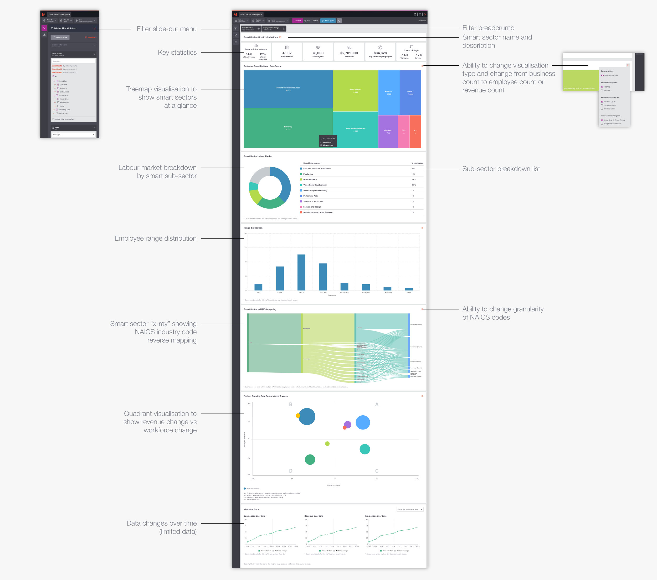
The other was Smart Sector Intelligence, built around technology developed by our own data science team to understand businesses based on how they actually described what they did, rather than relying entirely on traditional industry classifications.

They were very different propositions built on common technology.

Mosaic gave the underlying platform a name and an identity of its own - something that could support those applications while leaving room for whatever came next.

Mosaic platform structure The Brainnwave and Mosaic platform relationship.

Lots of small things making a bigger picture.

The name came from our CEO.

The idea was simple enough: lots of individual pieces coming together to form something larger, which happened to fit particularly well with what we were building.

One business doesn't tell you much about an economy.

Thousands of them begin to reveal a picture.

That became the starting point for the visual identity too.

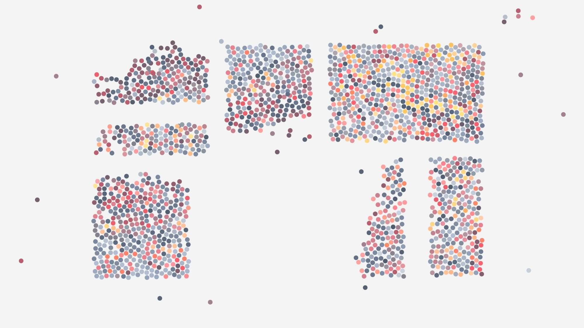
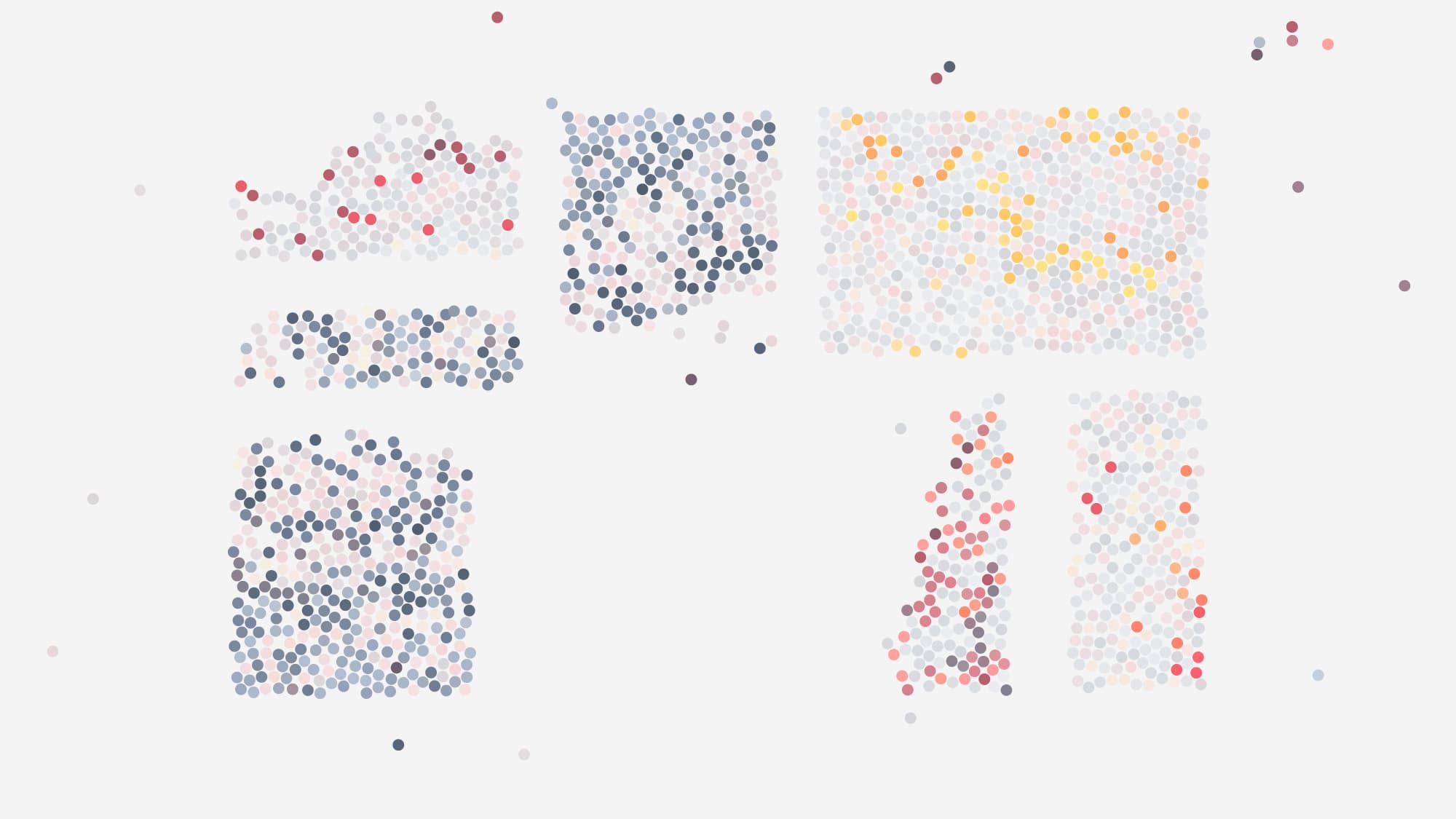
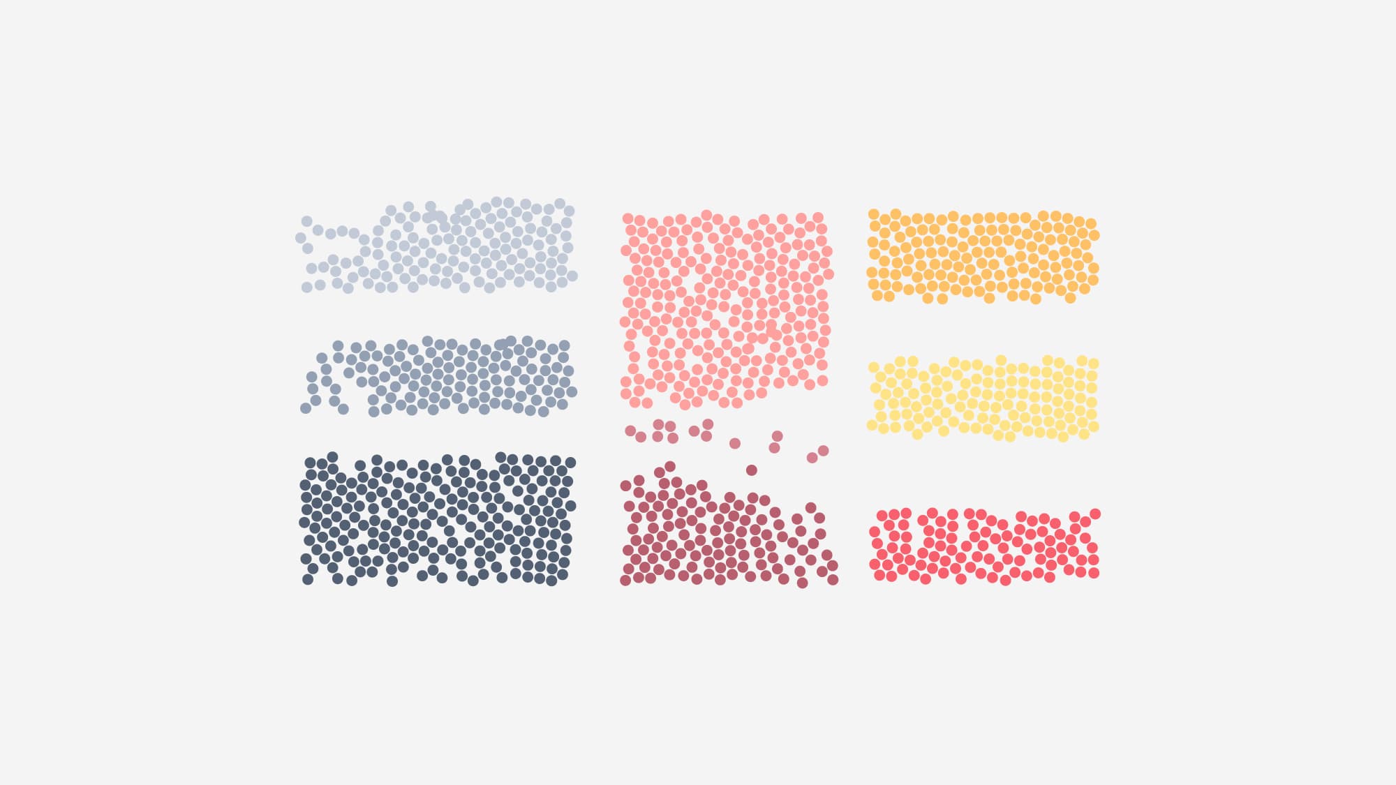
Dots form from an unstructured mass into organised categories or clusters.

Finding the M in the data.

The Mosaic mark came together surprisingly quickly.

I built the M as a simple graph-like form, giving it a visual connection to data without making it look like another generic piece of enterprise software.

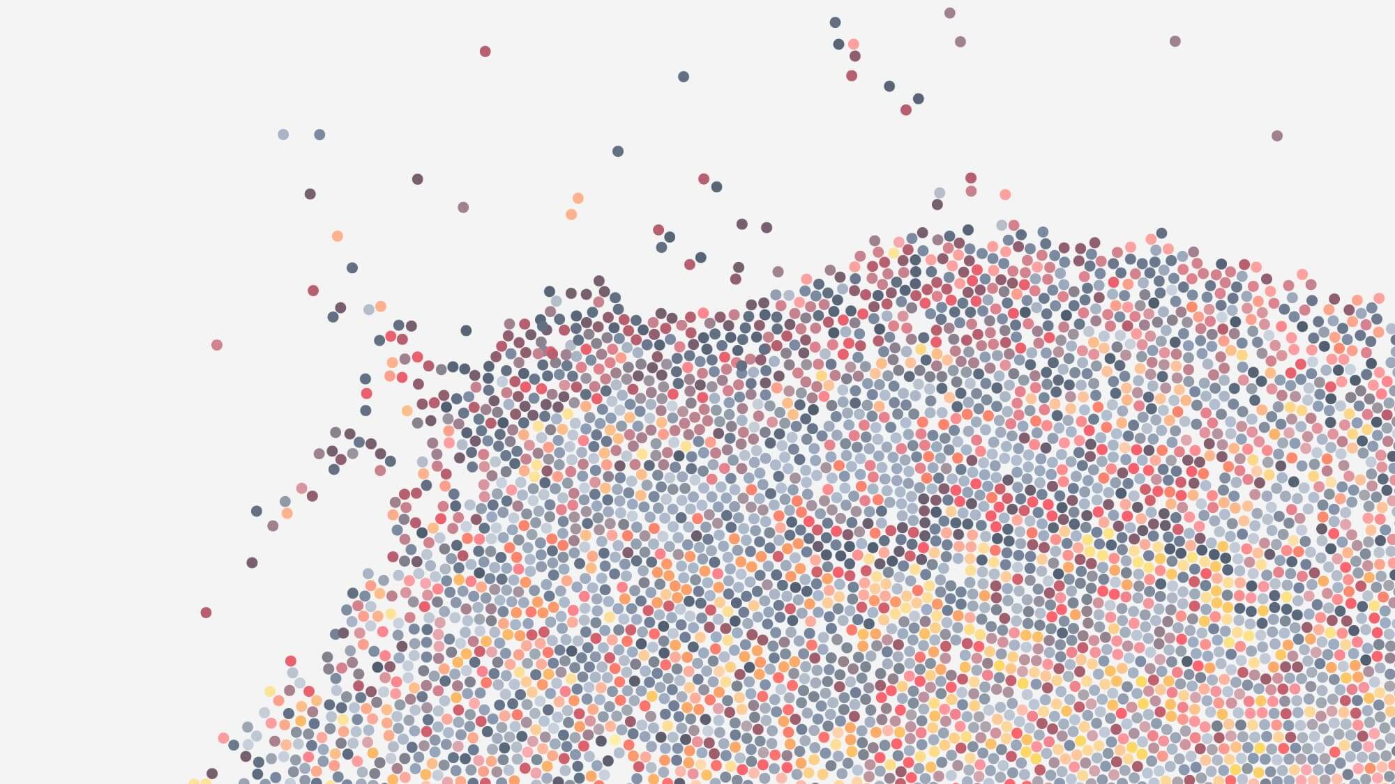
Around it, I started developing a wider language of points, clusters and connections. Individual dots could represent individual businesses, while their position, colour and grouping could reveal the patterns within them.

Mosaic inherited some visual DNA from Brainnwave, particularly the red, but I introduced a much deeper blue that gave the product its own character.

It felt related to Brainnwave without simply looking like Brainnwave with a different logo.

What if you could see your economy differently?

Smart Sector Intelligence wasn't particularly easy to explain.

Economic development teams already had ways of classifying businesses, but those classifications could be broad, outdated or simply fail to capture what a modern company actually did.

Our proposition was that Mosaic could find another view.

For the website, I wanted to explain that visually rather than opening with several paragraphs about machine learning and multidimensional vector spaces.

So I built the homepage around a long scrolling story.

Start with all the businesses in your area. Look at how they're normally classified. Then use the language those businesses use to describe themselves to reveal different relationships, sectors and opportunities.

The further you moved through the page, the more the picture came into focus.

The original scrolling story, explaining how SSI works in layperson's terms.

From one business to an entire sector.

Inside Mosaic, users could approach the data from either direction.

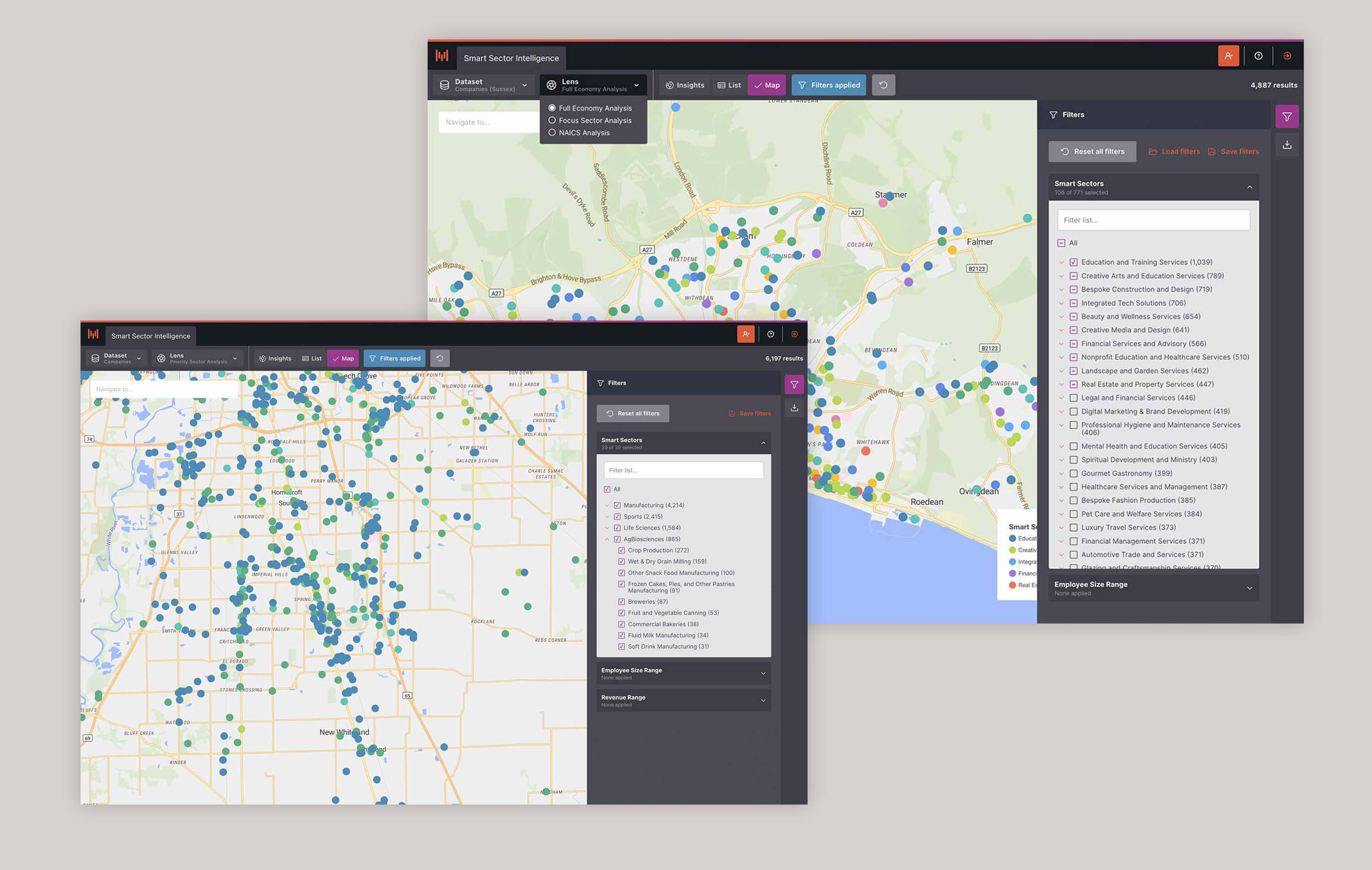
They could start with their region and explore the businesses within it - filtering them by location, sector and other attributes, then moving between map, list and insight views.

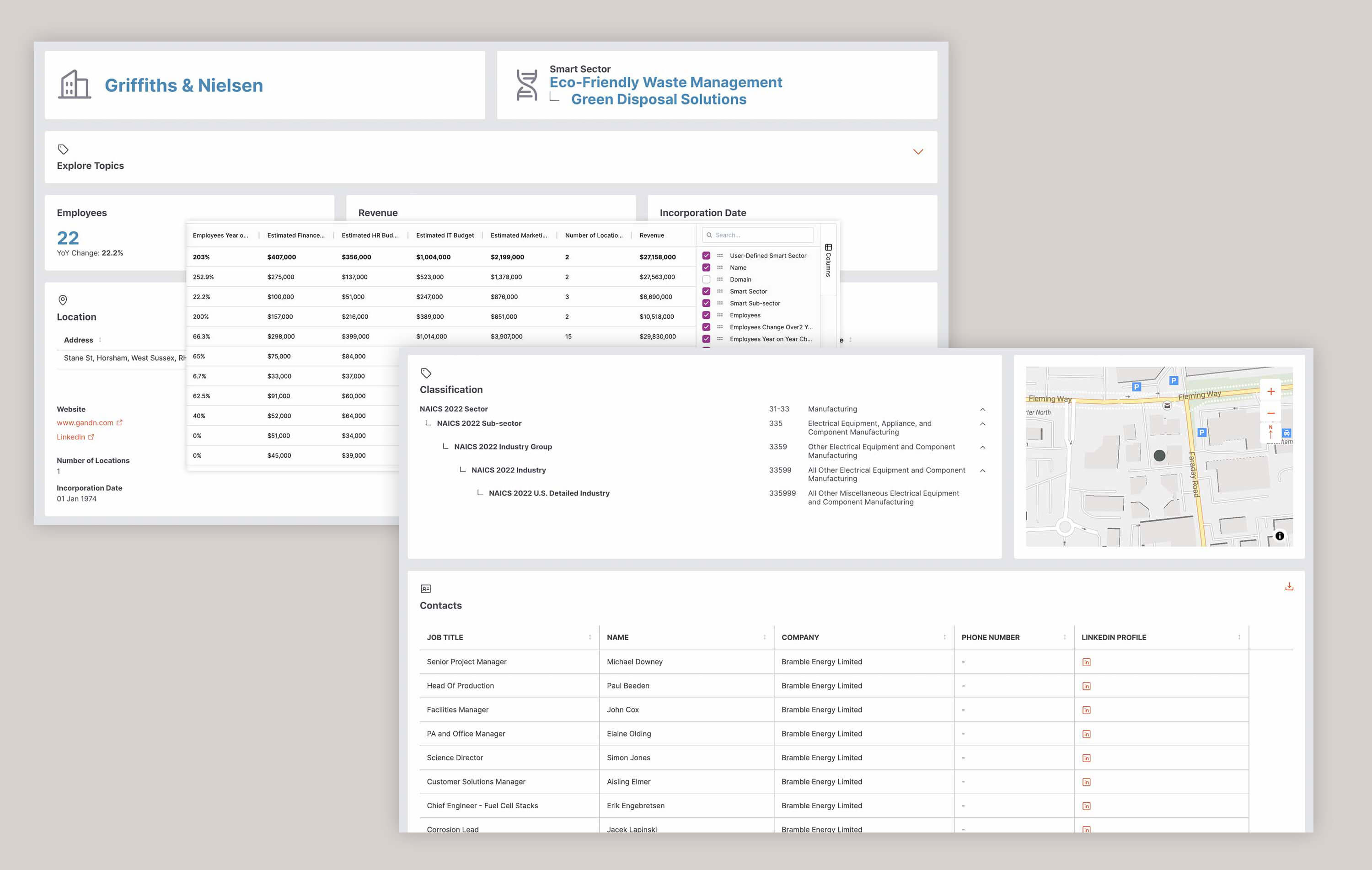
Or they could start with a single business.

Because the underlying model represented companies within a multidimensional semantic space, Mosaic could identify other businesses that appeared similar based on what they actually said they did.

In practical terms, the user could say:

“Show me businesses like this one.”

And Mosaic could begin revealing a sector that might not line up neatly with conventional classifications.

The technology underneath was complicated. The interface needed to make the result feel obvious.

Maps businesses and insight views of a geographic location.

Bringing the identity into the product.

One of the things I liked most about Mosaic was that the boundaries between product and brand started becoming less obvious.

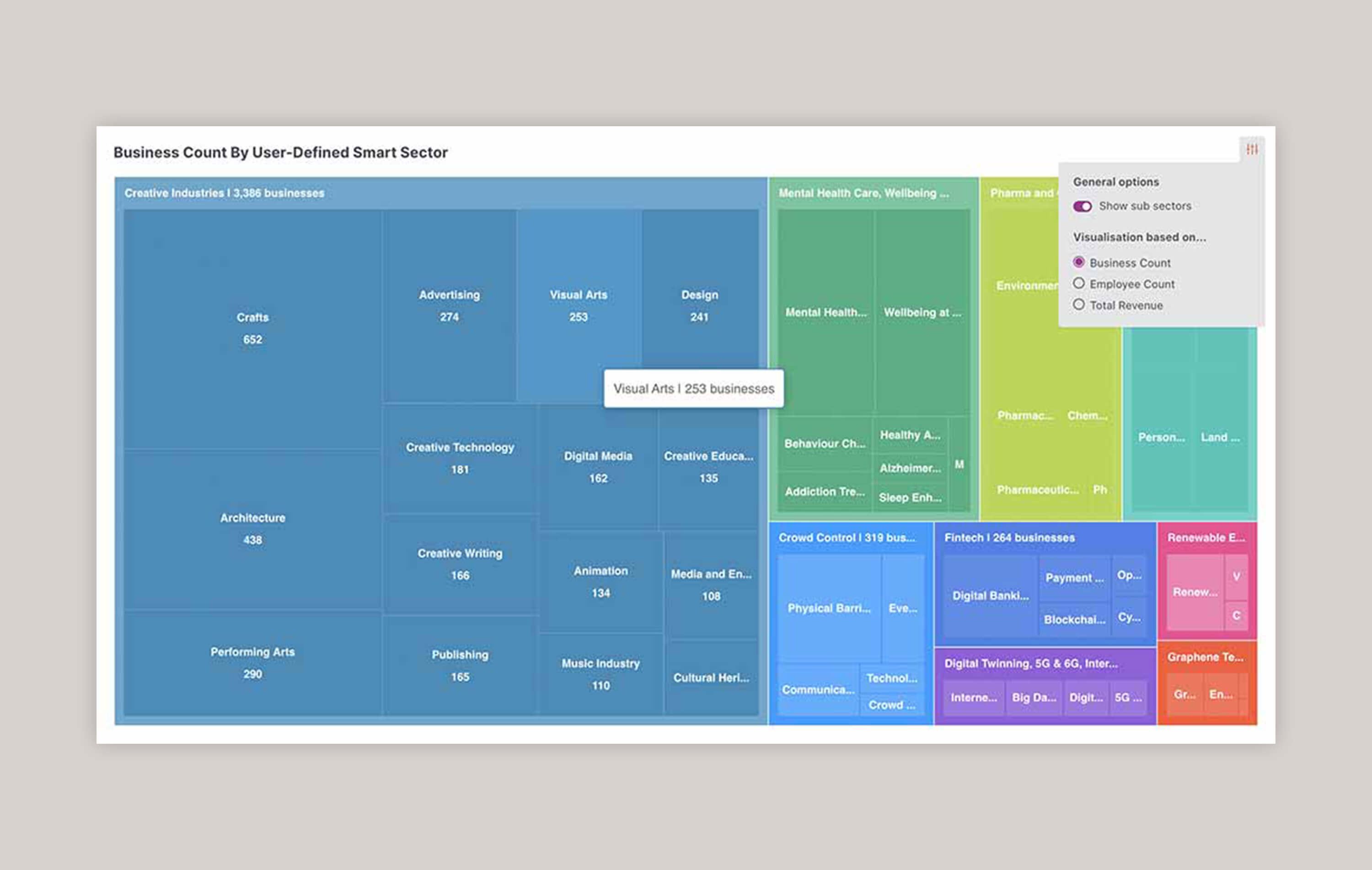
The M worked naturally within the application. The colours, typography and graphic language started to carry across. Maps and data visualisations felt connected to the dots and clusters we were using in marketing.

There were still the usual compromises between design and what could realistically make it into development, and plenty of things were simplified on the way to an MVP.

But compared with earlier Brainnwave products, Mosaic increasingly felt like one coherent thing.

And, as a useful side effect, screenshots of the product finally looked like they belonged on the website advertising it.

Finding a bigger opportunity in a simple feature request.

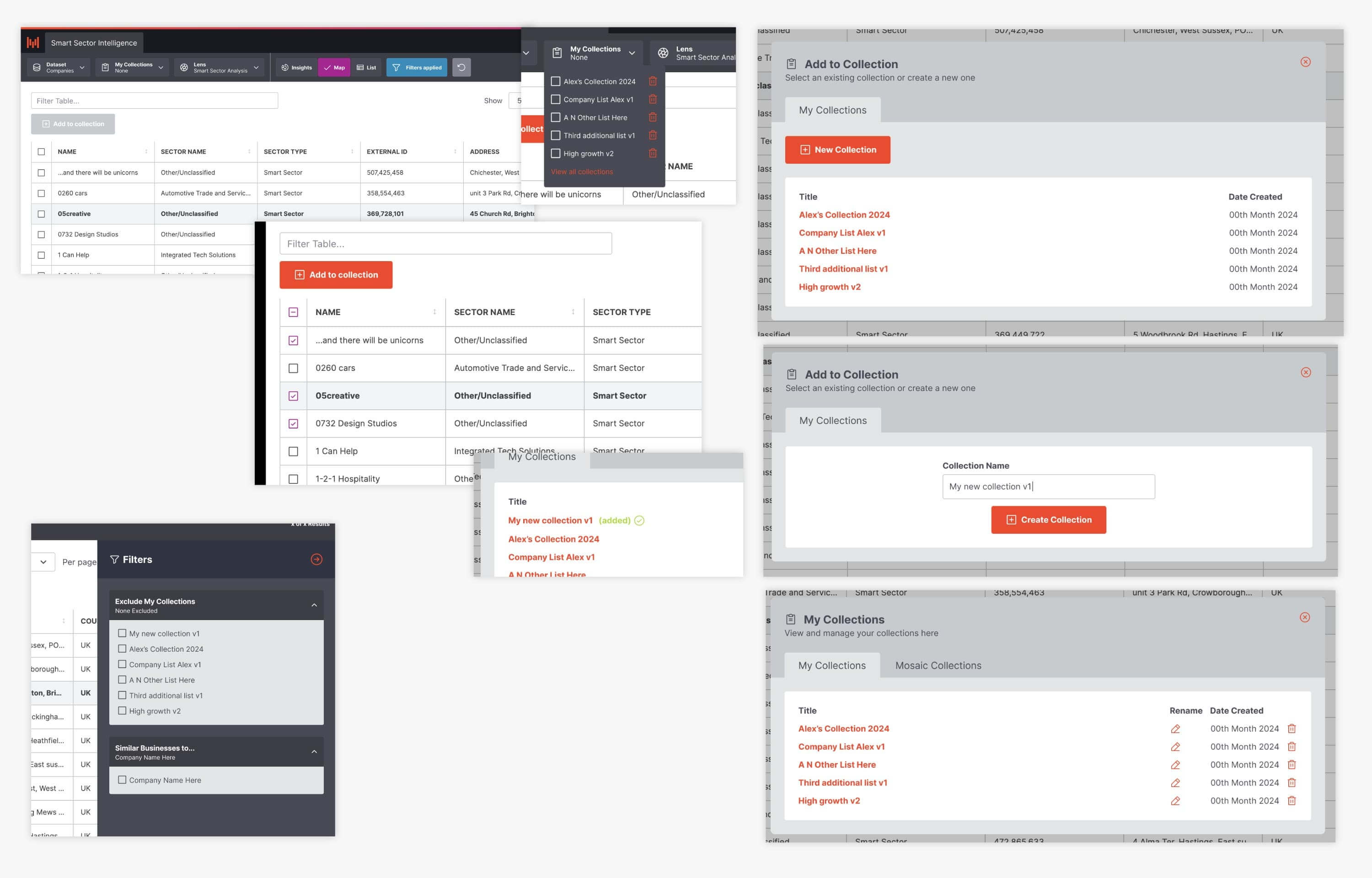
Users asked for a way to save their own lists of businesses.

Rather than build a separate lists feature, I treated those collections as subsets of Mosaic's existing data. That meant they could use the maps, filters and insights we'd already built — making a relatively simple feature much more useful without introducing unnecessary complexity.

Read the User Lists product design story
Mosaic lists

Taking Mosaic beyond the screen.

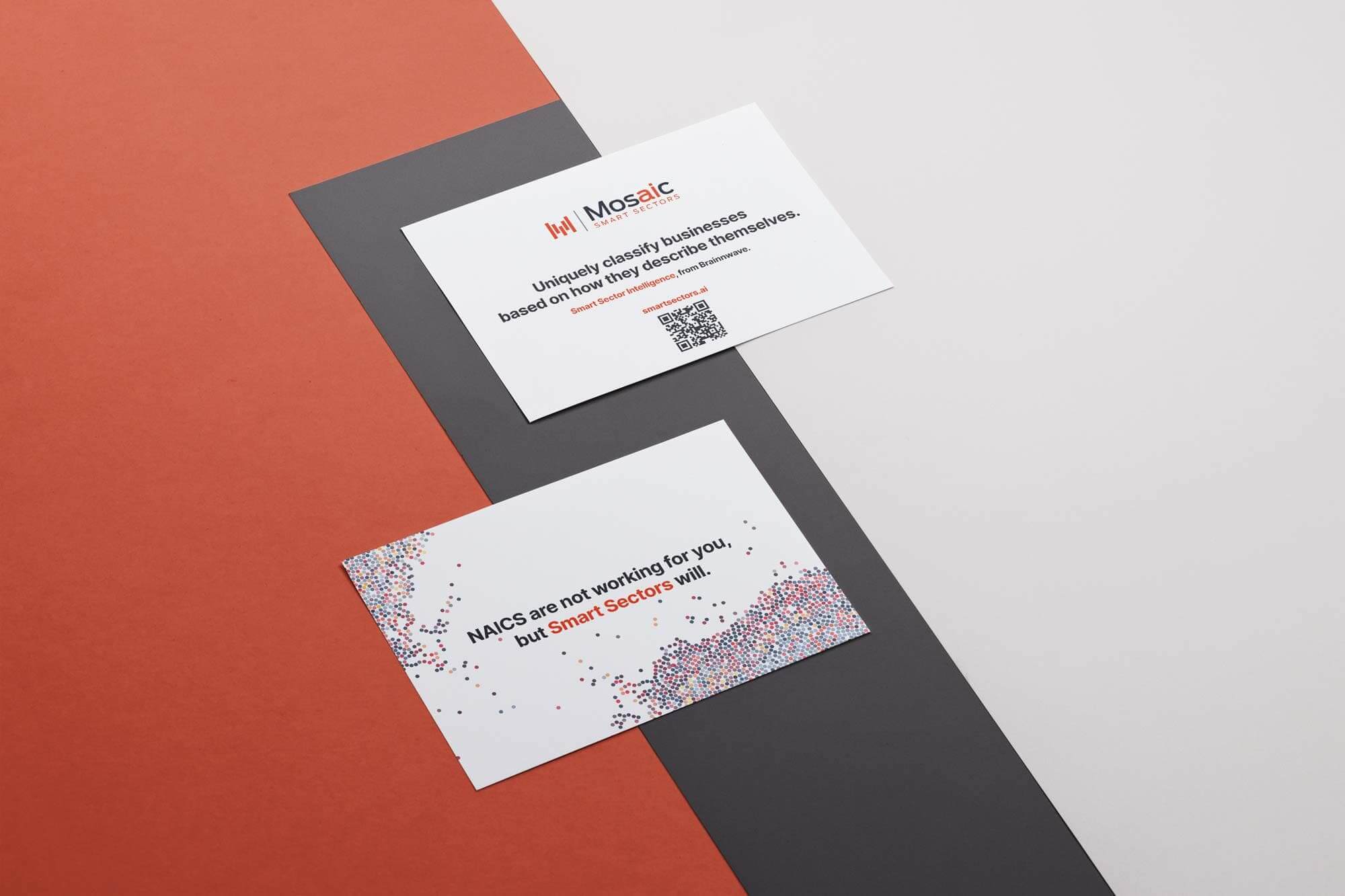
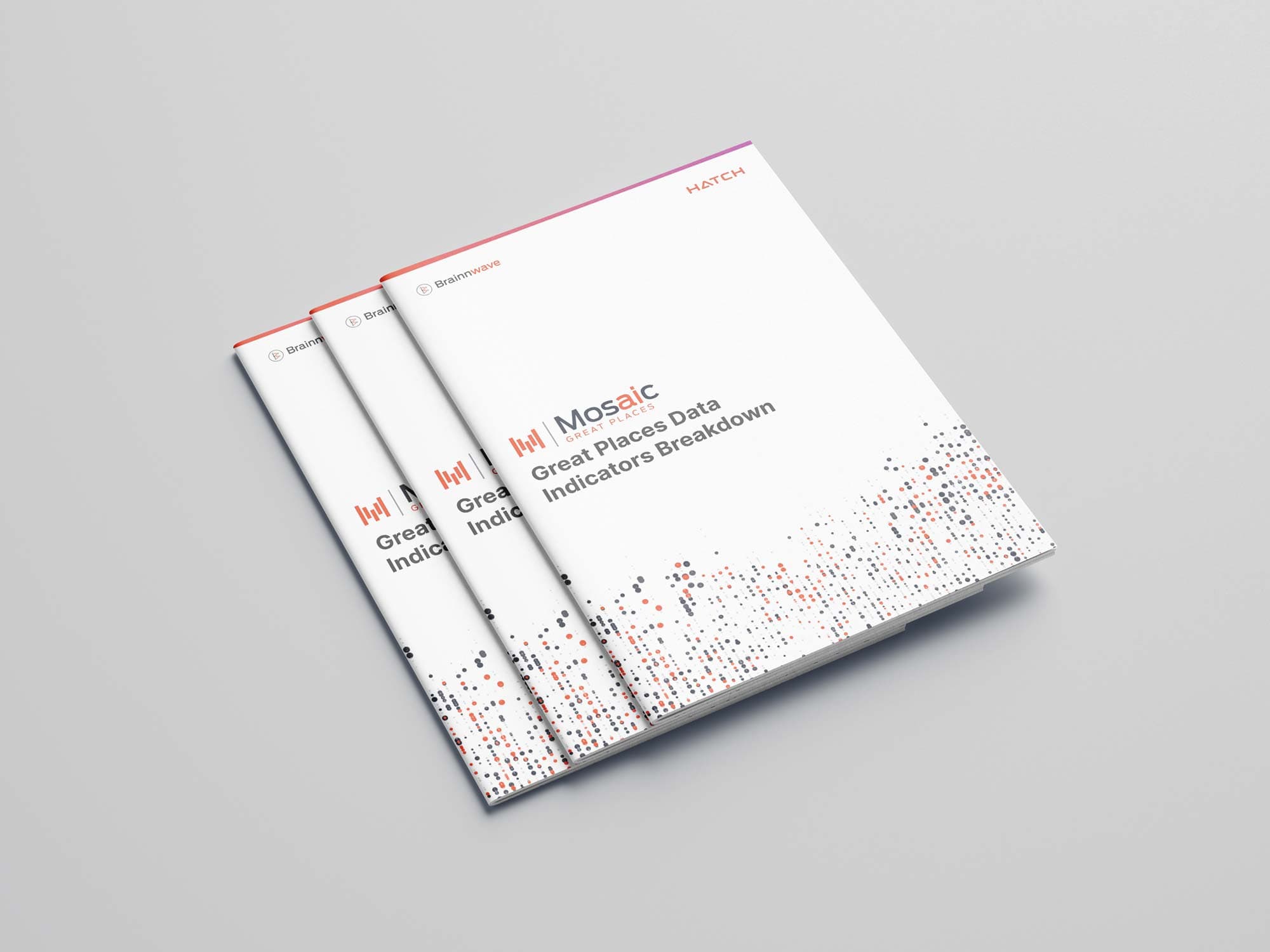
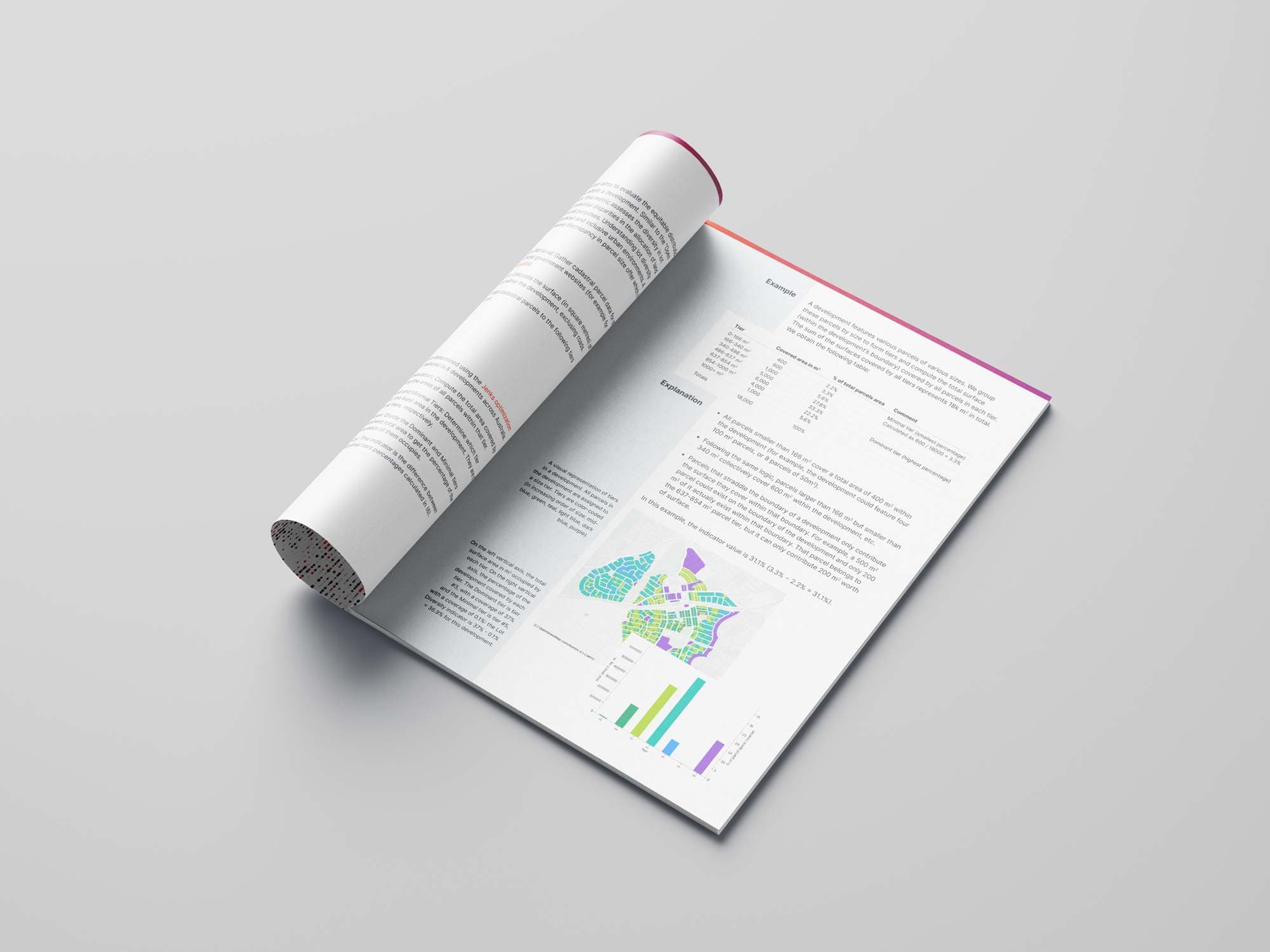
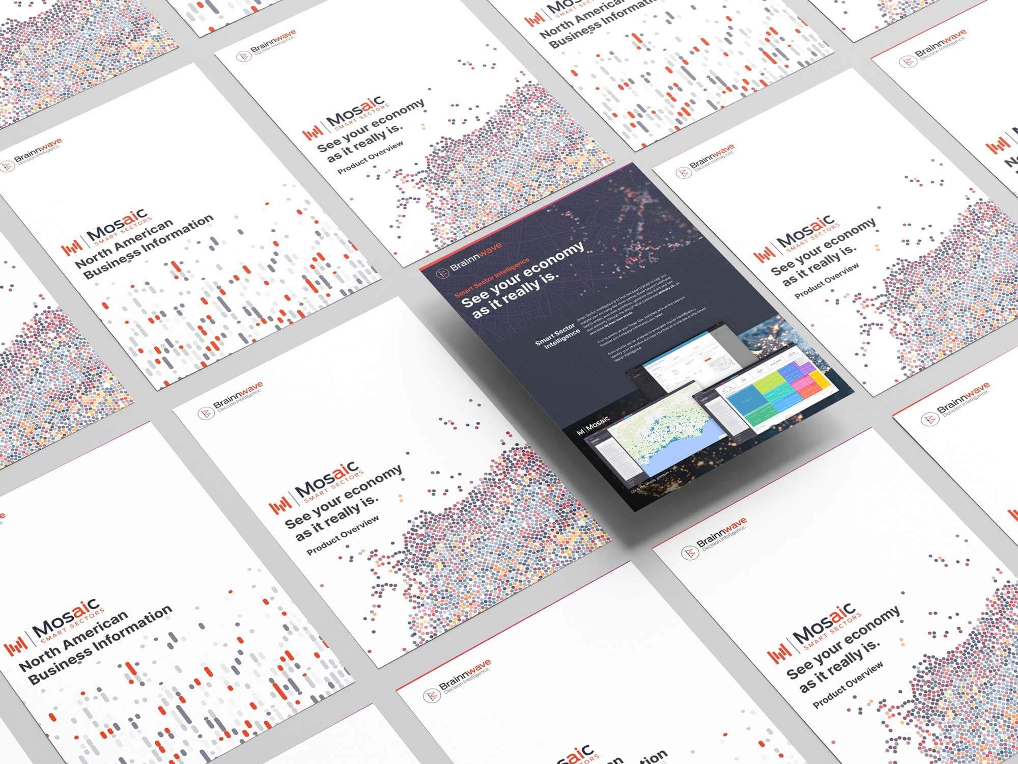
Mosaic also needed to work as something people could encounter at conferences, in meetings and during sales conversations.

I carried the identity through brochures, flyers, presentations and exhibition material, using the same graphic language we'd developed across the website and product.

That was one of the things I enjoyed most about the project.

It wasn't a brand identity over here and a software interface over there.

Increasingly, it was just Mosaic.

The product Brainnwave had been trying to become.

Mosaic arrived fairly late in Brainnwave's story.

Smart Sector Intelligence felt like one of the clearer propositions we'd developed. The product was becoming more coherent, we were making progress with the features around it and there were signs that we'd found a useful problem to solve.

Whether we'd genuinely found product-market fit is harder to say.

Economic development organisations had long sales cycles, budgets were difficult and we never built the volume of customers that would have allowed us to properly test everything we thought we knew.

So I wouldn't pretend Mosaic became the enormous success we hoped it might.

But creatively, it felt significant.

After years of platforms changing names, products changing direction and propositions being rewritten, Mosaic was one of the first times I felt we'd created something with enough of an identity to stand on its own.

Mosaic

Related work
Where Mosaic began

Mosaic grew out of a much longer story of experimentation at Brainnwave. The original case study looks at the changing company, products and design role that led to the platform Mosaic became.

Read the Brainnwave story Back to all work