More work
Things made for their own sake
Goth Juice is one of the things I make when nobody's paying me.
Explore the Cut Records story Back to all work
Turning a stupid name for coffee into a completely unnecessary fictional brand.
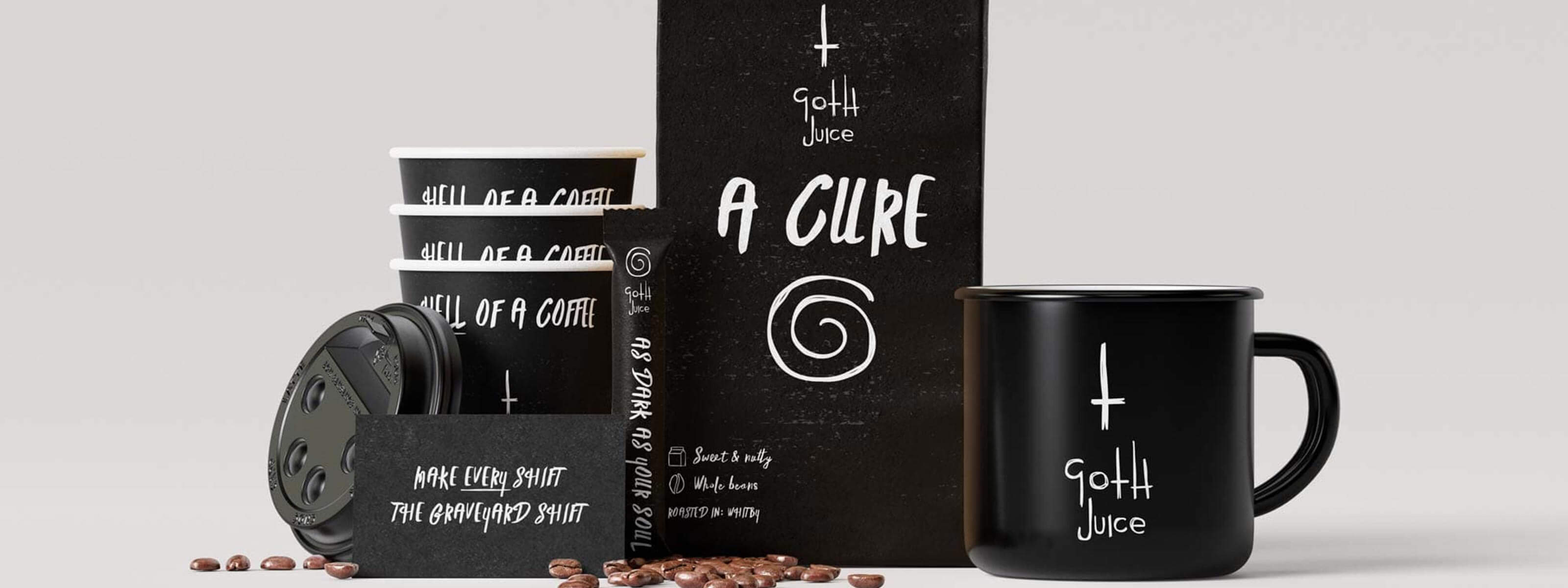
A friend of mine refers to coffee as Goth Juice.
Or possibly Goth Water.
Either way, Goth Juice was better.
I liked the joke enough to wonder what it would look like if it were real.
There was no client, no brief and absolutely no intention of starting a coffee company.
I just wanted to make something.
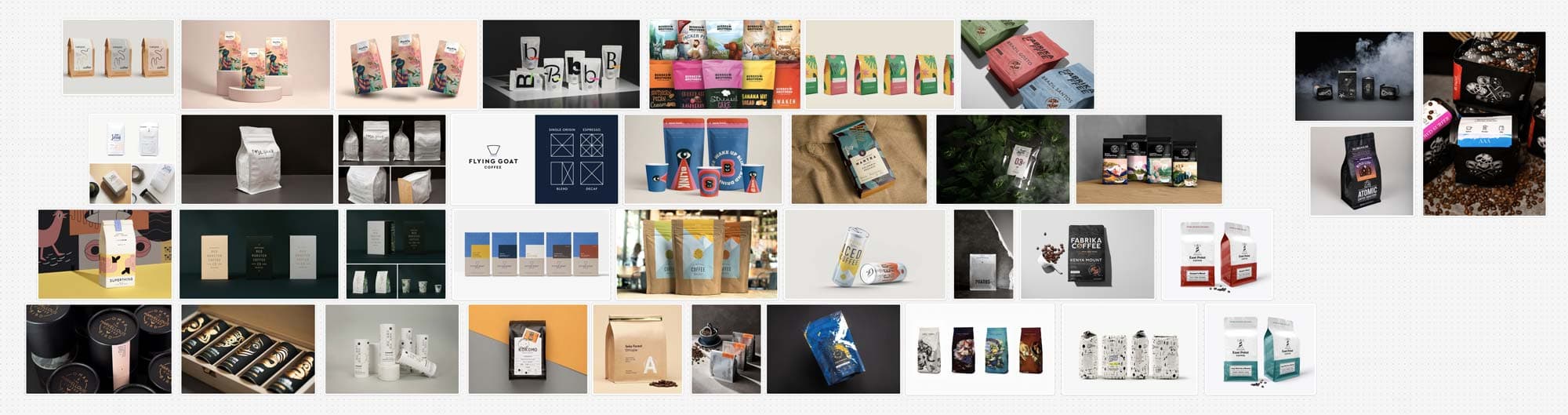
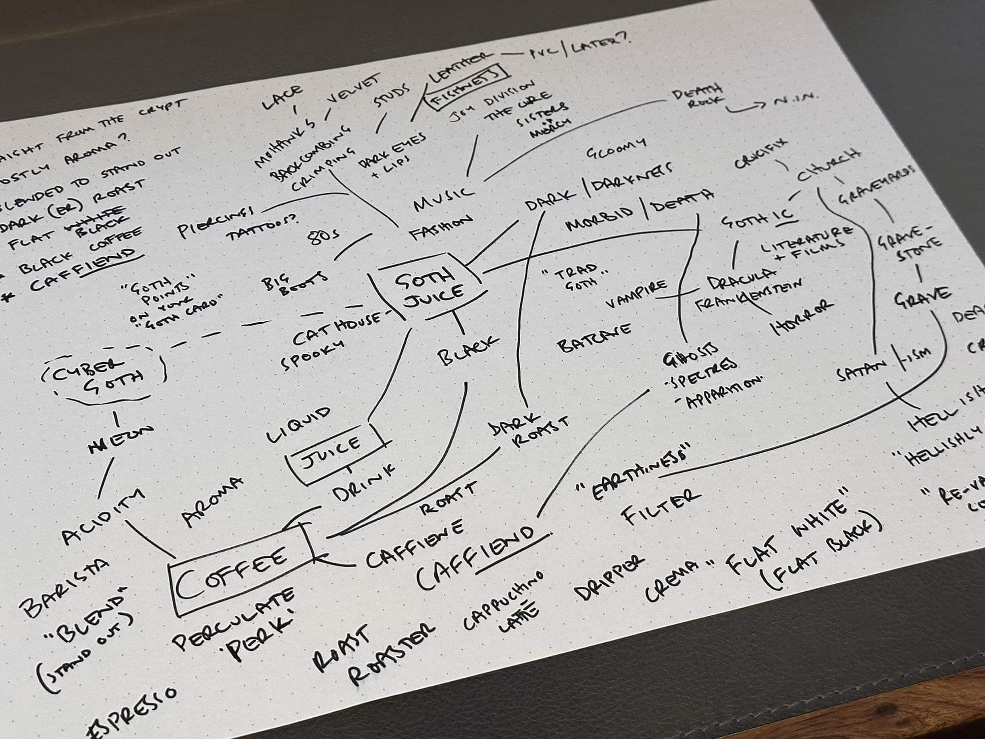
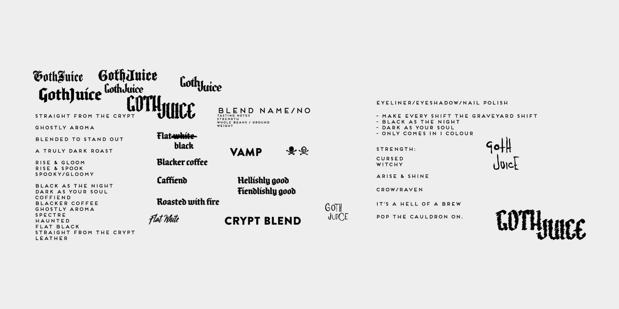
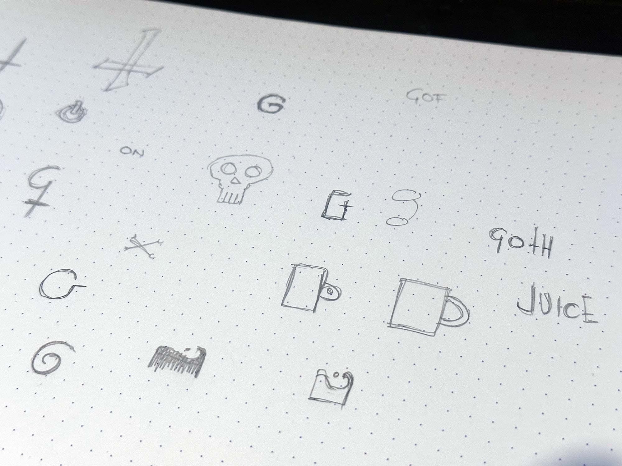
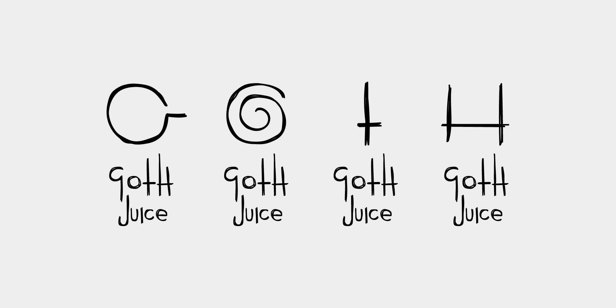
The identity started with a simple circular coffee cup viewed from above.
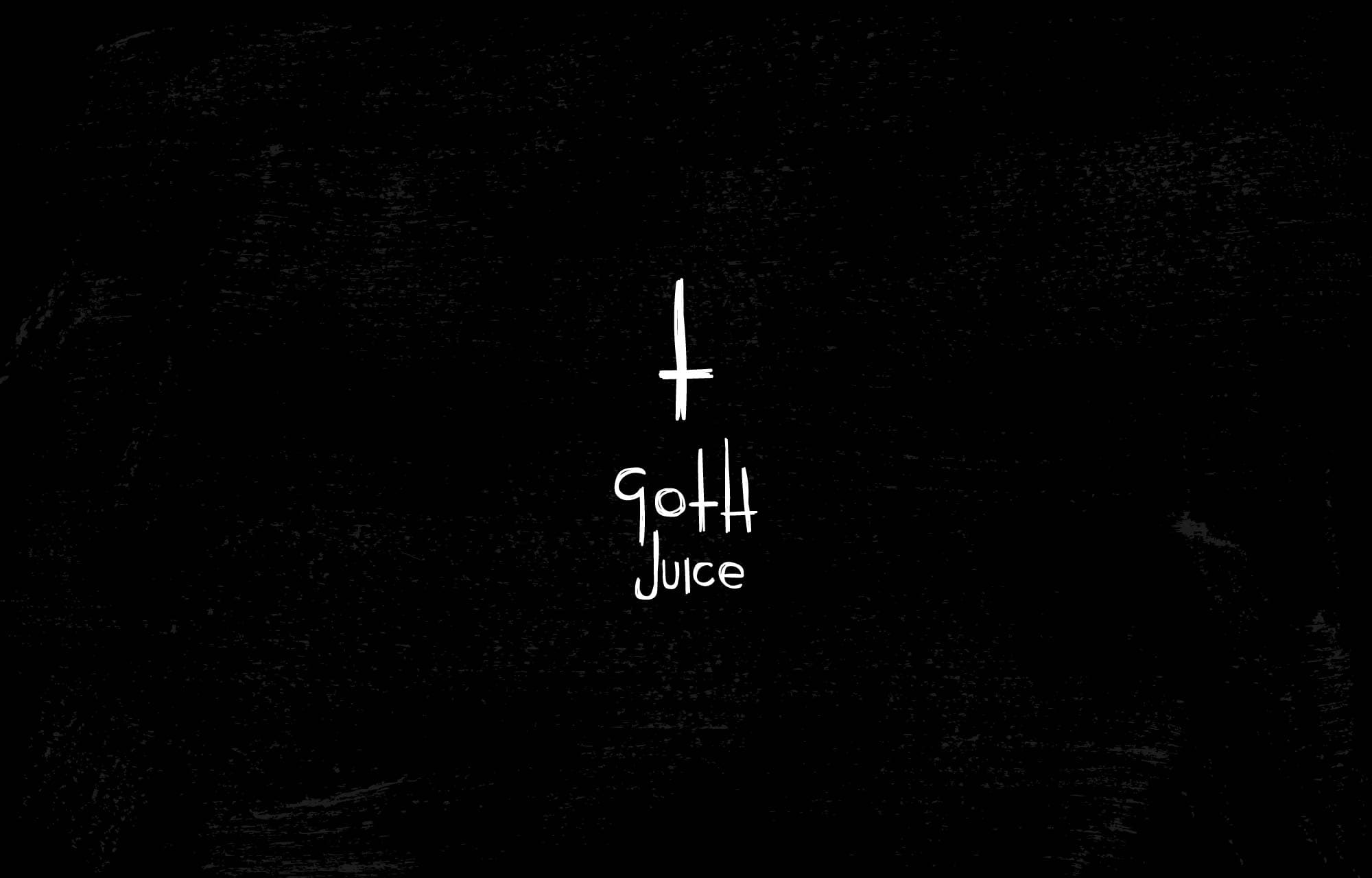
That became the G.
From there I started wondering whether the other letters could be treated the same way.
The O became a swirl of coffee.
The T became an inverted cross.
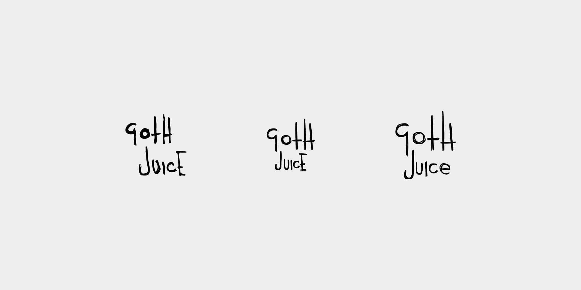
And the H completed a set of four pictograms that could work individually, together as the word GOTH, or animate into the complete identity.
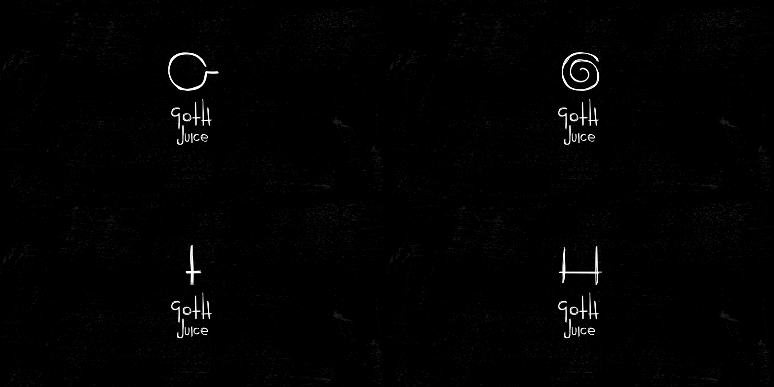
Developing the colour palette for a fictional goth coffee company was not the most demanding part of the project.
Black. White. Done.
The stripped-back palette let the pictograms, typography and copy do most of the work.
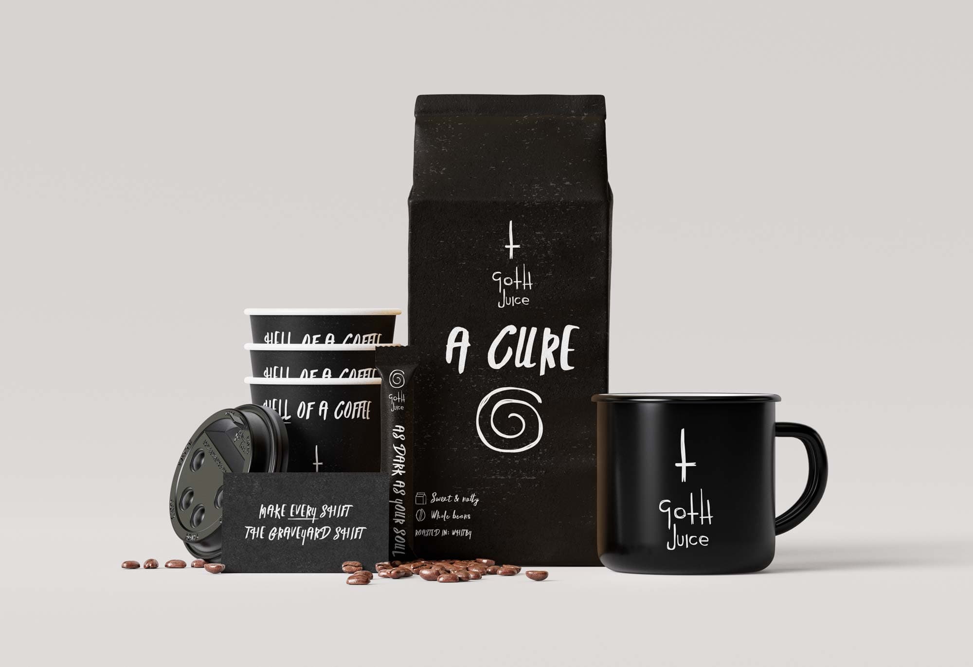

Once the identity existed, coffee language provided plenty of material to ruin.
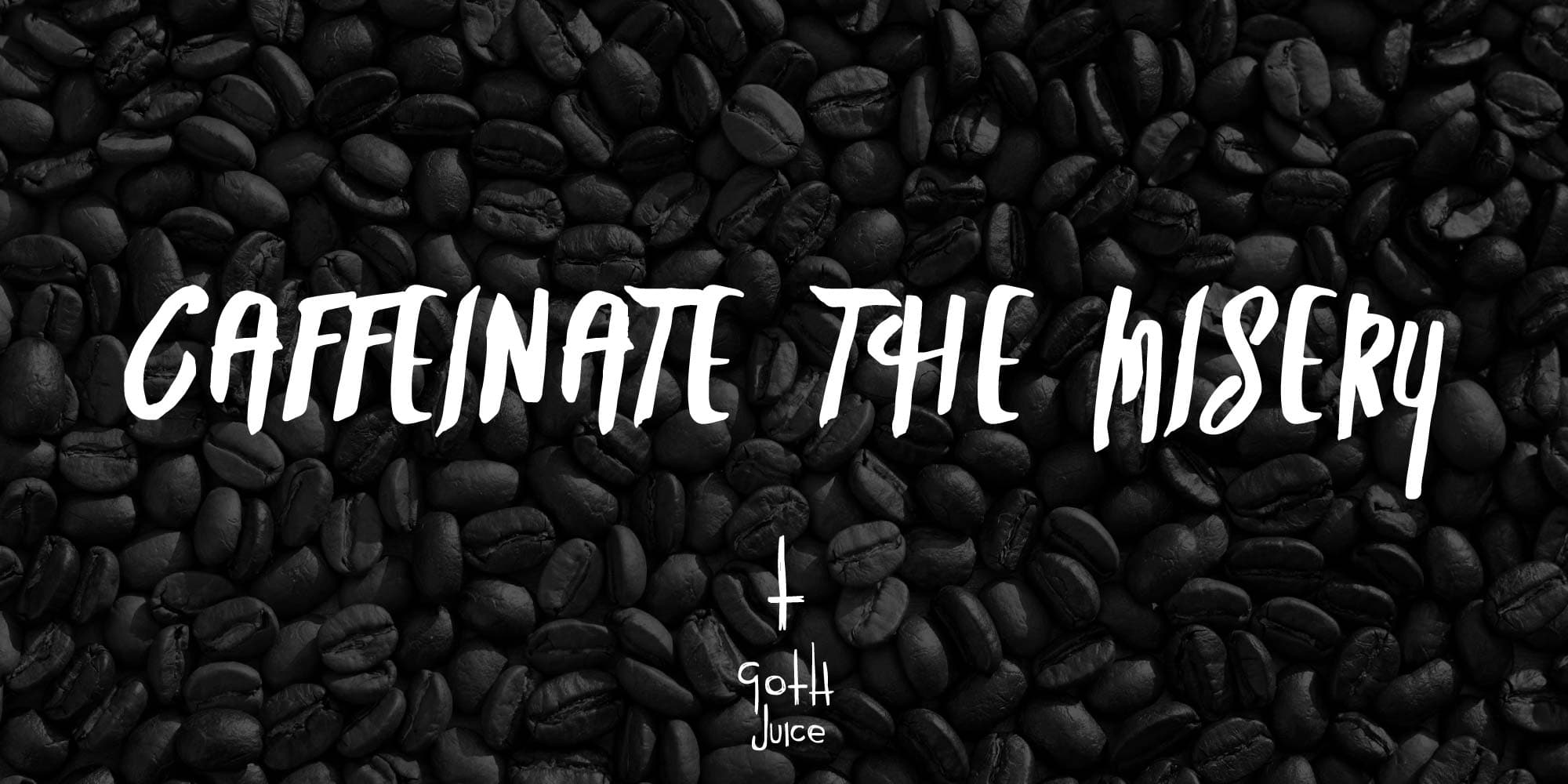

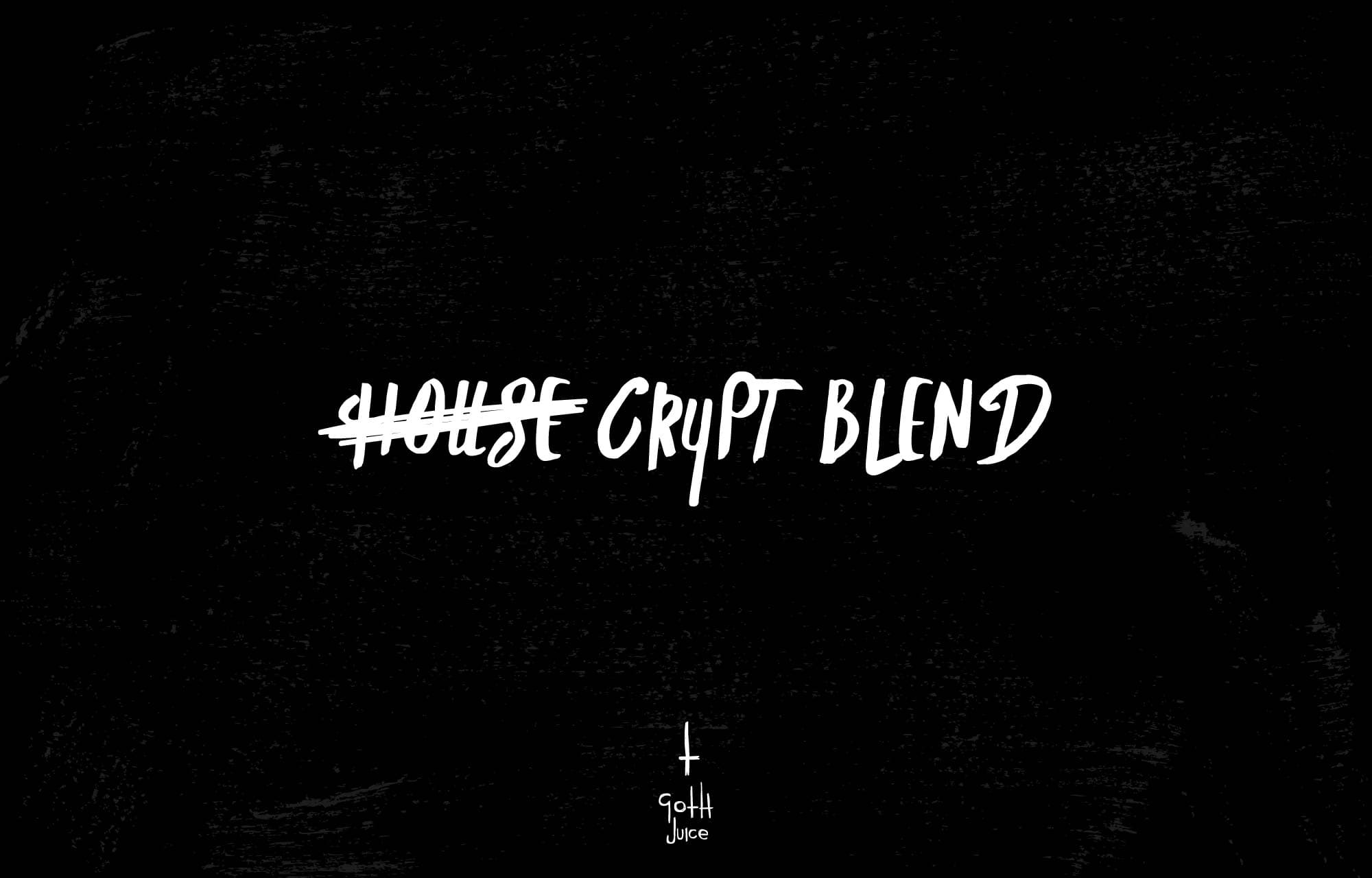
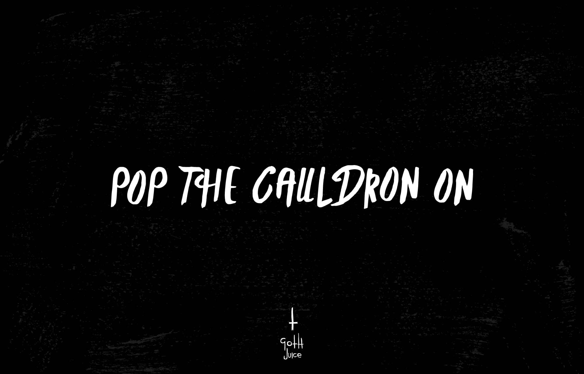


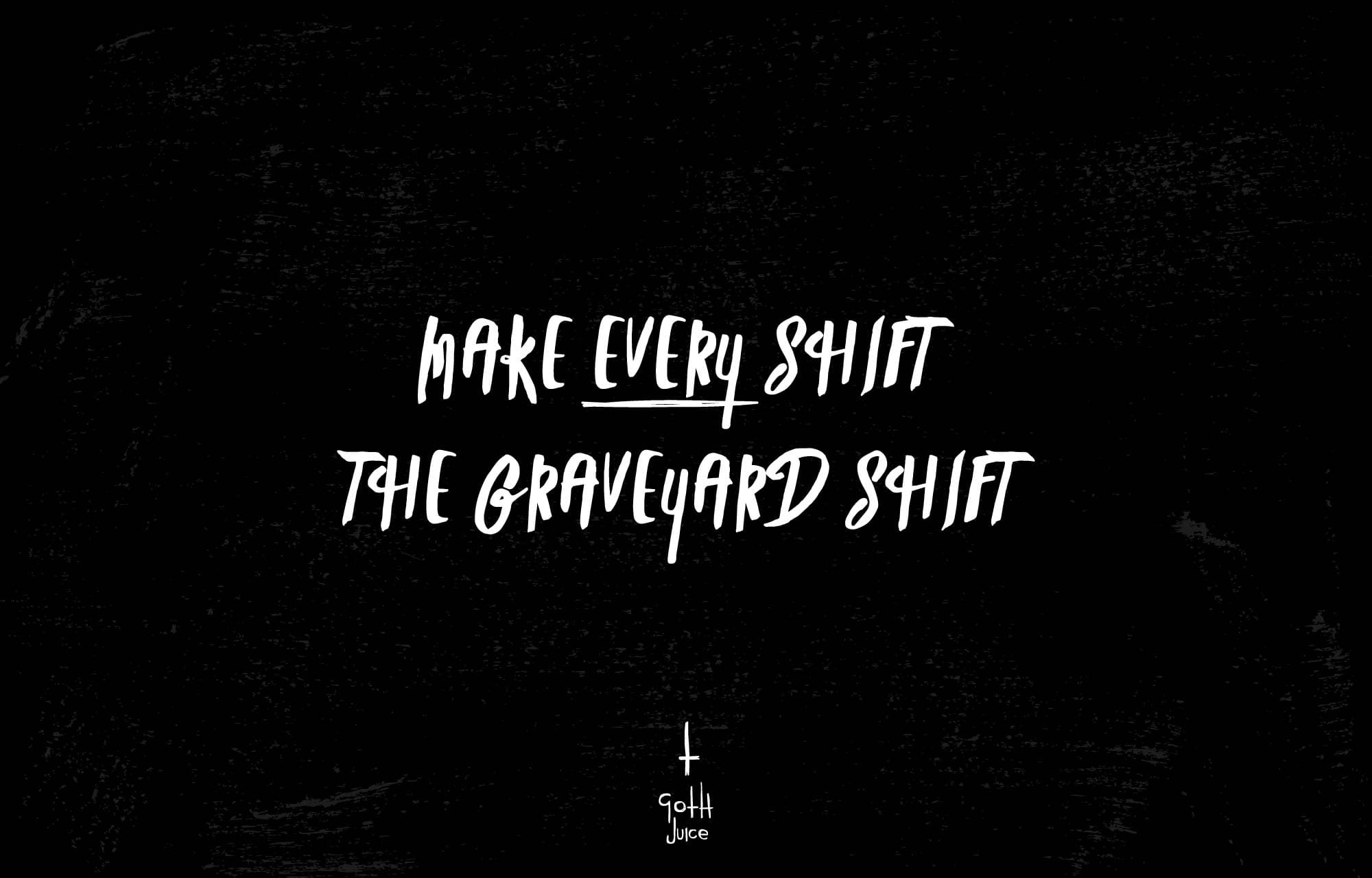
Goth Juice never became a real coffee company.
That wasn't really the point.
It was an excuse to take a throwaway phrase, follow it for a while and see whether there was an identity hiding inside it.
There was.
A logo.
A visual language.
An animated mark.
Packaging.
A tone of voice.
And far too many coffee-related goth jokes.
Sometimes that's enough reason to make something.
Goth Juice is one of the things I make when nobody's paying me.
Explore the Cut Records story Back to all work