DFRNT / Stillhead · Music, identity, graphic design, packaging, illustration & video

Making my own creative playground

Over two decades of making electronic music, running record labels, designing records and occasionally deciding to throw the whole thing away and start again.

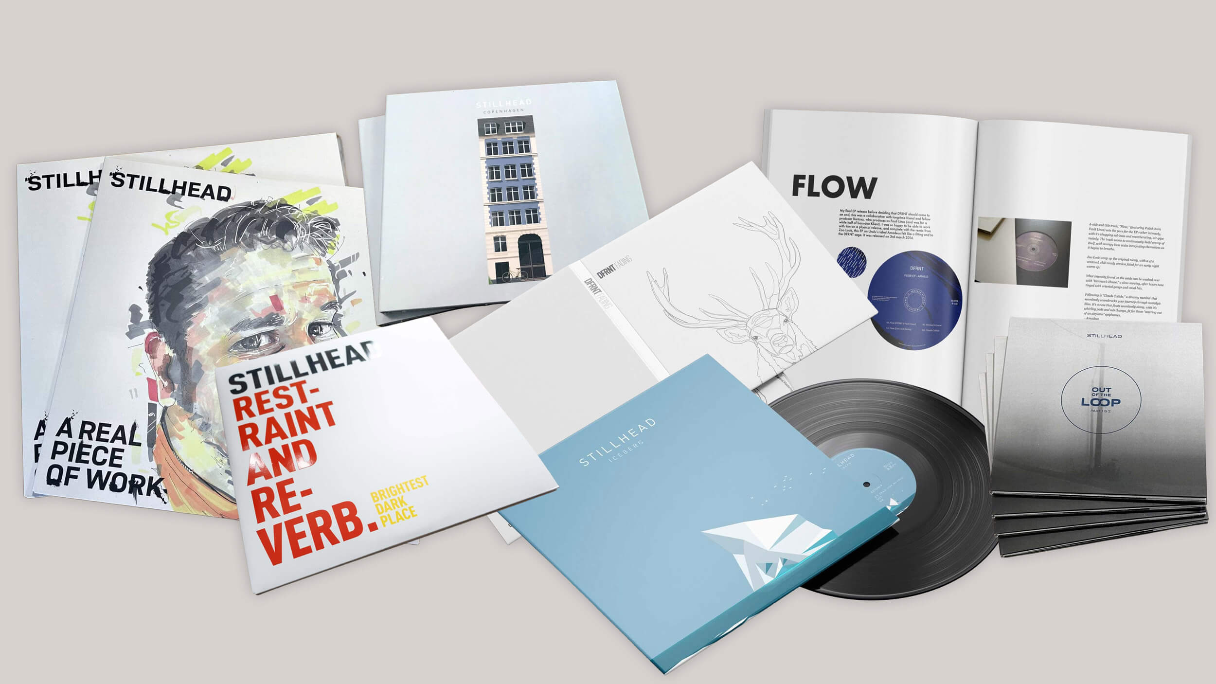
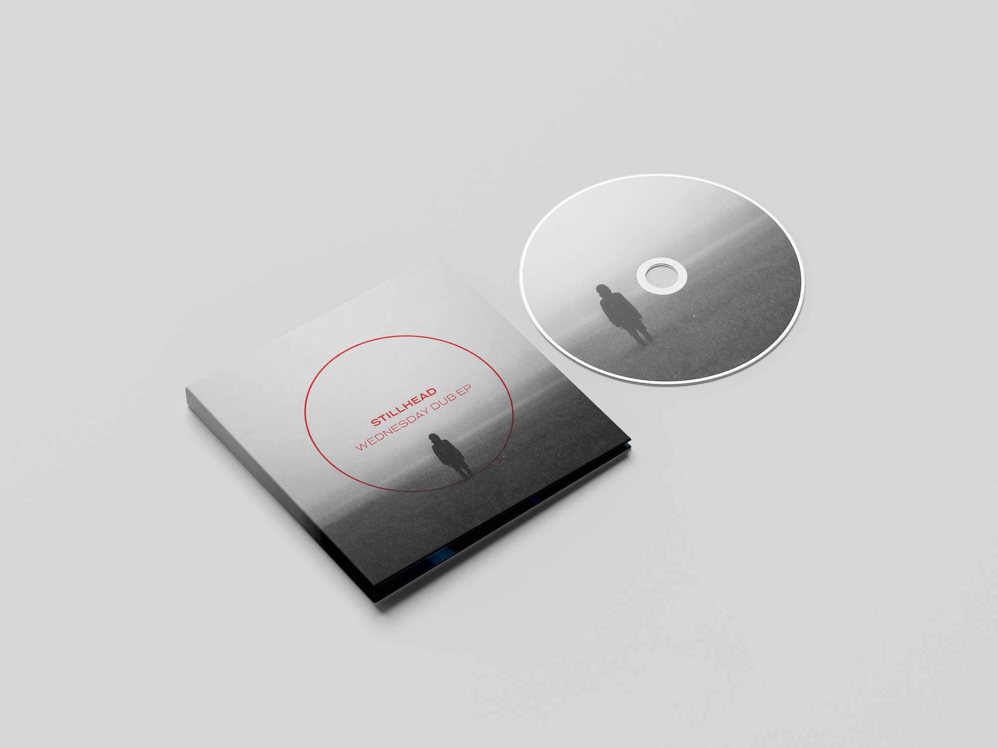
Stillhead and DFRNT CD and record sleeves

The other stuff.

I've spent most of my career designing things because somebody needed them.

This is the other stuff.

For nearly twenty years I've been making and releasing electronic music as DFRNT and later Stillhead - and designing almost everything that surrounds it.

Identities, record sleeves, vinyl, CDs, websites, videos, merchandise and whatever else seemed like a good idea.

There was no client. No brief. No approval process.

Music was only half the fun.

I've designed the visual side of almost everything I've released.

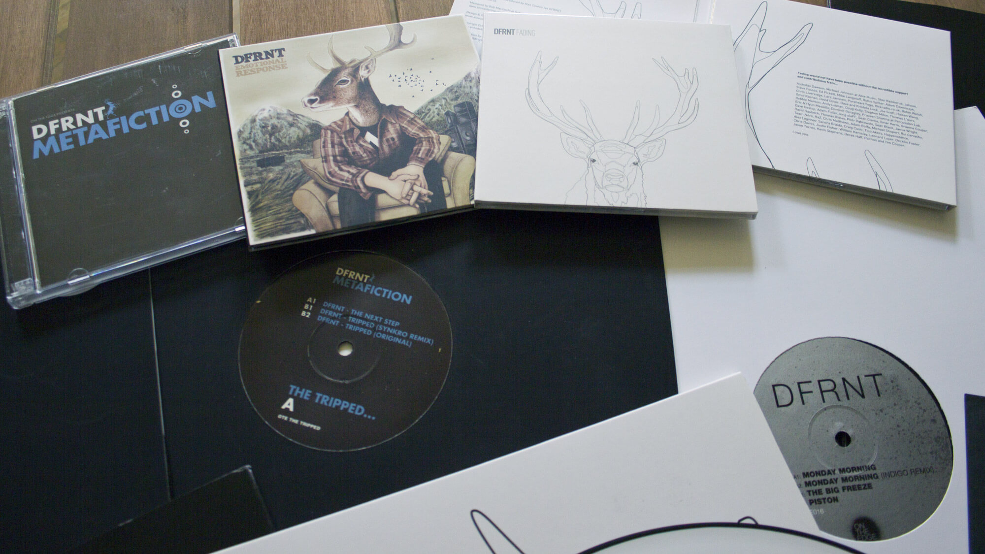
DFRNT had its own identity, built around a deer emblem that gave the project a subtle Scottish connection. Later, Stillhead gave me the opportunity to start again.

Along the way I also created record labels including Echodub, Cut Records, and Brightest Dark Place, designing their identities and packaging releases for other artists as well as myself.

But I've never been particularly interested in making everything look the same.

The identity might provide a thread, but the records were where I got to play.

Every record could be something different.

The music always came first. Then I got to decide what the thing I'd made should look like.

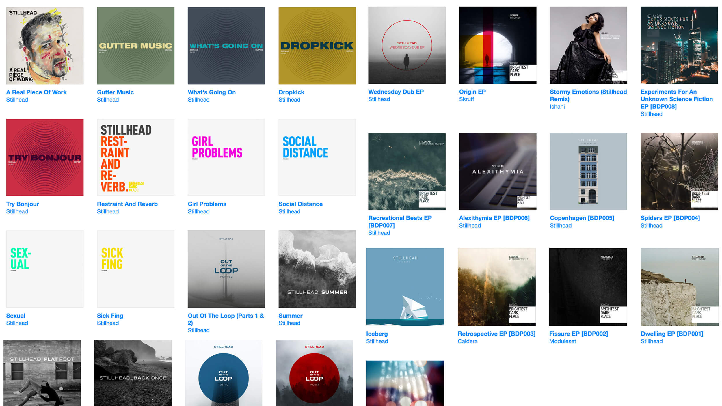
Each album could have its own visual character. The music gave me a starting point, and I could follow it into photography, illustration, typography or whatever felt right for that release.

Photography. Illustration. Typography. Texture. Fog. Huge blocks of colour.

If I liked something, I could try it.

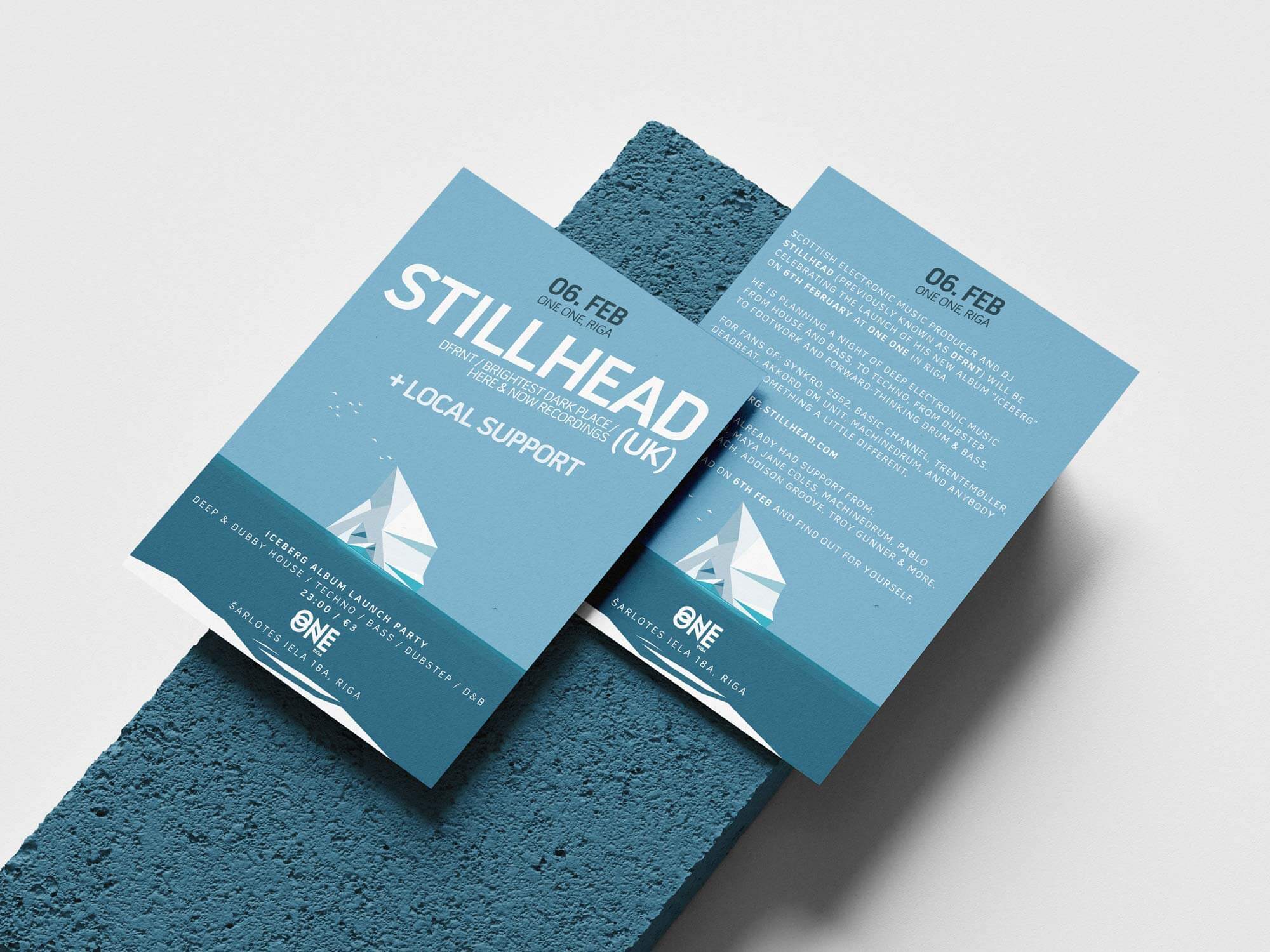
Early DFRNT releases, an Echodub label t-shirt screenprint, an early Stillhead transparent vinyl and flyer design for the first Stillhead album launch party.

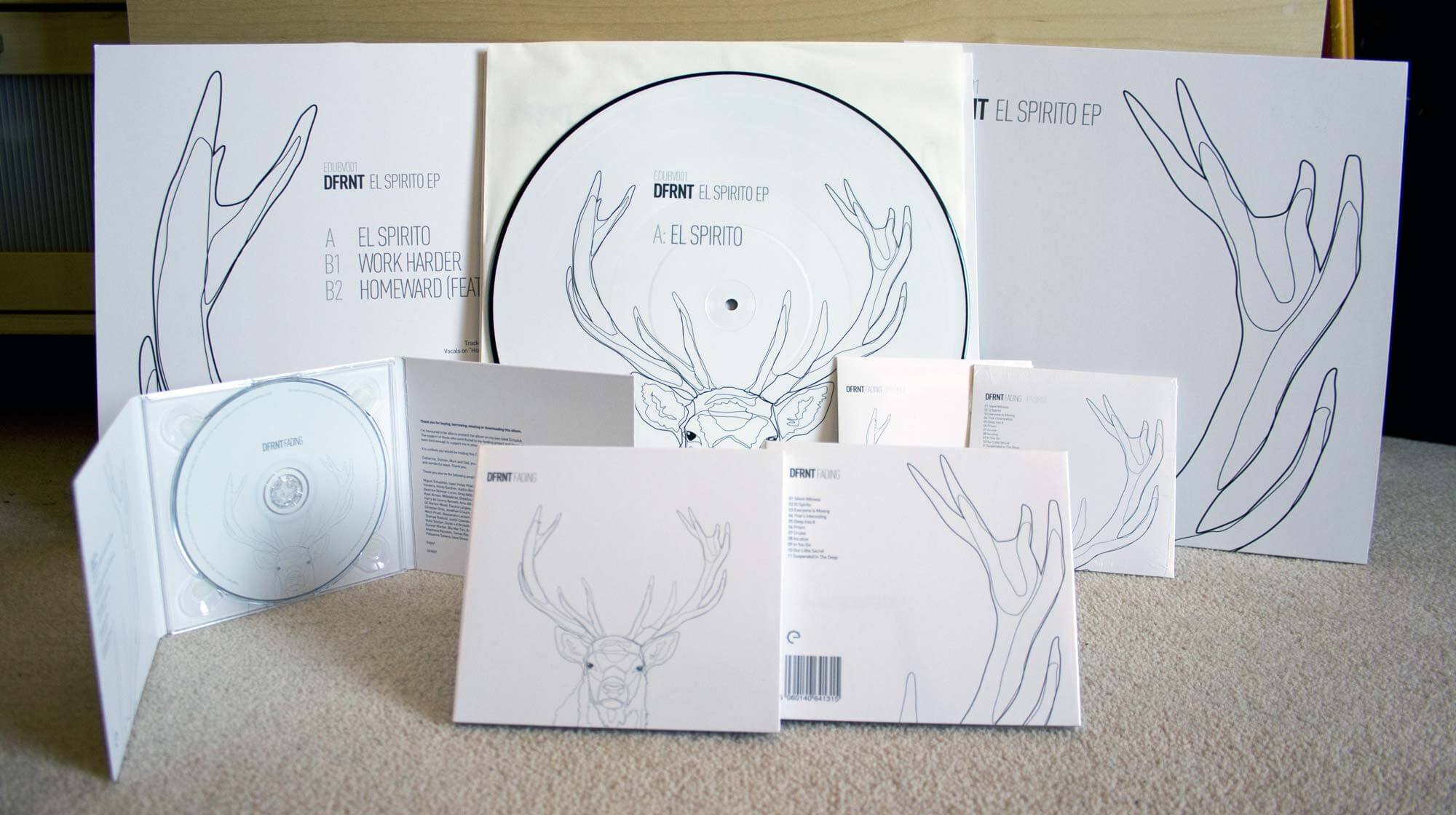
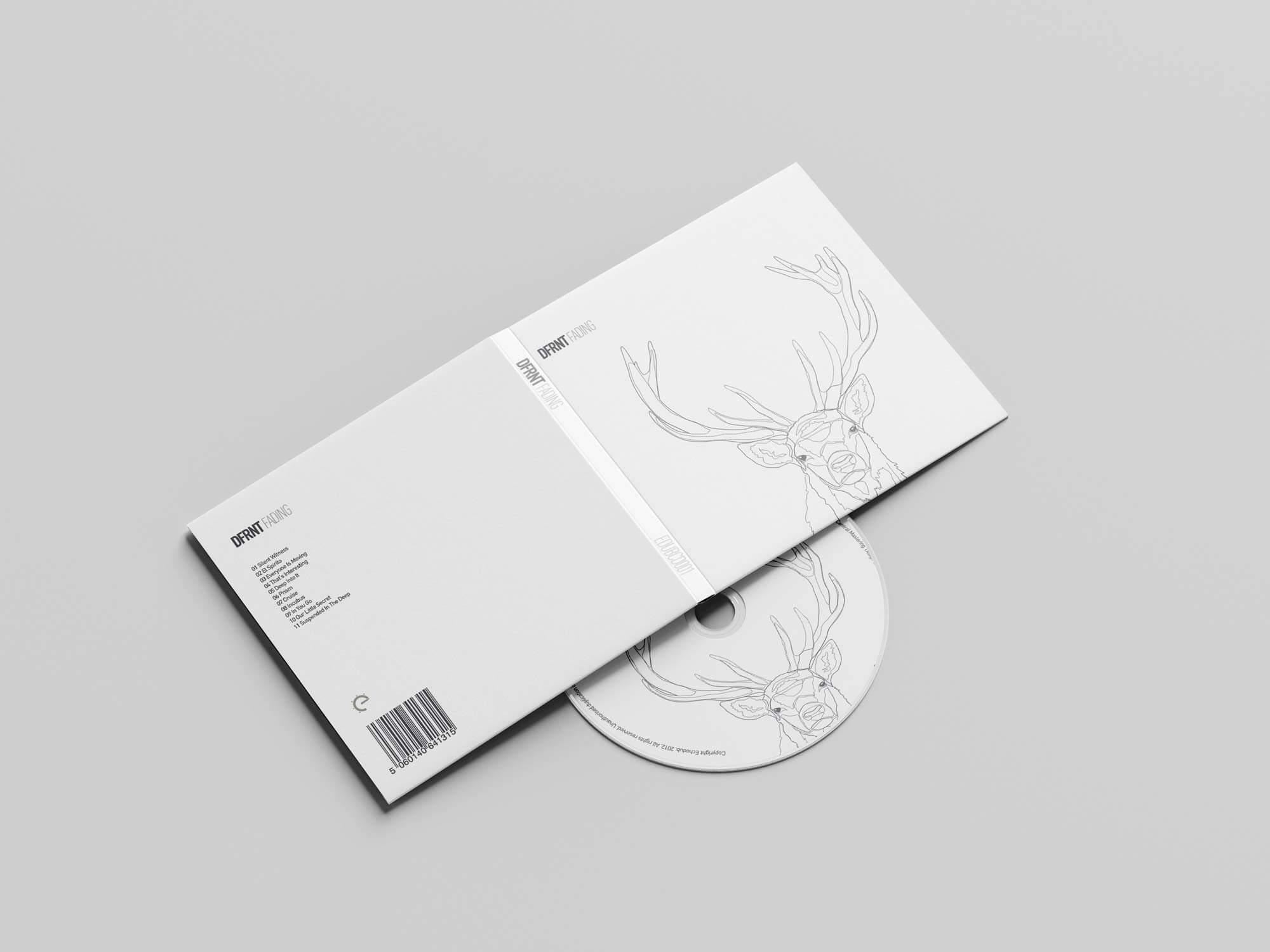
Fading

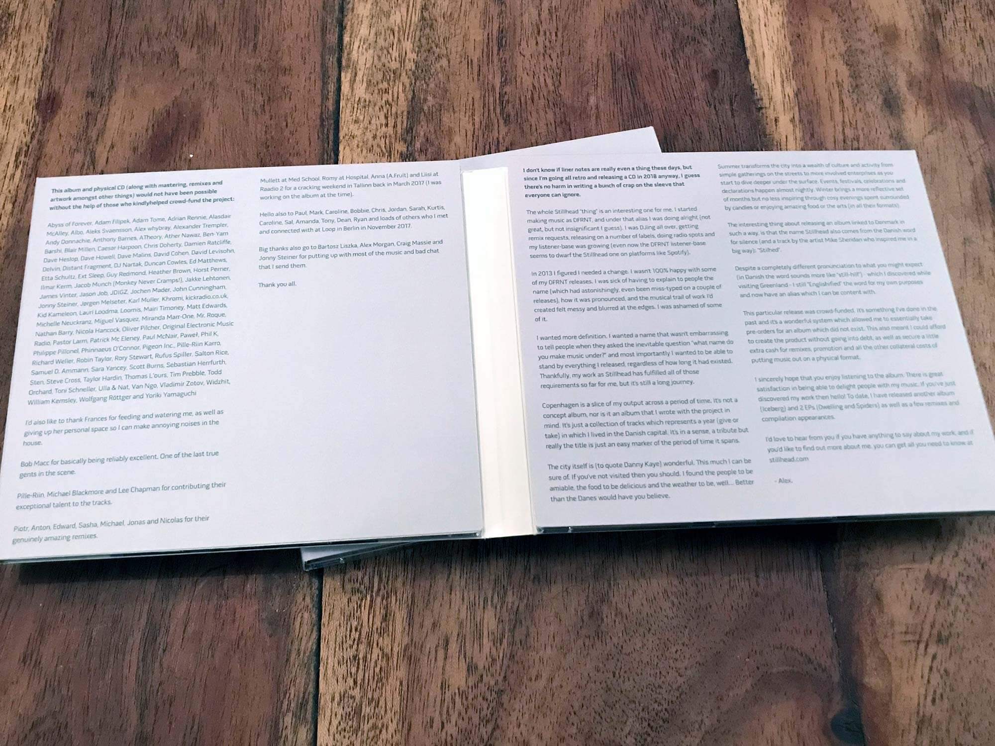
Fading was probably one of the most complete physical releases I made as DFRNT.

The artwork expanded across a picture disc and a six-panel folding CD package, turning the release into something much more tangible than a thumbnail sitting beside a play button.

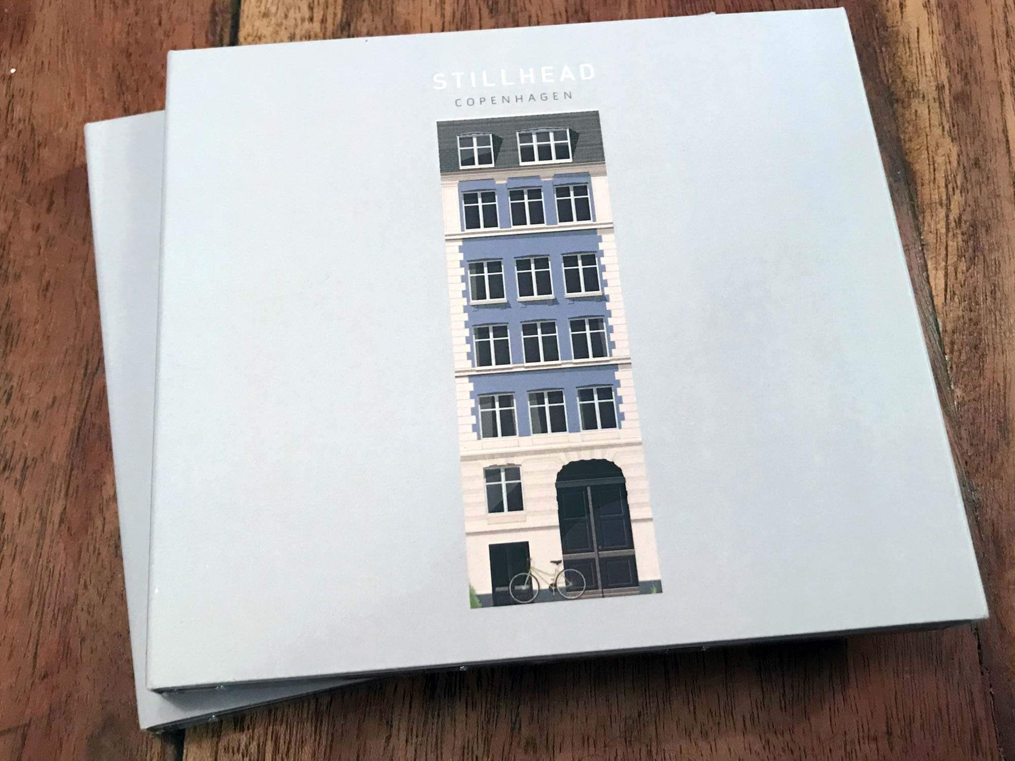
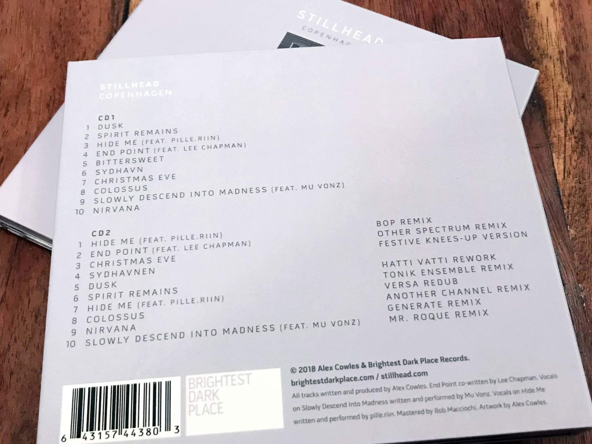
Copenhagen

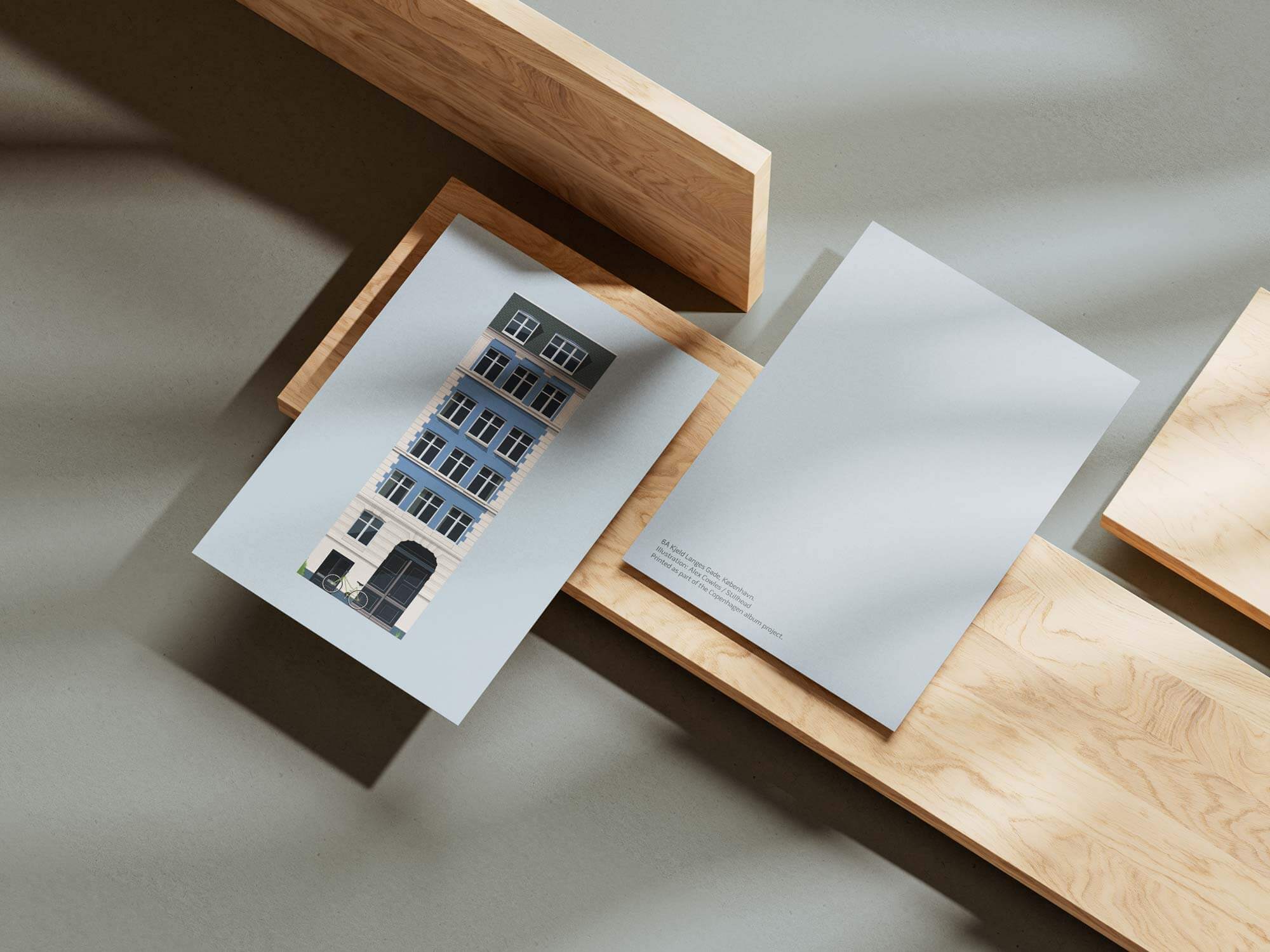
For Copenhagen, I drew an illustration based on a place I'd stayed in the city.

Nothing more strategic than that.

I liked the place. I liked the drawing.

So it became the record.

Stillhead - Copenhagen illustration

Out of the Loop

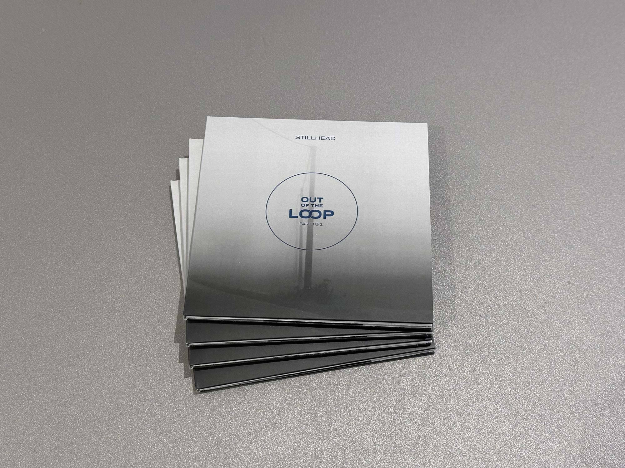
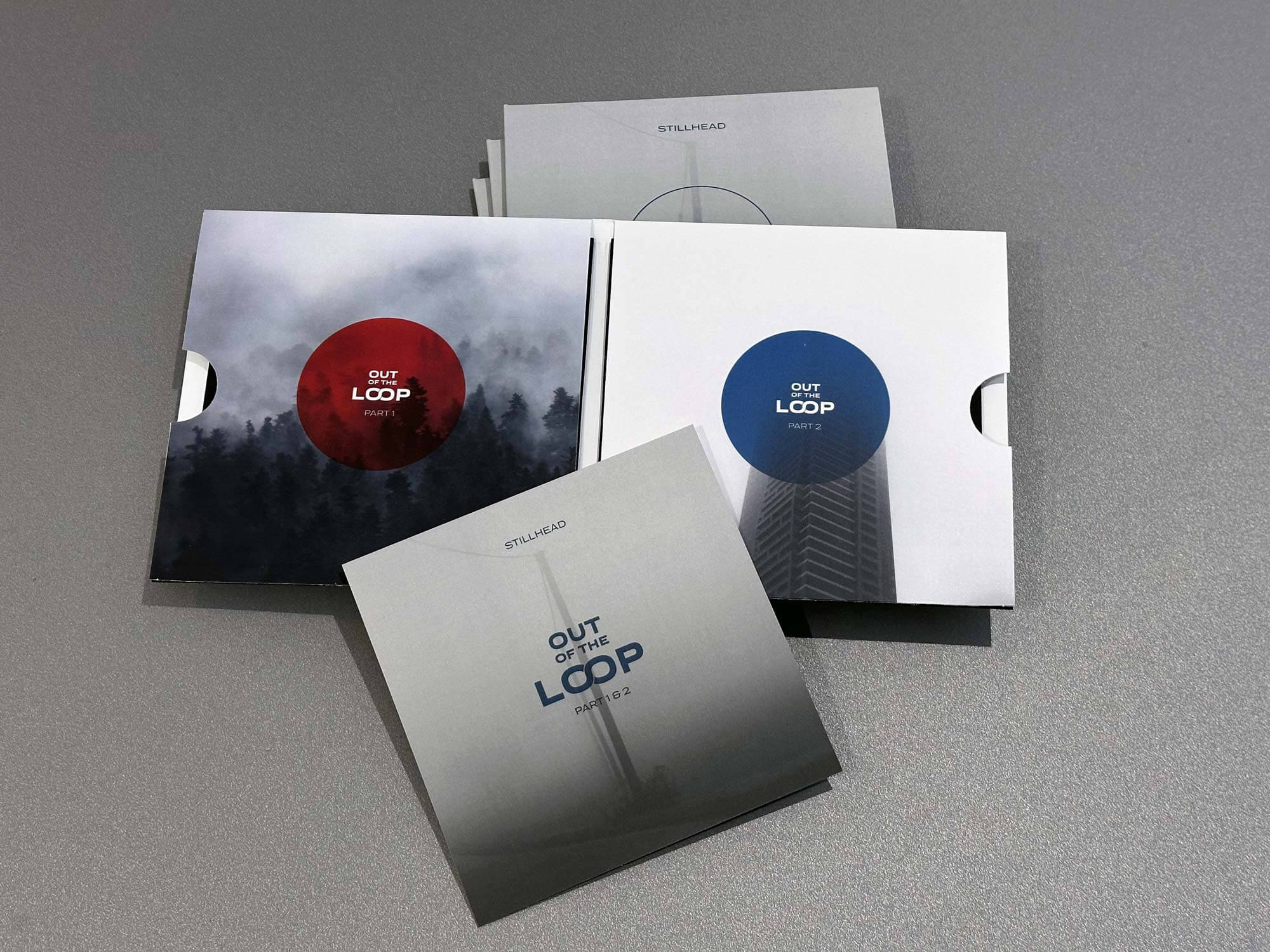
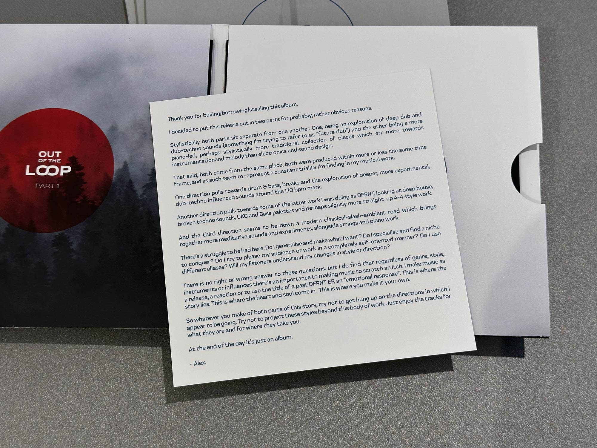
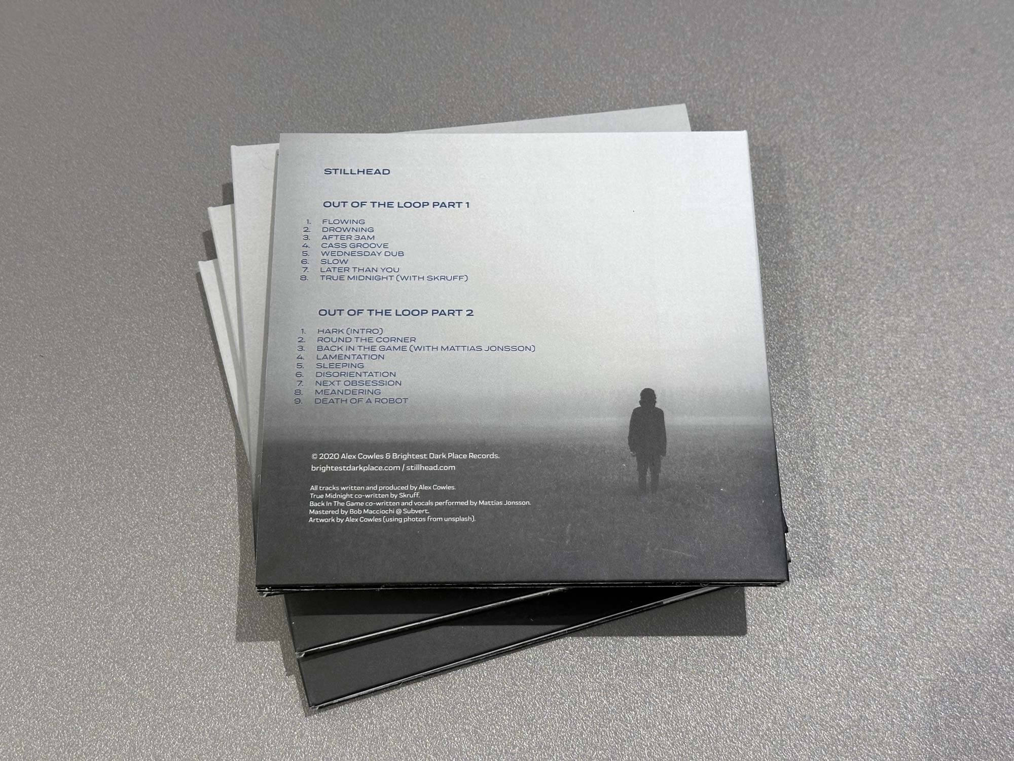
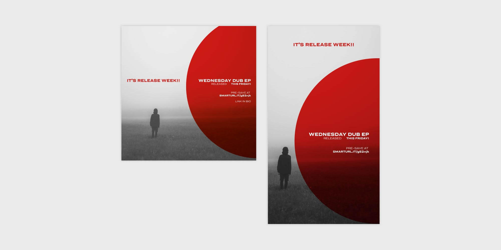
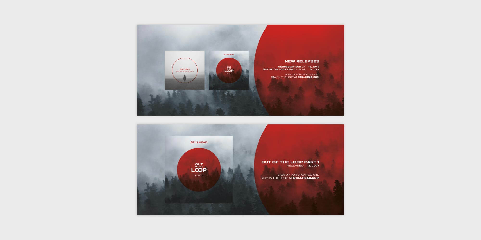
Out of the Loop was released in two parts, both built around a foggy, slightly mysterious visual world.

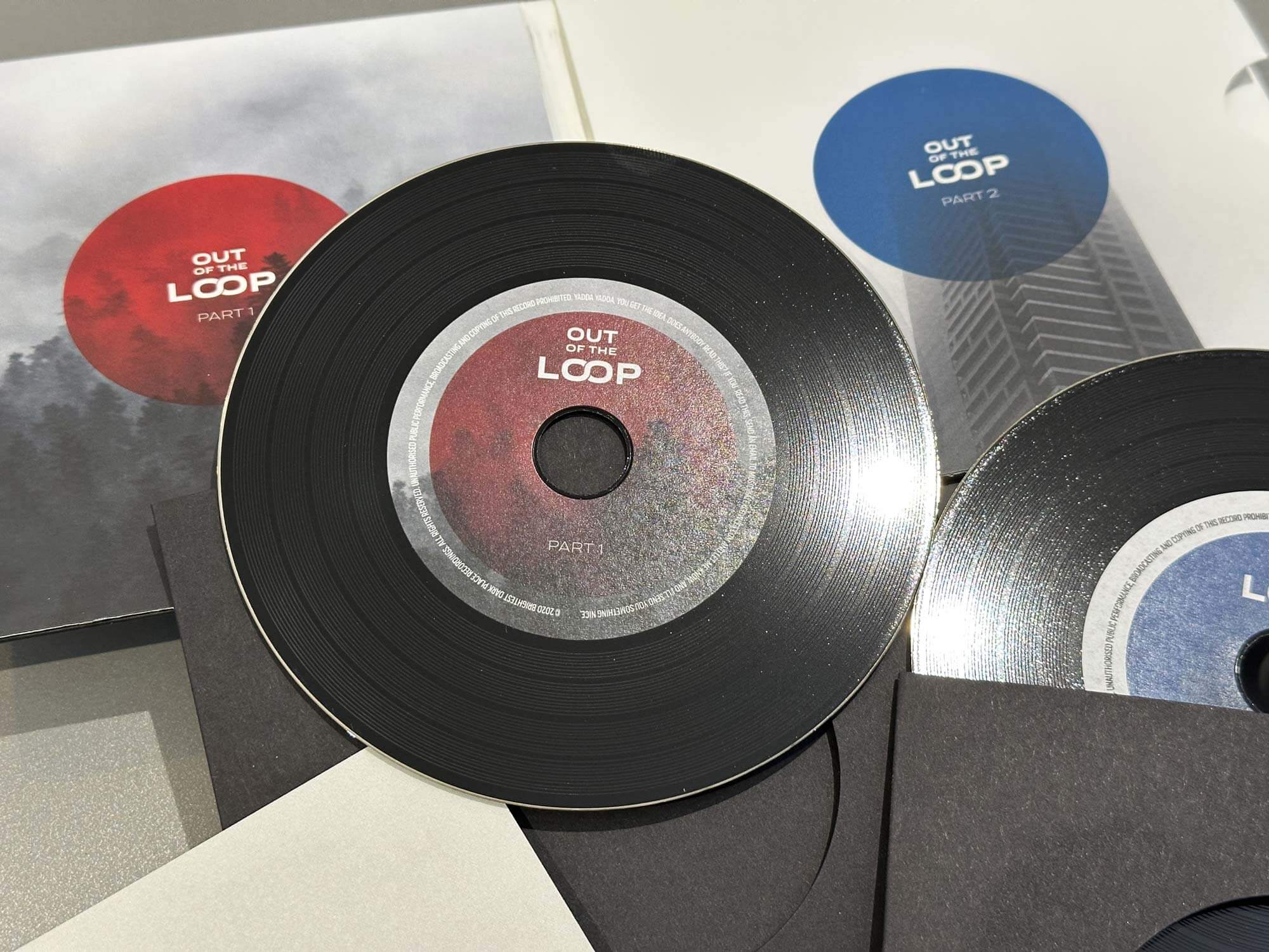
When I later brought the two parts together as a physical release, I designed it as a miniature double-vinyl album - two tiny vinyl-style CDs in their own inner sleeves inside a gatefold package.

Completely unnecessary.

Which is probably why I liked it.
Stillhead - Out of the Loop

The nice thing about being your own client is that the client is an idiot.

One project might be built around an illustration. Another around photography. Another might be almost entirely typography.

Brightest Dark Place - the label I created alongside Stillhead - initially had a much more consistent photographic identity. Atmospheric images, restrained typography and a simple identity holding everything together.

Eventually even that loosened up.

It's a container for whatever I want to put into it.

And that's kind of the point.

I threw away the bit people actually recognised.

After years as DFRNT, I'd reached the point where I wanted a clean start.

So after four albums, more than twenty EPs and years spent building an audience around the name, I did the commercially sensible thing.

I threw it away.

Stillhead was the reset.

In retrospect, it wasn't necessarily a brilliant decision from an audience point of view. Not everyone followed me across to the new name.

Apparently my carefully considered personal rebrand wasn't as important to them as it was to me.

But creatively, it gave me exactly what I wanted. A clean slate. And an excuse to design everything again.

Stillhead work

Restraint & Reverb

Restraint & Reverb went somewhere completely different.

Big, unapologetic typography became the visual idea.

I released four singles ahead of the album, each using the same typographic approach, before bringing everything together for the full release.

Then I spent far too much money making it physical.

A double album on heavyweight coloured vinyl.

Yellow and orange.

Stillhead - Restraint and Reverb

Sometimes it escaped the record sleeve.

Most of the visual work lived around the releases themselves, but occasionally an idea needed something else.

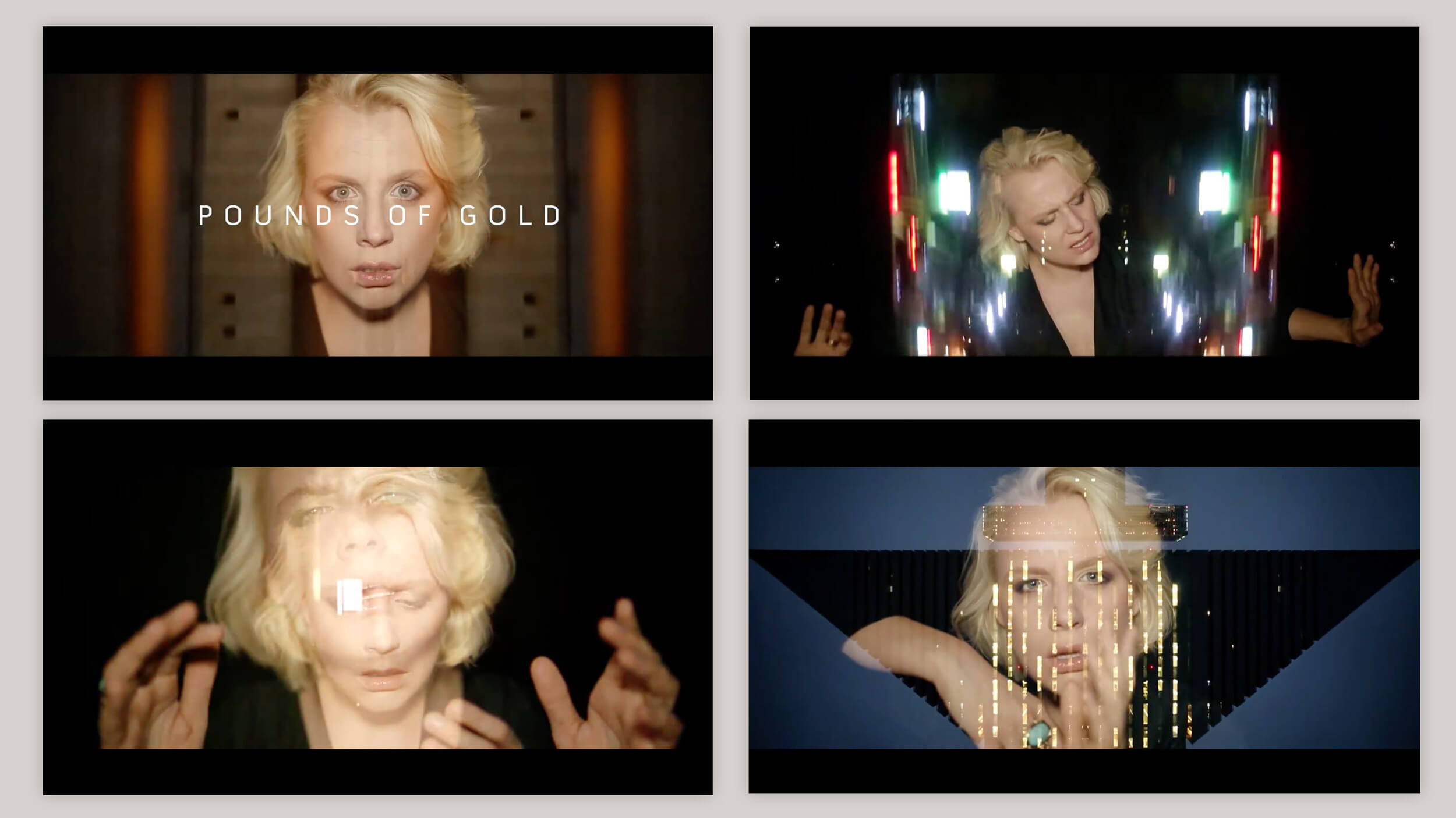
For Pounds of Gold, I combined footage shot by the vocalist with material filmed by a listener in Japan, editing the two together into a music video.

For a while I streamed music production on Twitch too, which inevitably resulted in me spending an unreasonable amount of time designing environments, overlays and graphics for something that was supposed to be about making music.

There have been websites, merchandise and assorted other experiments along the way too.

Mostly whatever the thing needed.

A Real Piece of Work

By the time I made A Real Piece of Work, generative AI had made it extremely easy to type some words into a box and receive something that could technically be called album artwork.

I considered it.

The album title had a deliberate double meaning: a collection of work, but also a description of a difficult person.

If I was going to call something A Real Piece of Work, using a generated image felt like taking the piss.

So I pen-and-inked a self-portrait instead, which became the cover.

I crowdfunded the physical release as a limited double gatefold vinyl edition.

And somebody bought the original drawing.

Which was nice!

Stillhead - A Real Piece of Work original pen and ink drawing
A double gatefold sleeve with transparent vinyl. Fancy.

Mostly, I just wanted to make something.

I've been doing this alongside my actual design career for pretty much the same amount of time.

It has never had a design strategy. Nobody has ever asked me for a moodboard. There's no stakeholder approval, no user testing and absolutely no design system.

I make the music first. Then I work out what it should look like.

Sometimes that's photography. Sometimes illustration. Sometimes enormous type. Sometimes it means drawing my own face with a pen because using AI for an album called A Real Piece of Work felt like a poor choice.

There's no real commercial justification for most of it.

It's simply somewhere I can follow an idea because I like it.

And that's probably why I've kept doing it for so long.

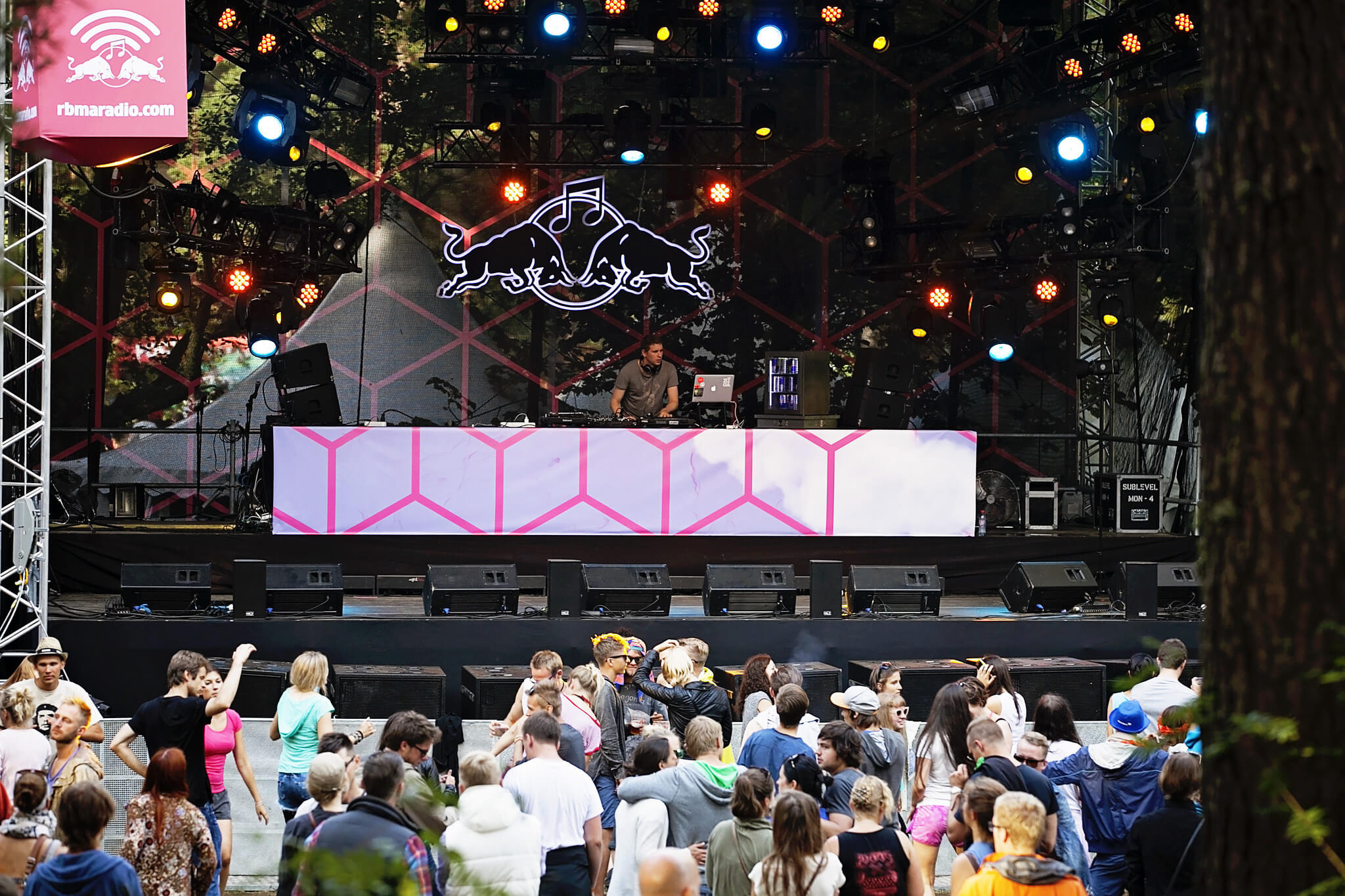
Stillhead - RBMA Stage at Positivus

Back to the day job
Other ways of filling a blank page

The work here has always been personal, but it shares a thread with the rest of my practice: taking an idea from the first spark through to something tangible.

Read the Digital Podge story Back to all work