Related work
Making complex products clearer
Explore other work shaping data products and the companies behind them.
Read the Brainnwave story Read the Mosaic story Back to all work
From redesigning complex simulation software to rethinking how the company explained what it did.
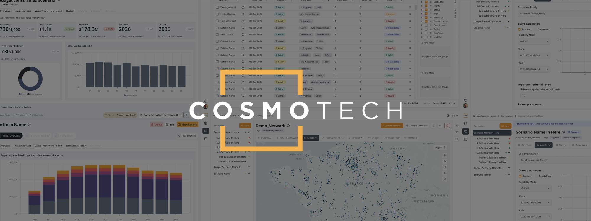
I'd initially worked with Cosmo Tech on a short UX contract around Asset, their asset management and simulation product.
The technology was powerful. The experience around it was considerably less so.
The interface had grown around the underlying technology rather than the way somebody actually needed to use it. Navigation was confusing, terminology was inconsistent, workflows crossed several parts of the platform and important dependencies weren't obvious.
Cosmo Tech already had a junior UX designer doing good work, but they needed someone more experienced to establish the wider direction, tackle the bigger structural problems and help get design taken seriously within the product team.
So I joined as Creative Director.
Despite the title, for the first six months or so I worked almost entirely on the product.
This turned out to be harder than it sounds.
Asset was part of a much bigger simulation ecosystem involving models, datasets, scenarios, policies, investments, resources and results. Parts of it overlapped with Cosmo Tech's Supply Chain product. Different products had different back ends. Models came from separate modelling tools. APIs imposed their own limitations.
And every few months I'd discover another bit I hadn't realised existed.
Before I could simplify any of it, I needed to understand how all of those pieces actually fitted together.
A lot of the early work was therefore as much about mapping the product as designing it - working with product owners, product managers and technical teams to understand what users were trying to accomplish, what the platform was actually capable of and where the interface was exposing complexity it didn't need to.
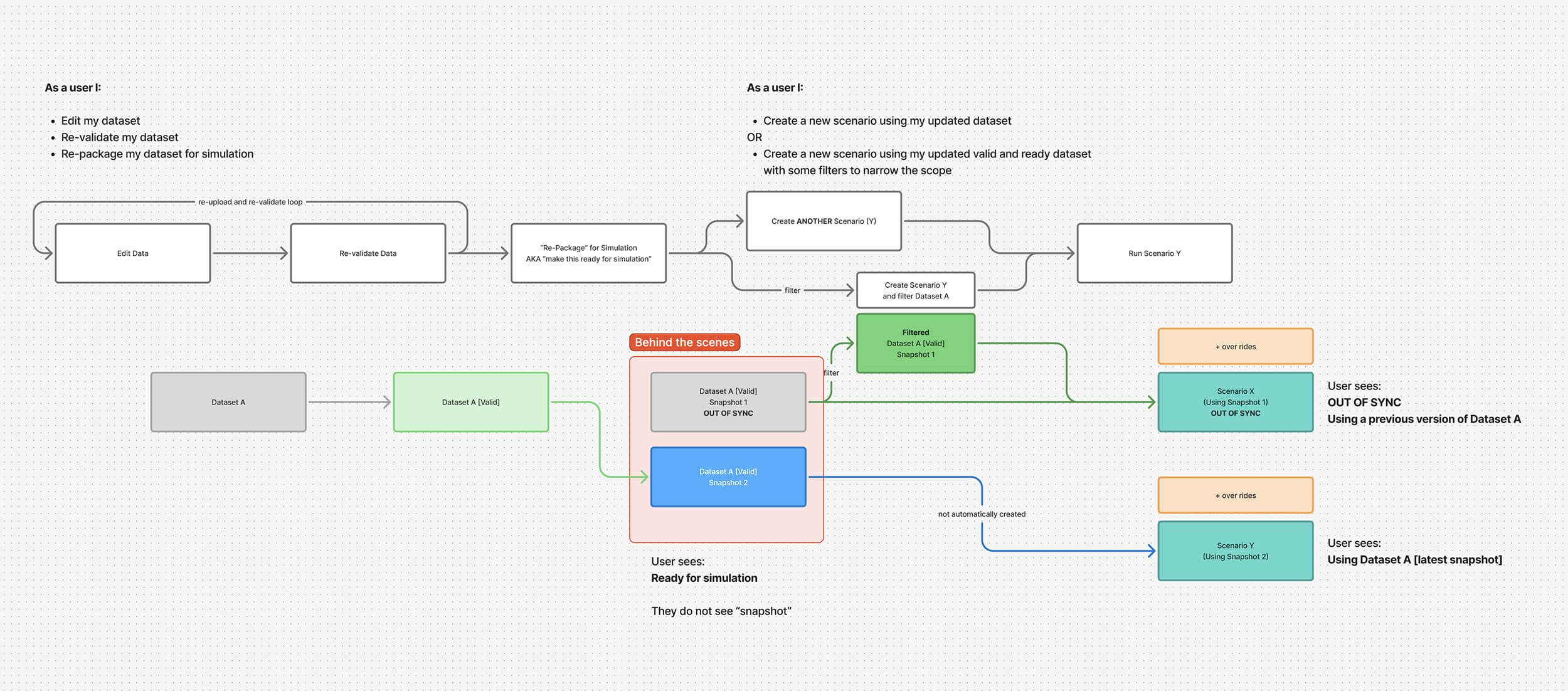
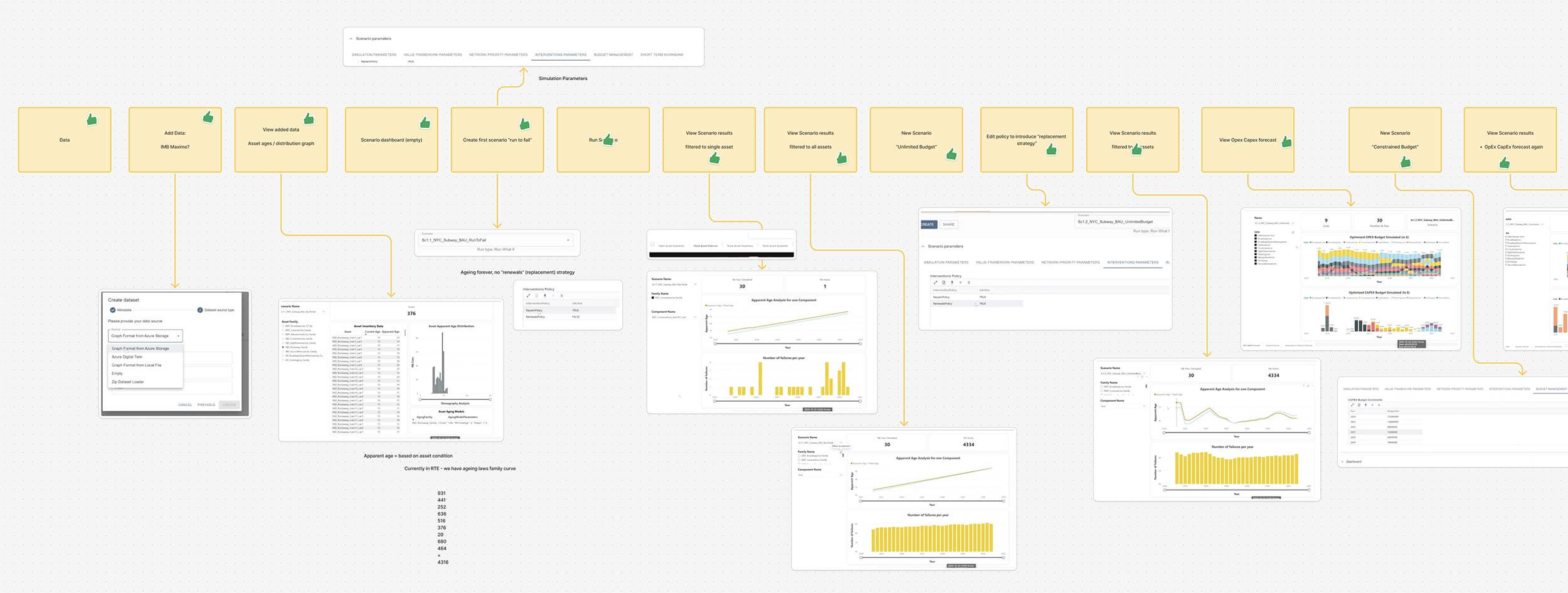
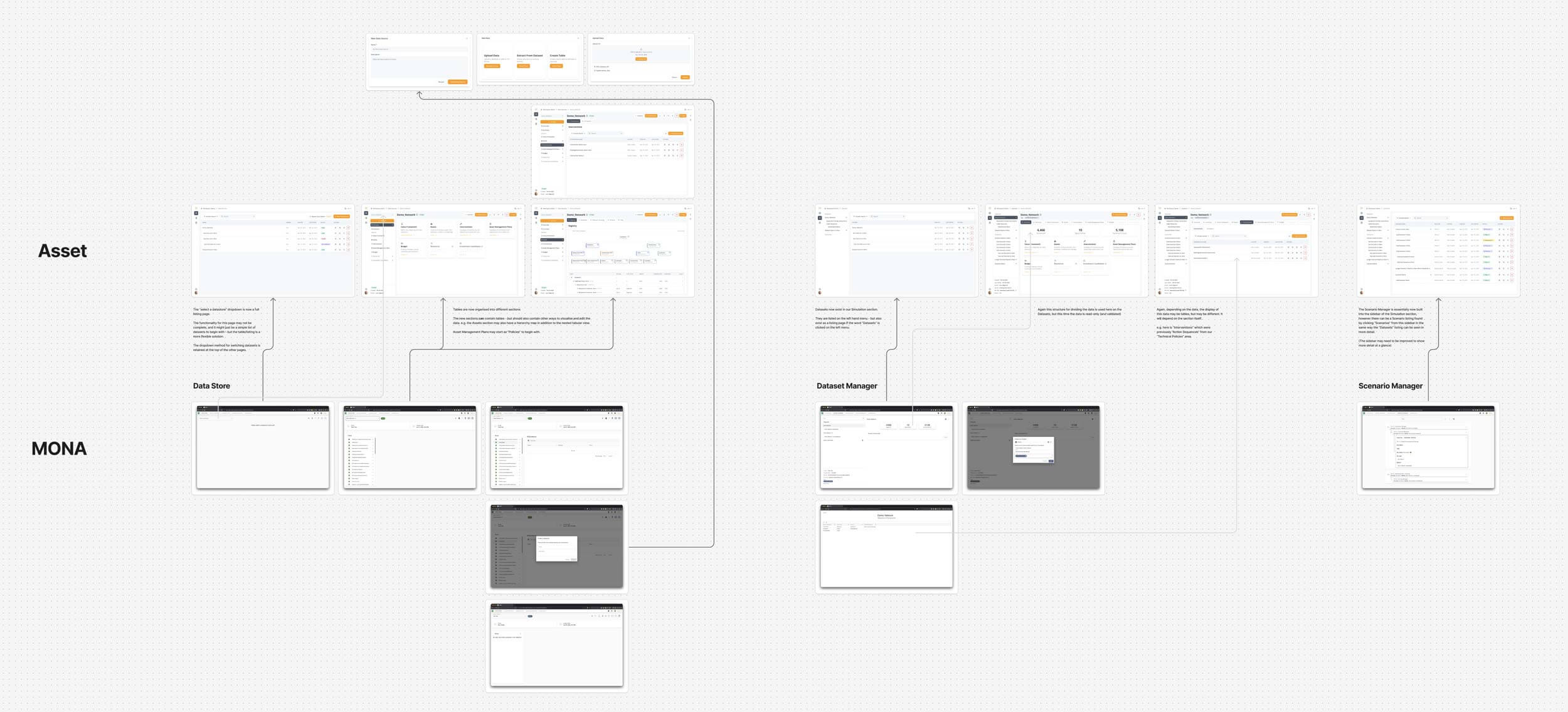
One of the biggest problems with Asset was that its structure didn't communicate the way people actually used it.
Users encountered separate areas for things like scenarios, datasets and data management without a clear sense of what needed to happen first or how one thing led to another.
But the fundamental workflow was much easier to understand:
Validate your data → create a baseline → run a simulation → understand the results → change your assumptions → run it again.
Repeat until you've found the right balance between things like asset condition, investment, resources, budget and time.
That became a much more useful way to think about the product.
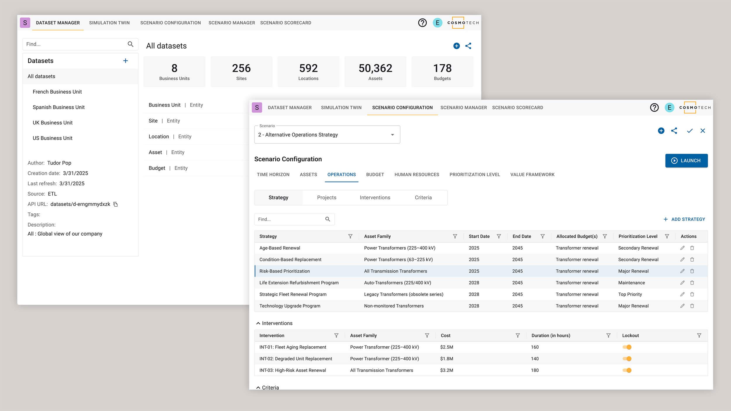 Existing MUI-based interfaces.
I reworked the main information architecture around Data and Scenarios / Simulation, with ideas such as Compare sitting naturally after them rather than exposing a collection of loosely connected technical tools.
It wasn't about turning the whole product into a three-step wizard. The people using this software still needed to understand what they were doing.
The job was to make the structure support their understanding rather than fight against it.
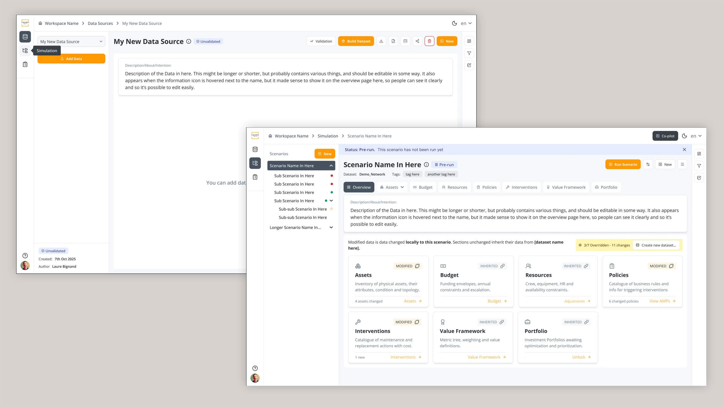 New left-aligned navigation bar and scenario data overview.
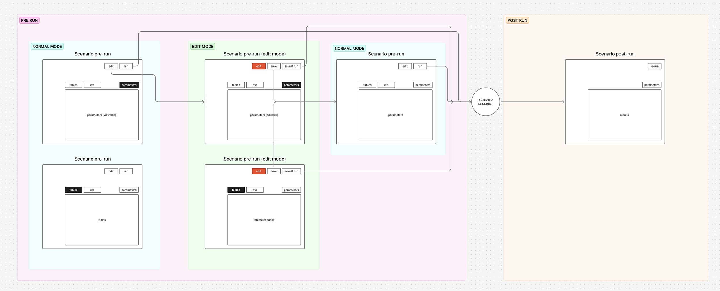
One particularly awkward part of the product was what happened after a simulation had been run.
Users needed to change inputs and see how those changes affected the outcome - exactly the kind of iterative exploration simulation software should be good at.
But the product described these changes as Scenario Parameters.
They weren't really parameters.
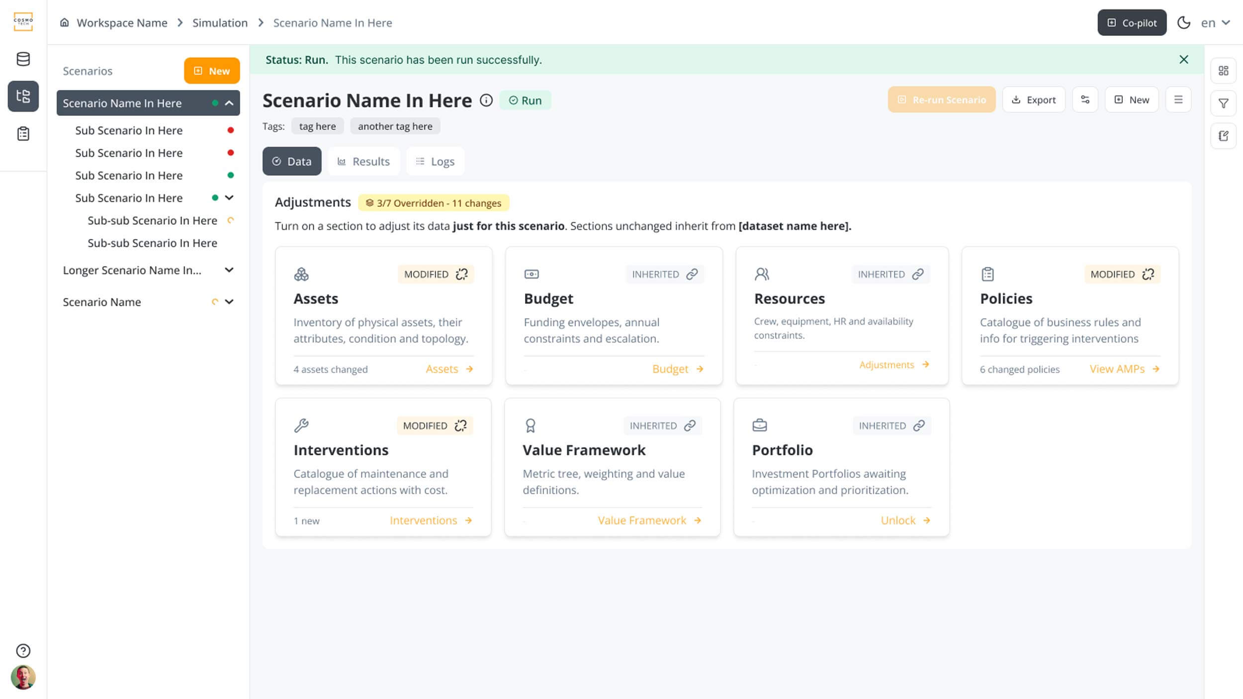
They were overrides: changes made locally to a scenario so somebody could test a different assumption without altering the original dataset.
I explored ways to make those overrides much more explicit in the interface, using clearer terminology, hierarchy and interaction patterns to show what came from the underlying data and what somebody had changed for this particular simulation.
The same thinking carried through to other complicated areas of Asset.
Asset information was broken into more understandable groups rather than presented as enormous collections of tables. Technical Policies - rules describing things like when an asset should be repaired and at what cost - were restructured with clearer hierarchy to make extremely flexible, form-heavy data easier to comprehend.
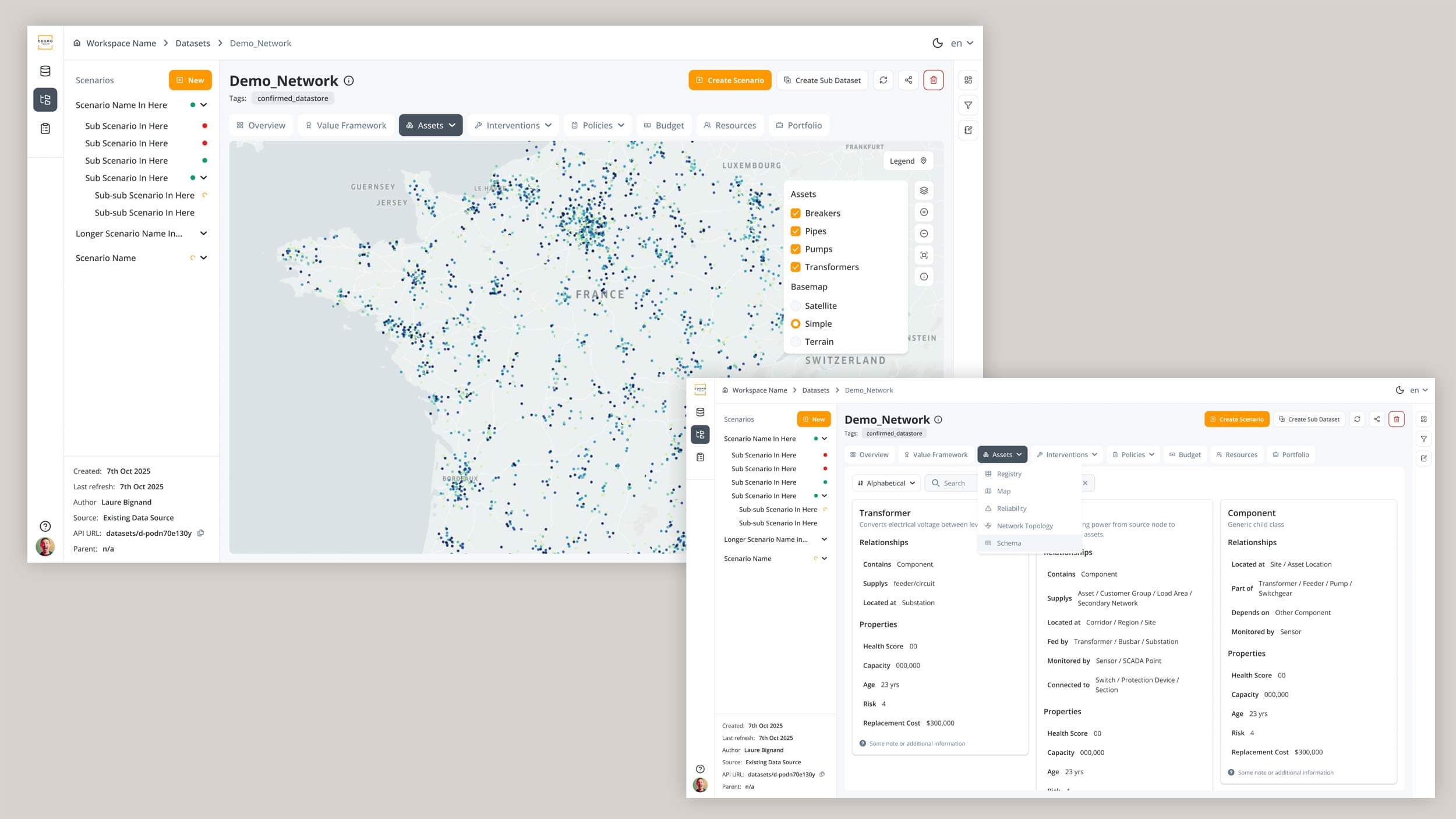
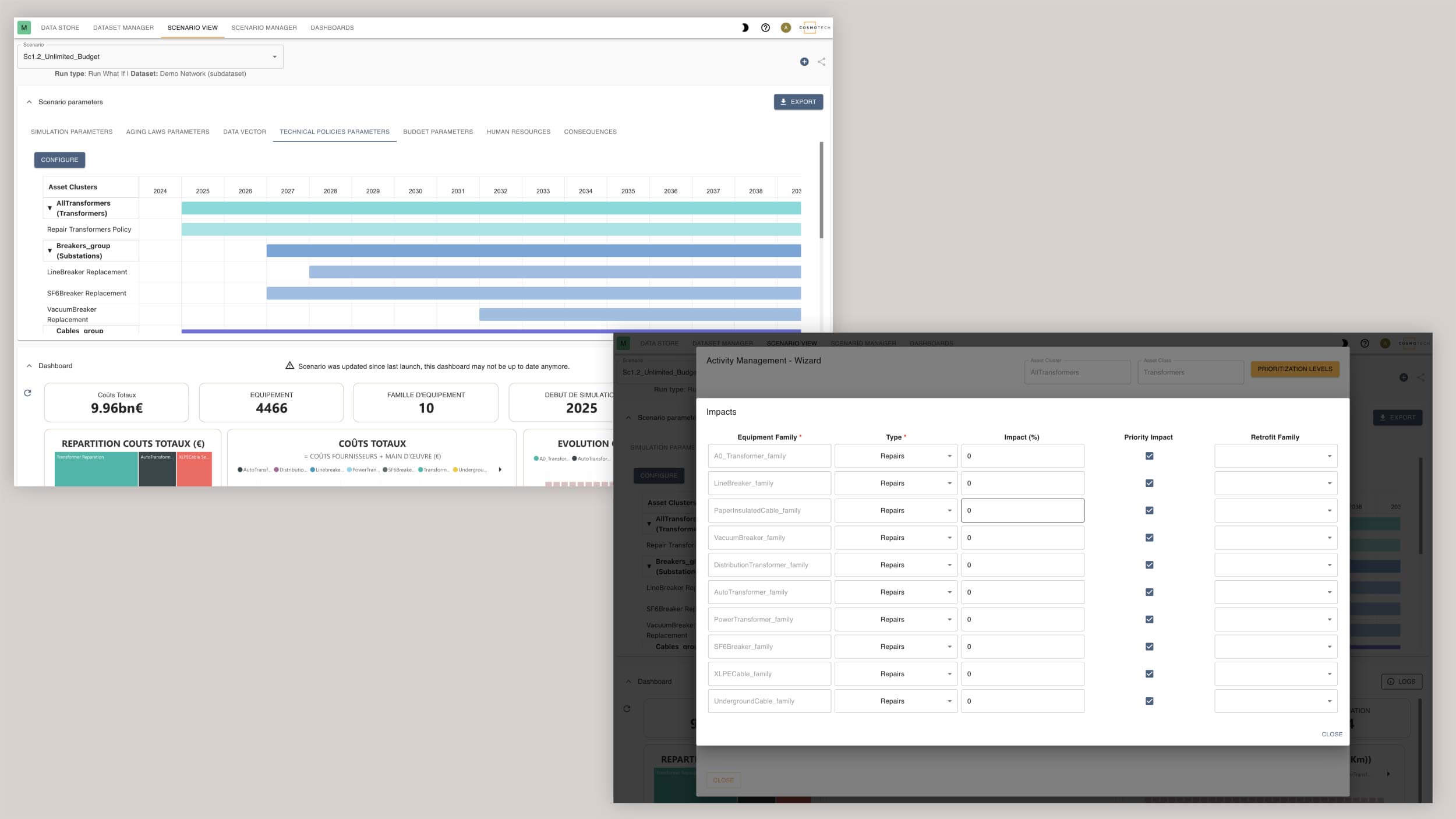
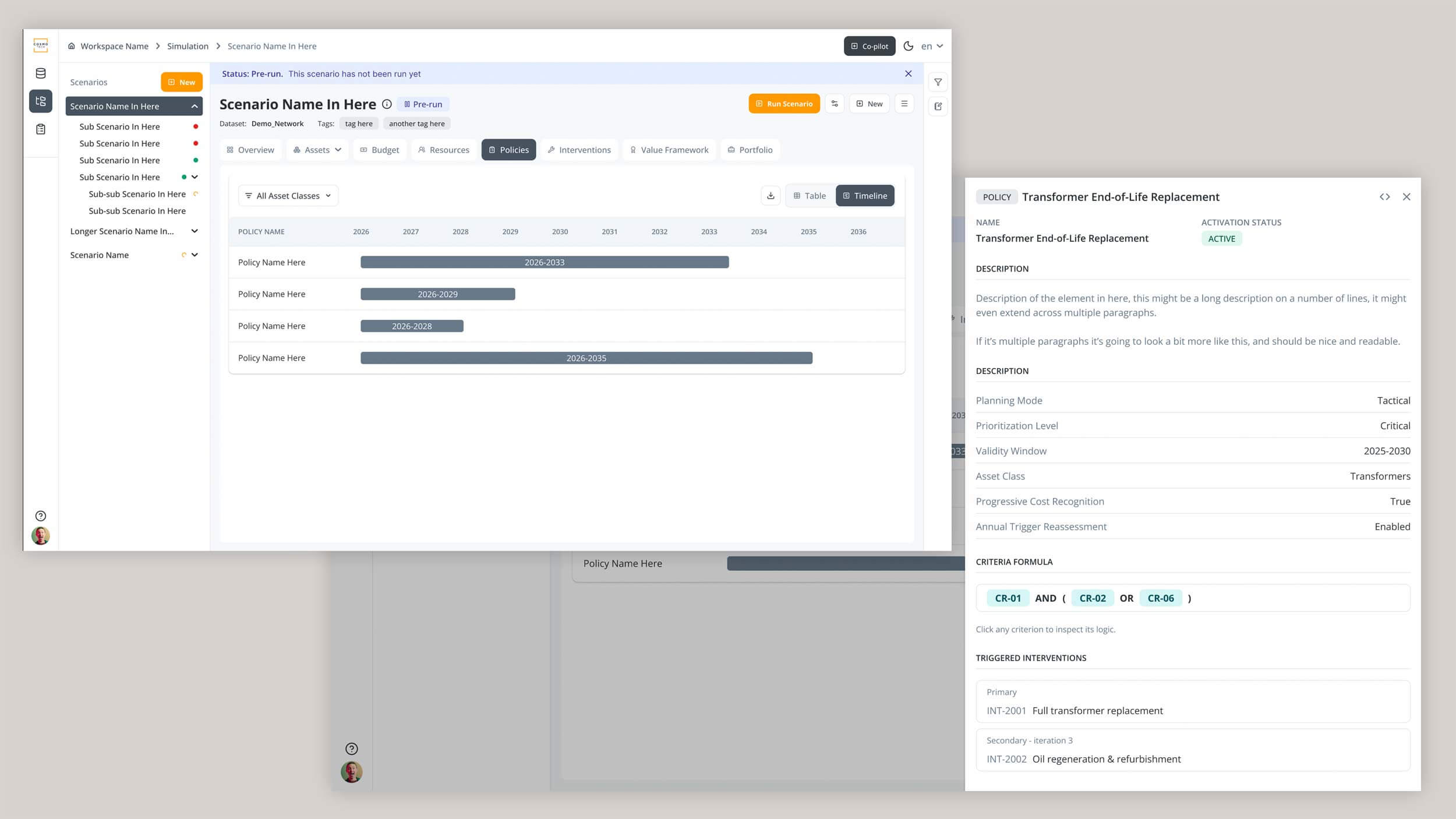 Asset data detail view plus old and new technical policies.
The existing interface relied heavily on Material Design without much of a product language of its own.
I established a new UI direction based on Flowbite, customised around the needs of Cosmo Tech's products, and created the larger layouts, navigation patterns and principles that could then be applied across individual features.
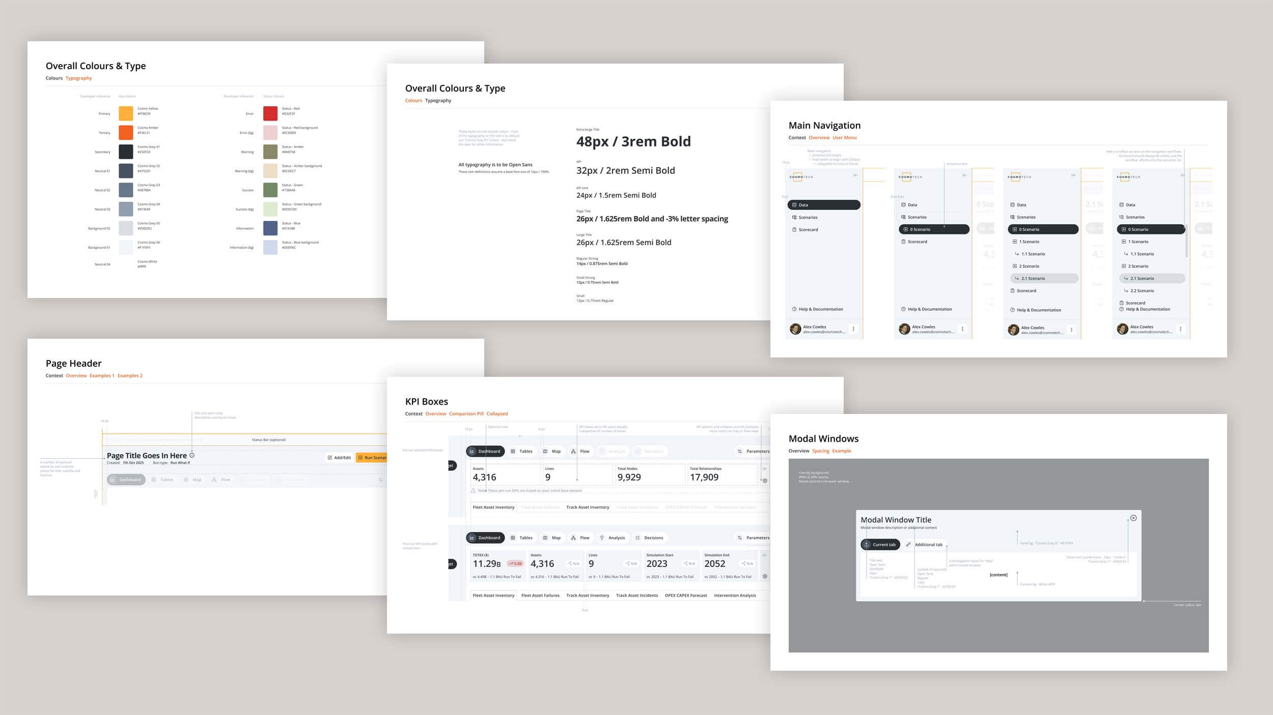 Early spec sheets for portfolio sections.
I worked closely with a direct report, who took ownership of many of the detailed screens, states and smaller product tickets as the direction became established.
I'd set the larger patterns and then review the work, help think through difficult interactions and step in when a problem needed more senior design input.
That allowed us to cover far more of the product than either of us could have done independently.
Cosmo Tech was an unusual combination: Investor-funded and technically ambitious enough to feel like a startup, but with the processes and constraints of a much larger organisation.
The existing APIs limited what the front end could do. Development resources changed. Requirements moved. Features were repeatedly reduced to MVPs.
We designed a new Portfolio area for prioritising investments against business objectives. It went from architecture and wireframes through polished prototypes to a heavily reduced V1 before attention moved elsewhere.
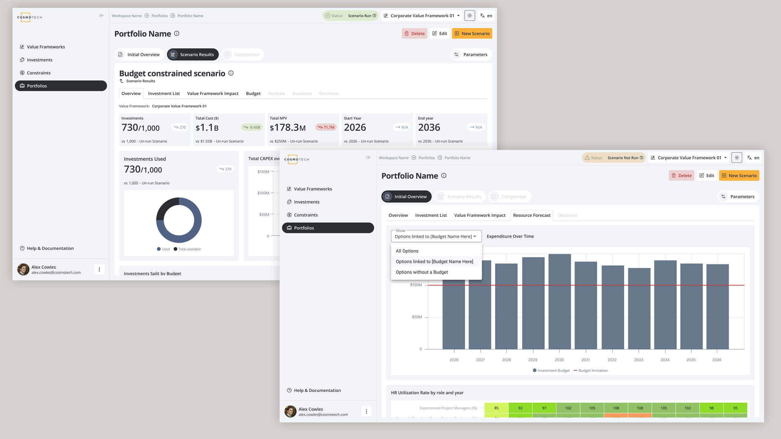
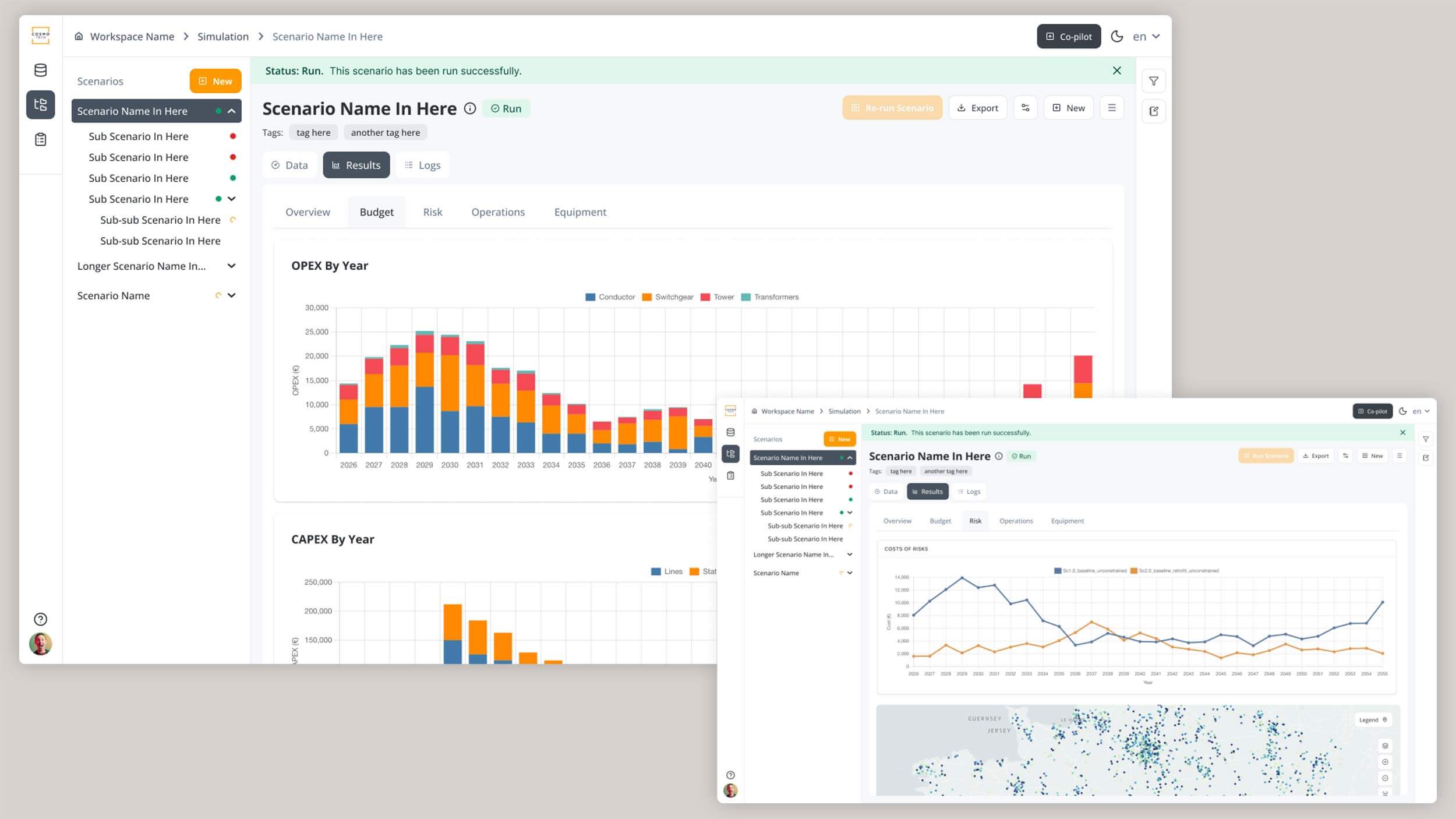
Asset progressed in similar fits and starts.
Eventually we brought in a developer I'd previously worked with at Brainnwave and created a browser-based Asset demo for the sales team, combining parts of the new design direction with pragmatic shortcuts and mocked data.
It wasn't the finished product I'd originally envisaged.
But feedback from customers who were shown the prototypes was consistently positive, and the work gave Cosmo Tech a much clearer direction for what the product could become.
The website.
By this point I'd spent months trying to understand Cosmo Tech's technology well enough to design for it.
That turned out to be exactly what I needed to tackle another problem: Explaining what any of it actually did.
The existing website was (perhaps still is!) huge, verbose and increasingly disconnected from where the business was heading. Older products and messages competed with newer ones, the growing focus on Asset wasn't reflected clearly enough, and the visual language felt dated.
The challenge was remarkably similar to the product itself.
There was plenty there.
It just needed someone to find the structure underneath it.
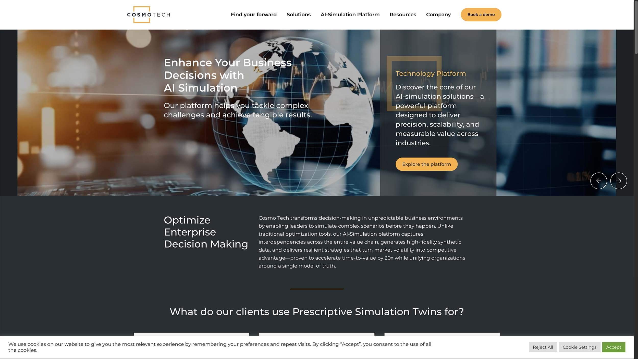
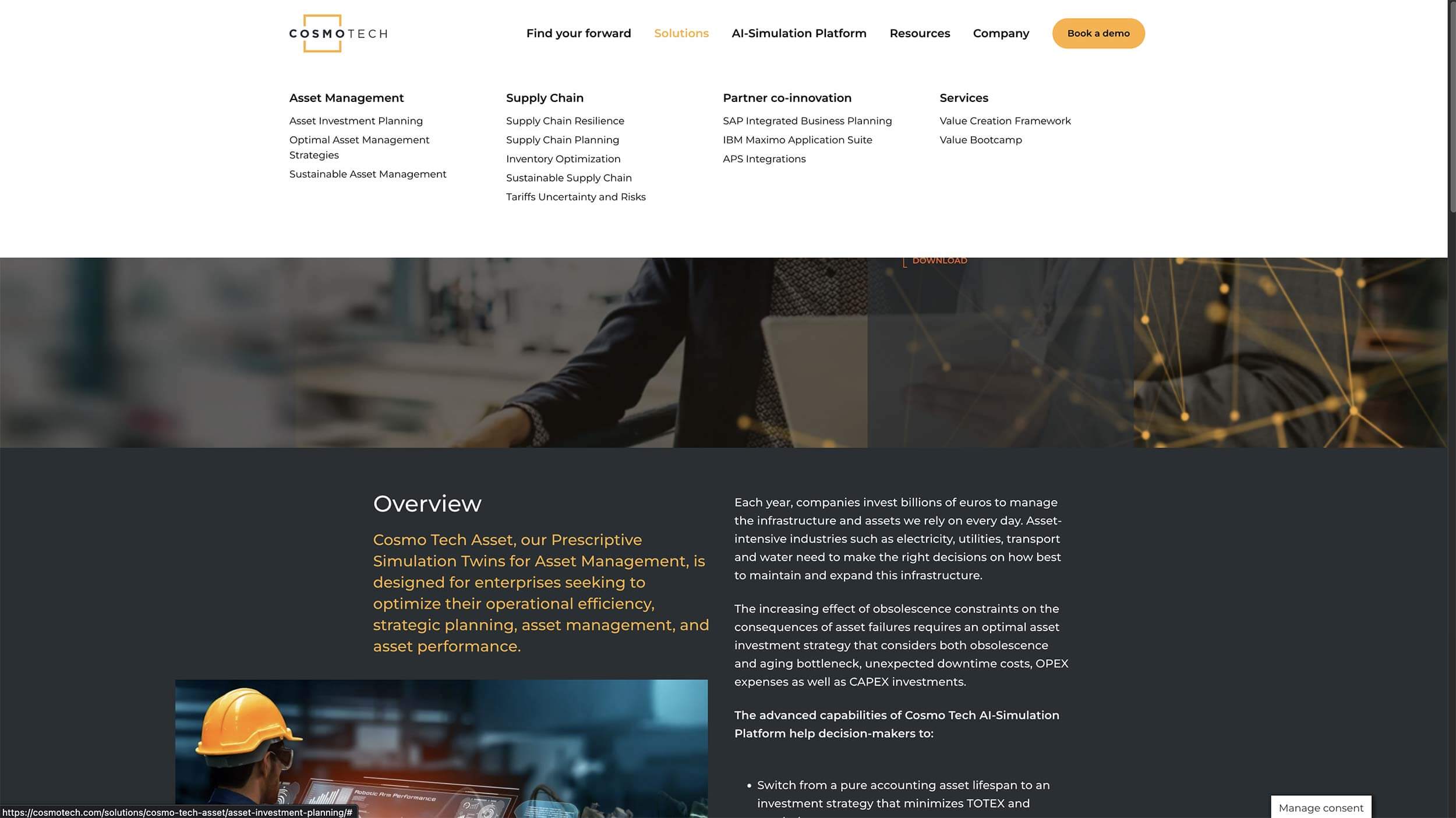
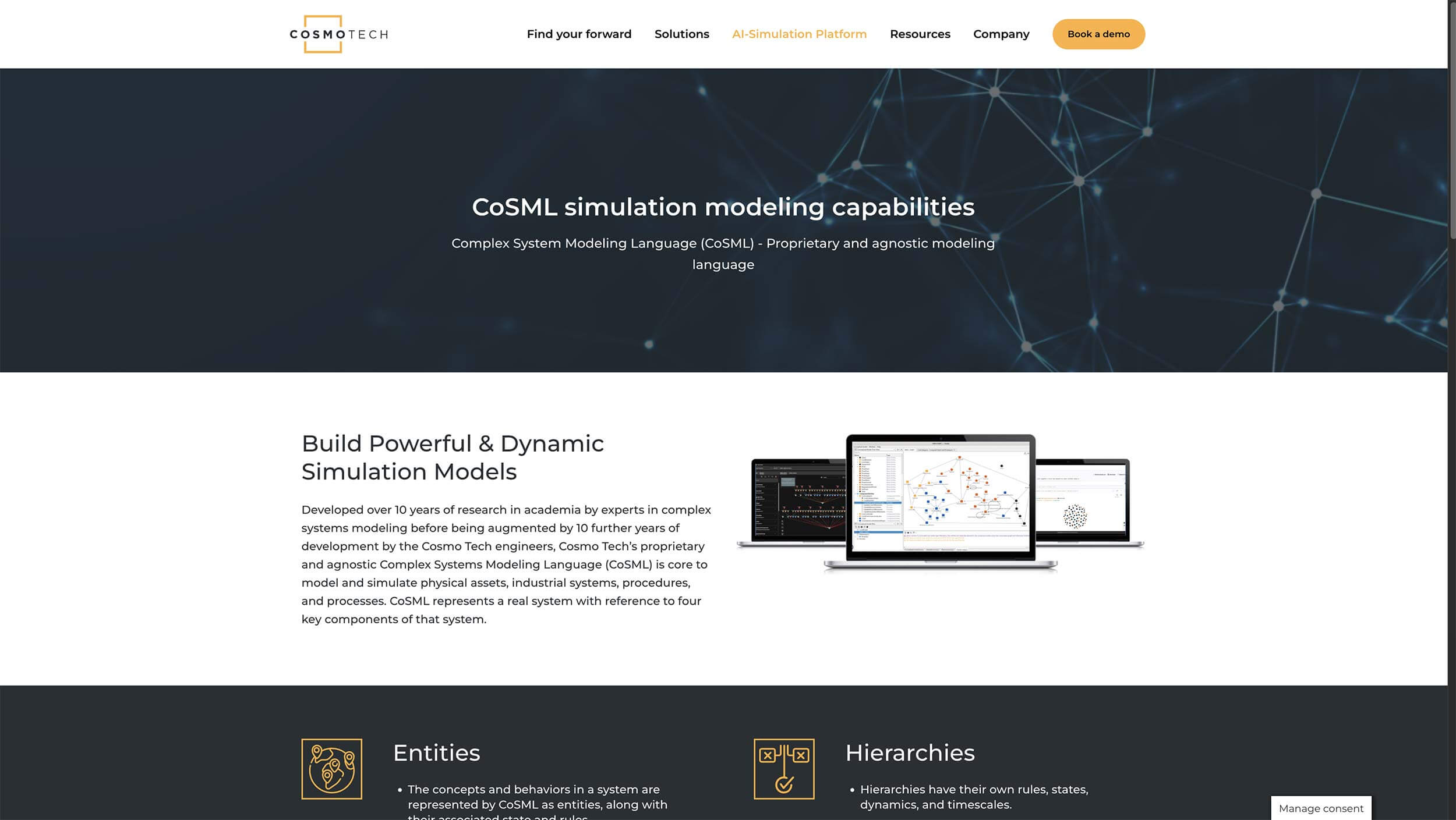 Old (perhaps still current) website.
I rebuilt the website from the ground up.
That meant reconsidering the sitemap and content hierarchy, simplifying the proposition, writing and restructuring content, designing the experience and visual direction, and ultimately building the site myself in WordPress.
The new structure focused much more clearly on what Cosmo Tech offered and how the pieces related to each other, with Asset taking a much more prominent role.
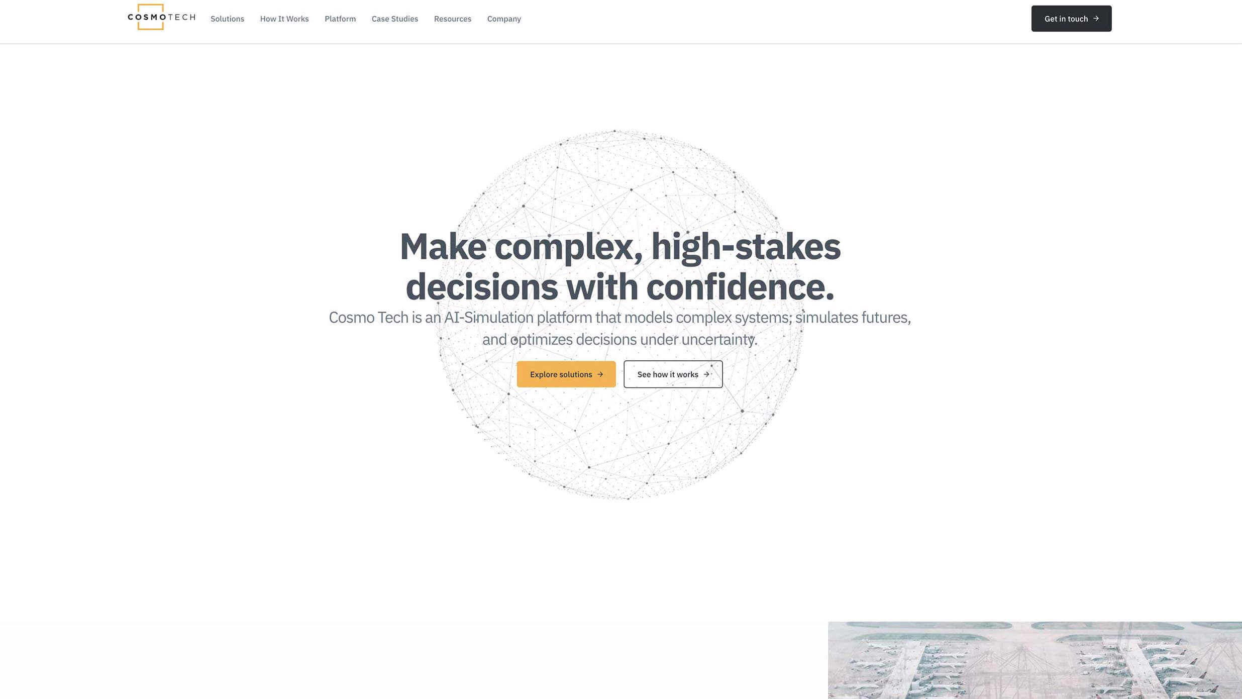
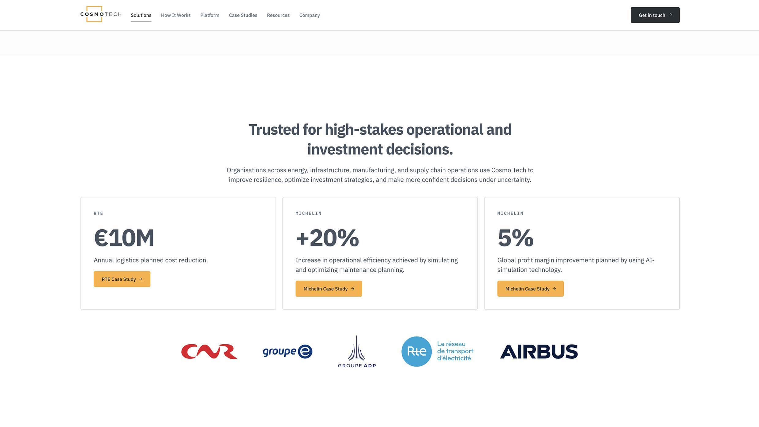
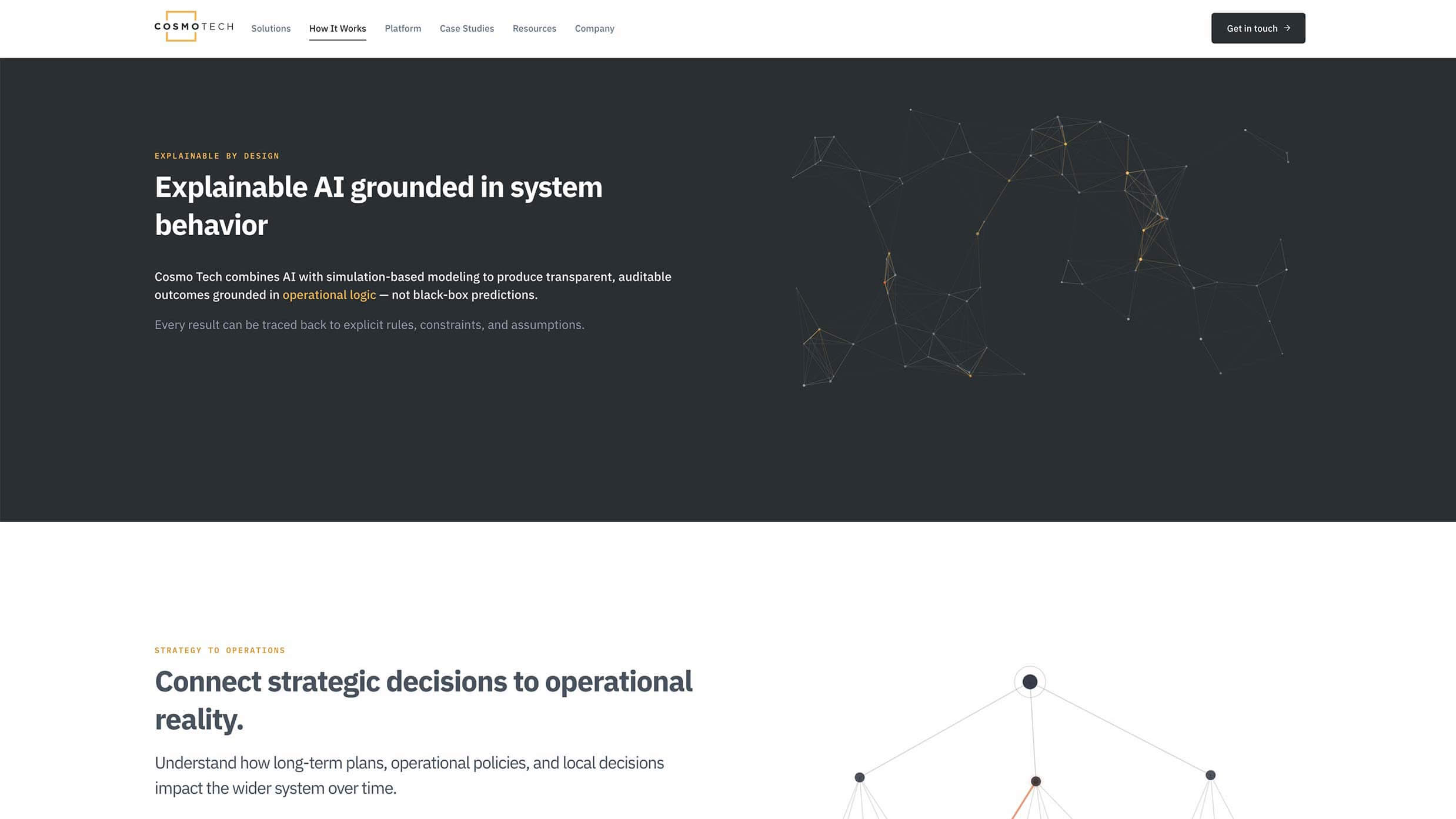
Visually, I retained the existing logo and parts of the colour palette but began evolving everything around them.
I introduced a new approach to photography and graphic devices, clearer typography, more deliberate use of motion and a visual system that felt much closer to the technology company Cosmo Tech actually was.
And because I was designing and building it, there was considerably less distance between the idea and the thing people would eventually use.
By the time my role ended, the local WordPress build was around 80% complete and on track for the planned launch.
Then the company's funding situation changed and my role disappeared before I could finish the build and migration.
So sadly, this one doesn't have a neat little launch story or a fun graph showing everything going up and to the right.
It does, however have something I think is more representative of how I actually work.
I arrived at Cosmo Tech to help improve a difficult user interface.
To do that properly, I had to understand the product.
Understanding the product meant understanding the technology, the data, the people using it and how all the different pieces of the company fitted together.
And once I'd done that, I was in a much better position to improve not only how the product worked, but how the company explained it.
That's probably the thread running through most of the work I enjoy.
Give me something complicated, fragmented or difficult to explain. Let me understand it properly. Then let me find the simpler thing hiding underneath.
Explore other work shaping data products and the companies behind them.
Read the Brainnwave story Read the Mosaic story Back to all work