QueryClick · Brand identity, creative direction, digital, campaigns & copywriting

Making search marketing less boring

Building a brand, a voice and a design capability from scratch for a growing digital marketing agency.

QueryClick

A phonecall.

“Are you a developer?”
“Not really.”

That phonecall led to a drink with Chris, QueryClick's founder, and a job that didn't previously exist.

The company had fewer than ten people and no designers. I became Head of Design with a fairly open brief, and first, we needed a brand.

Starting with a blank page.

QueryClick specialised in SEO, PPC and CRO.

If none of those acronyms mean very much to you, that was part of the problem.

The search industry was full of specialist terminology and QueryClick had very little in the way of an established visual identity. As the company started growing, we needed something that could make it look credible without simply disappearing into the same sea of dry, technical search marketing as everybody else.

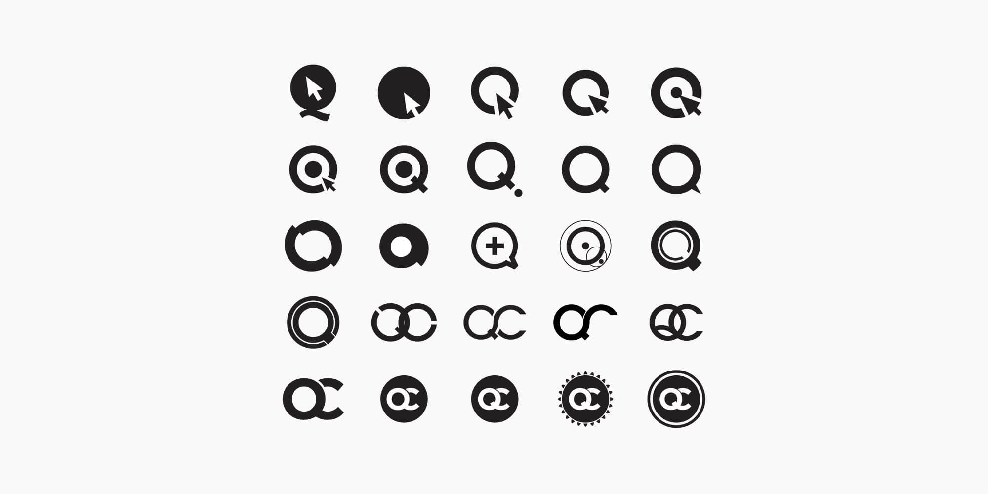
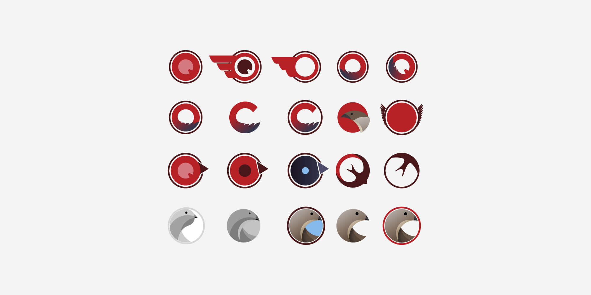
I developed a series of identity directions with Chris and the team, eventually creating the first proper QueryClick brand.

It gave us the foundations for everything that followed - website, sales material, client communication, campaigns, signage and all the other things a growing company suddenly needs.

I wanted the brand to be knowledgeable without becoming impenetrable.

And, if possible, slightly less boring.

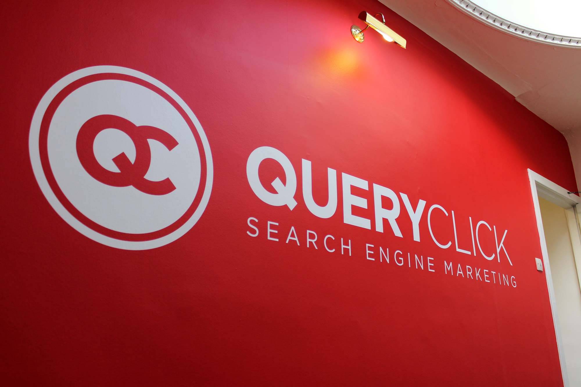
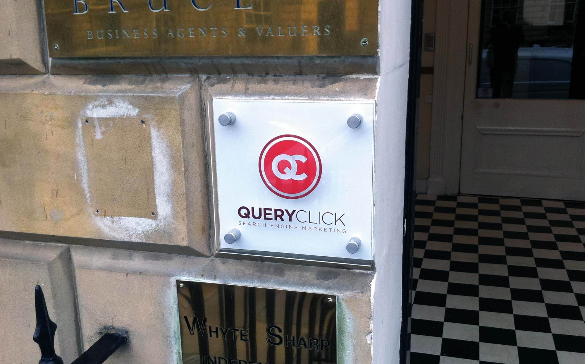
Our first office signage. Hard to miss!

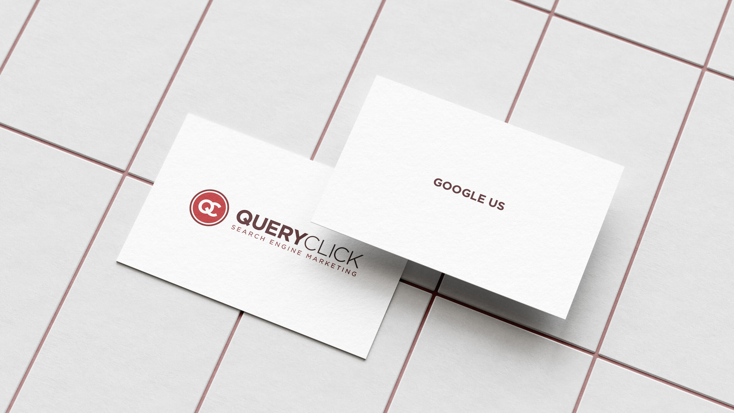
Google us.

One of my favourite applications was also one of the simplest.

For our business cards, I stripped almost everything away.

One side had our company name.

The other simply said:

QueryClick cards For a search marketing company, that was pretty much the entire sales pitch.

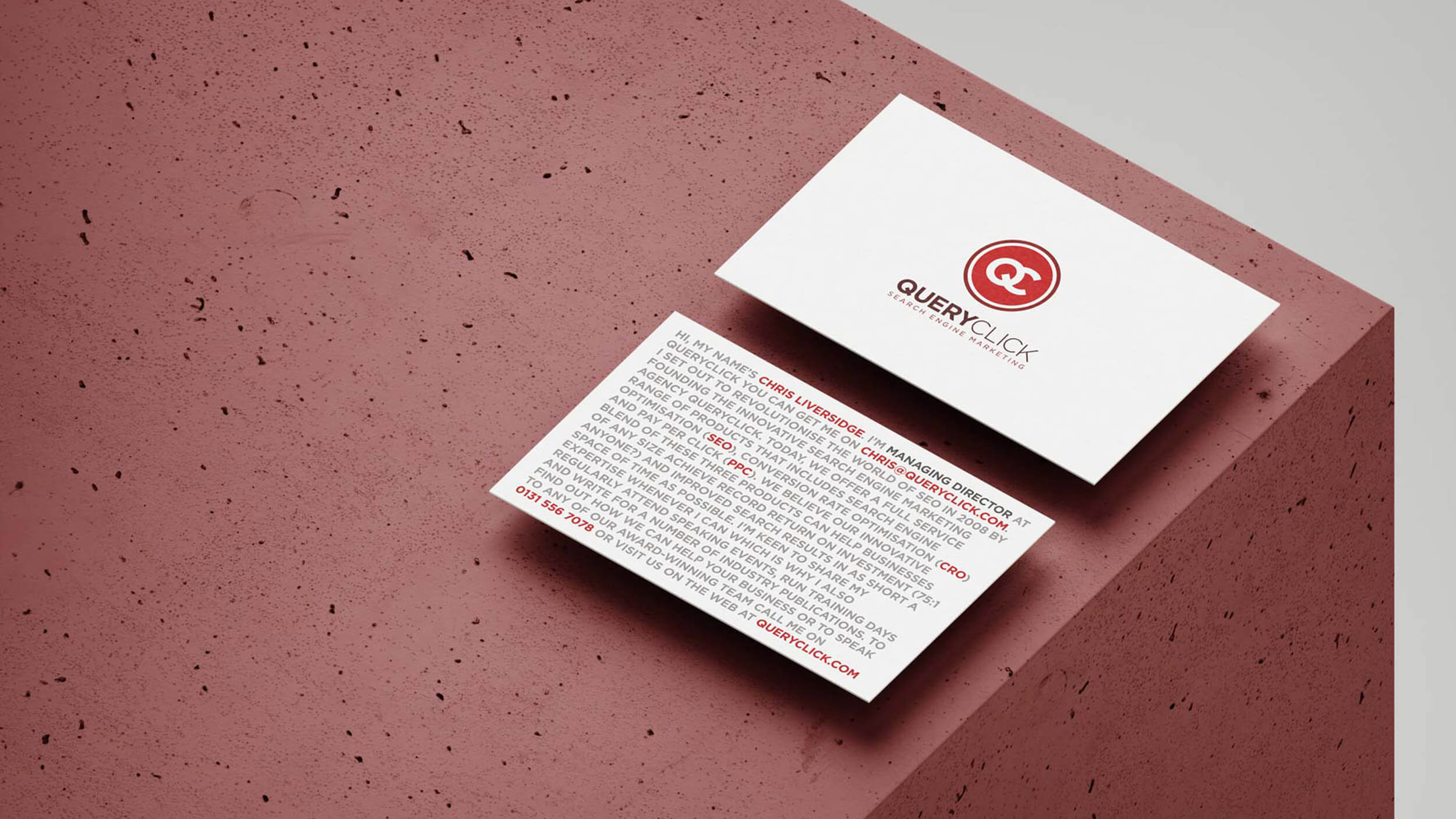
Turning contact details into keywords.

I also created an alternative series based around the idea of keywords.

Each card contained a block of text telling a story about the person it belonged to. Their actual contact information was buried inside it, picked out in red like search terms emerging from a page of content.

It took something completely ordinary - a business card - and used it to demonstrate the thing QueryClick actually did.

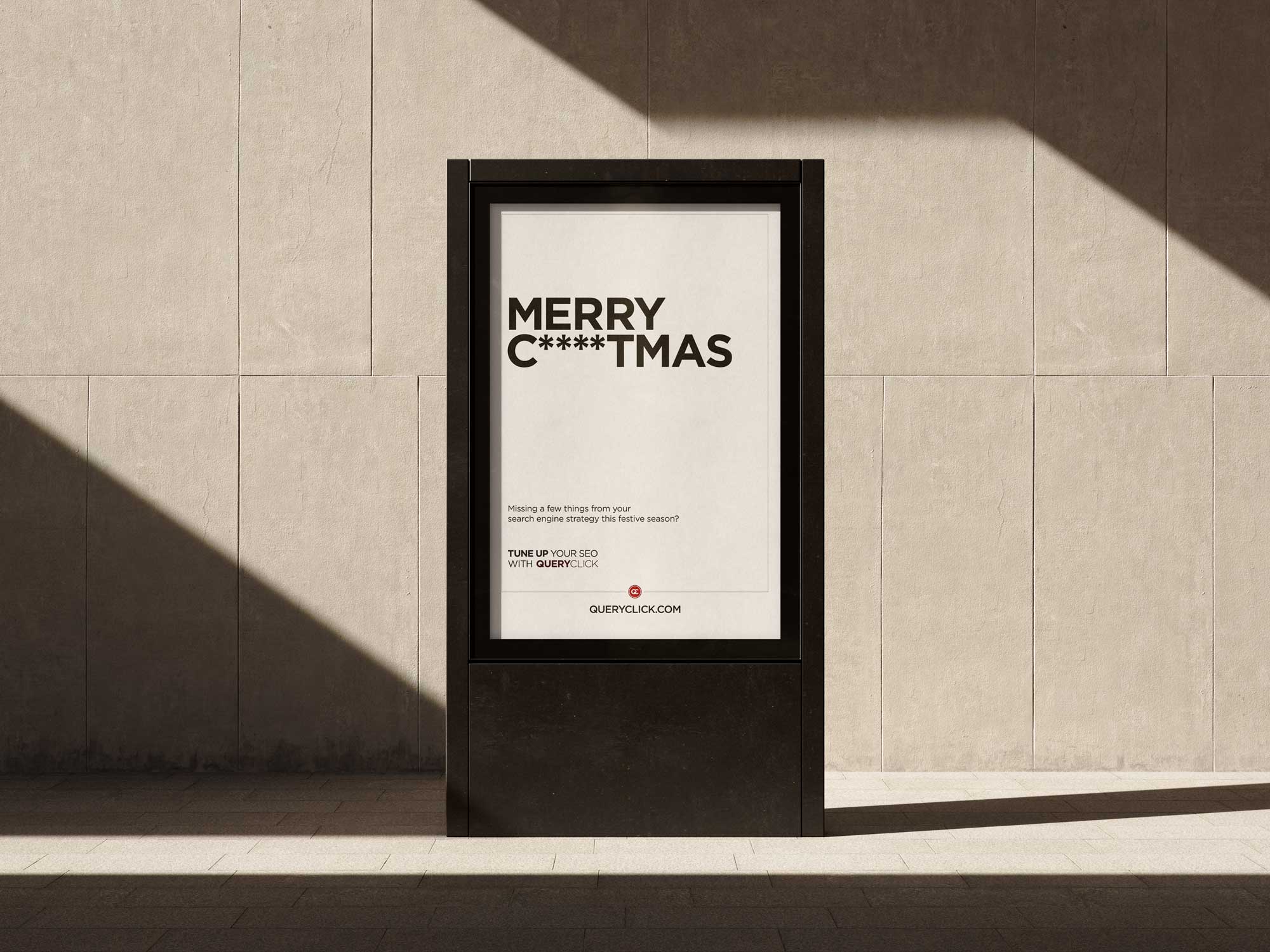
Missing a few things?

Search marketing also gave me plenty of opportunities to play with language.

At Christmas, rather than sending another generic seasonal message, I created a campaign built around a deliberately incomplete word.

It worked as an email and poster campaign, made a joke out of missing search terms and, thanks to the particular arrangement of those asterisks, looked just inappropriate enough to get people's attention.

It even earned QueryClick a bit of PR.

Sure, it's the least Christmassy Christmas campaign ever - but not bad for a search marketing company's Christmas card.

QueryClick Merry C****tmas campaign

Building whatever needed building.

Being the first designer in a small company meant the edges of the job were fairly theoretical.

I worked on the identity, website, emails, presentations, office graphics, client work, campaigns and whatever else happened to need making.

I also built out a web design offering that we could sell to existing and new clients.

When I joined QueryClick I was comfortable designing and building straightforward websites with HTML and CSS, with enough PHP to get myself into trouble.

As the work became more complicated, I learned what I needed.

By the time I left I was building the websites I'd designed using Django templates and working much more closely with the technical side of delivering them.

I also started writing. QueryClick encouraged everyone to contribute to the company blog, which gave me an excuse to find a voice beyond interface copy and headlines.

Somewhere between designing logos, building websites and producing an alarming number of infographics, I realised I quite liked writing too.

The website I successfully didn't design.

Not every design job ended with something being designed.

One client approached us about creating a new website.

Before starting, I spent half a day with their team running a proto-persona workshop to understand who they thought they were designing for and what those people actually needed.

By the end of the session, they'd reached a slightly inconvenient conclusion.

Their problem wasn't their website.

The conversation exposed much bigger questions about the company itself, and they decided to rethink their wider strategy before doing anything else.

So I successfully talked myself out of the website project.

Then I left the country.

After around three years at QueryClick, my life took a fairly significant turn.

QueryClick continued growing after I left, expanding its team and moving into considerably more impressive offices than the little rooms we'd started in.

A few years later, during a summer back in Edinburgh, I got the chance to work with them again.

Coming back to something I'd helped start.

By the time I returned, QueryClick was a very different company.

The team had grown considerably and the business had matured, but parts of the identity I'd created were still there.

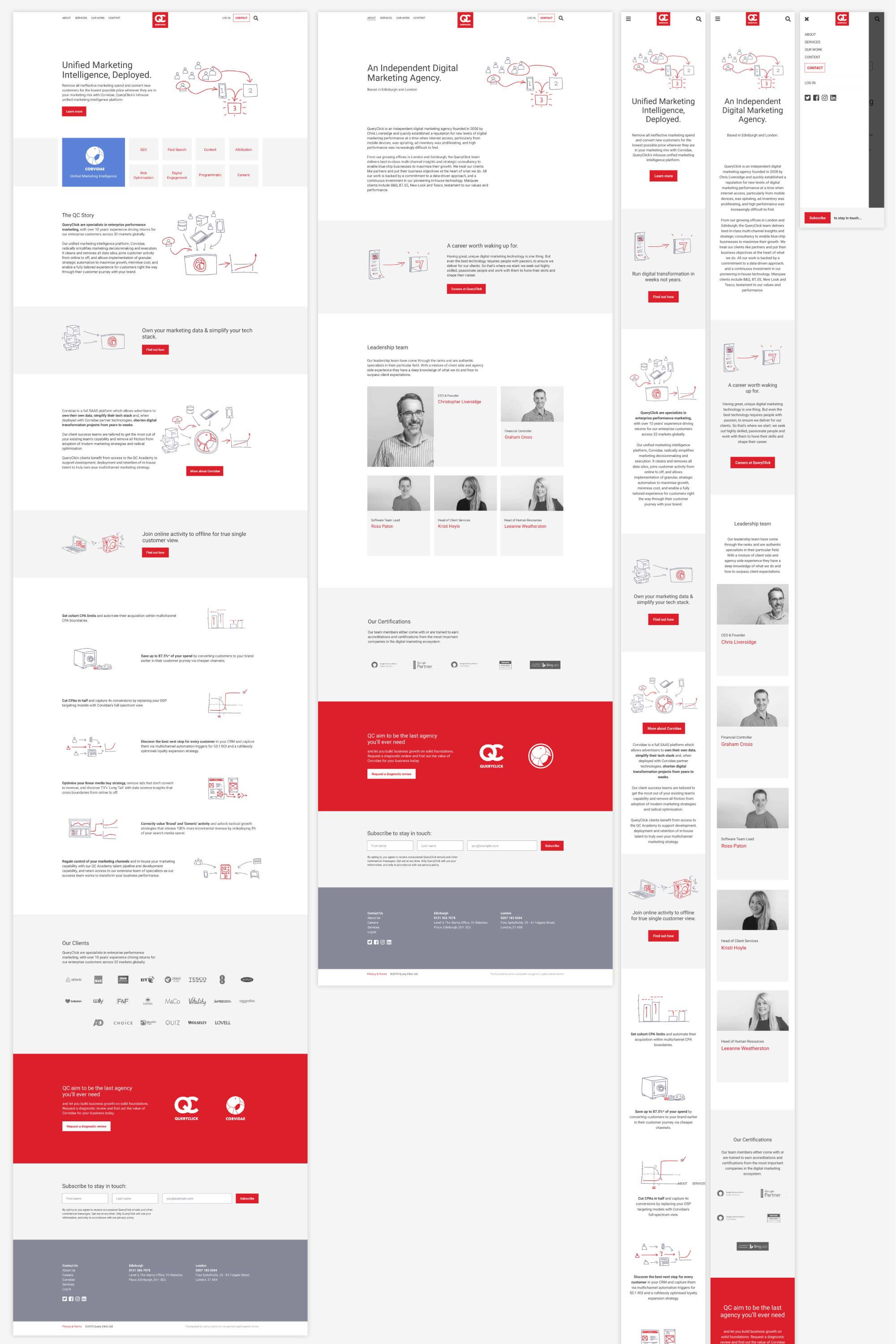
I was brought back in to modernise the website.

For a company obsessed with search performance, page speed was naturally a significant constraint. The site needed to feel contemporary while staying extremely lightweight.

That suited me fine.

I kept the visual approach deliberately simple, avoided unnecessary weight and focused on giving the company a cleaner, more modern expression of the brand.

A flock of new products.

Chris was also beginning to turn some of QueryClick's internal technology into standalone products.

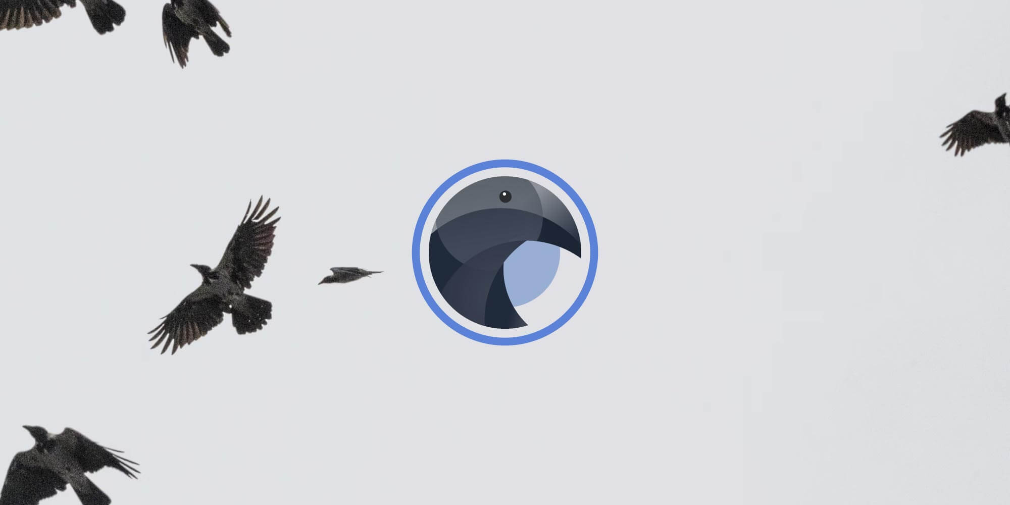
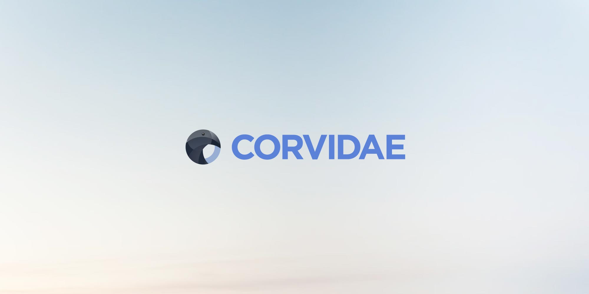
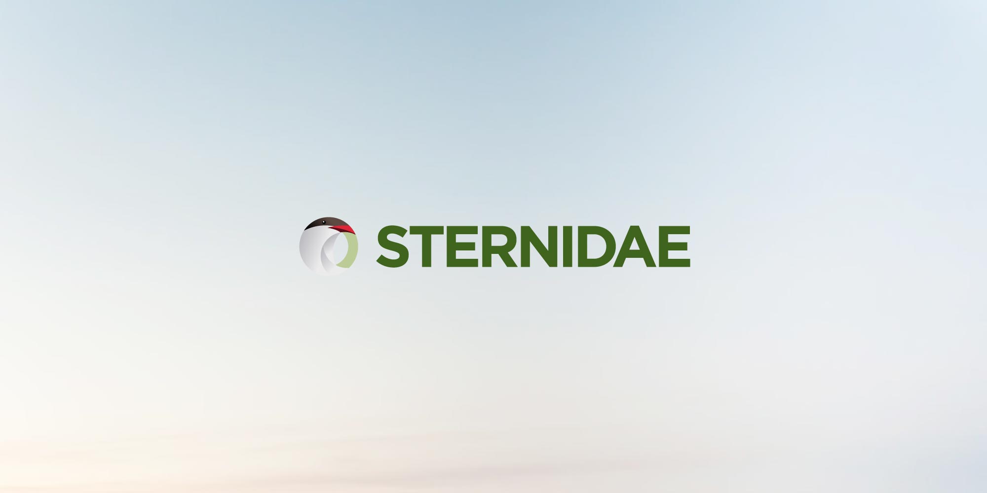
He already had the names: Corvidae, Swiftlink, Sternidae and Weaverbird.

I was asked to give them identities.

I used the existing QueryClick visual language as a starting point, then developed a family of illustrated bird marks - each with its own character and colour while still feeling related to the company behind them.

Corvidae was intended to launch first, so it received most of the attention, but I developed identities across the whole family.

Some things stick around.

I can't claim QueryClick grew because I redesigned it.

Plenty of considerably more important things happened after I left, and the company became much larger and more established than the small team I originally joined.

But there's one outcome I'm particularly fond of.

The identity evolved. It was simplified. The company changed.

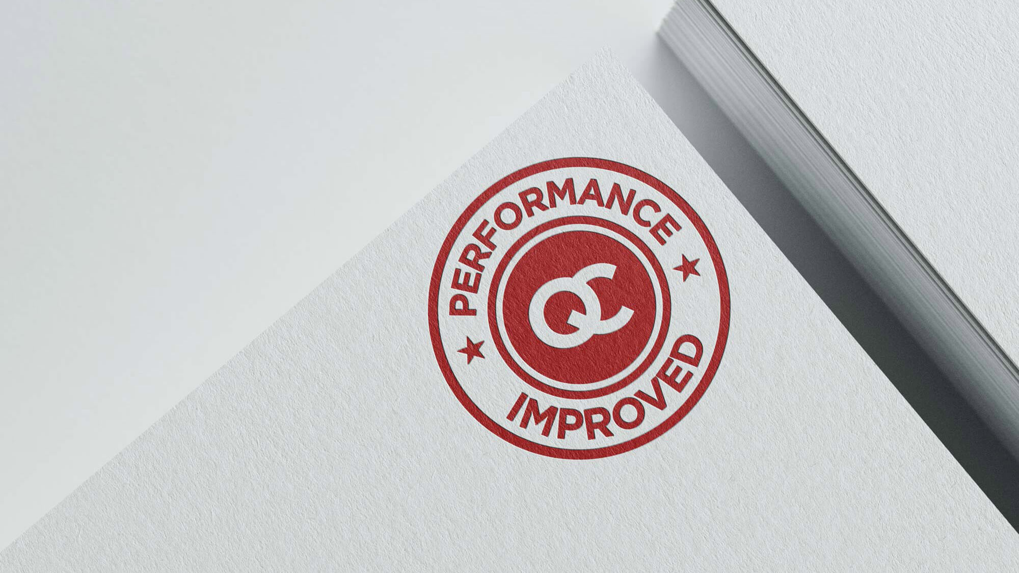
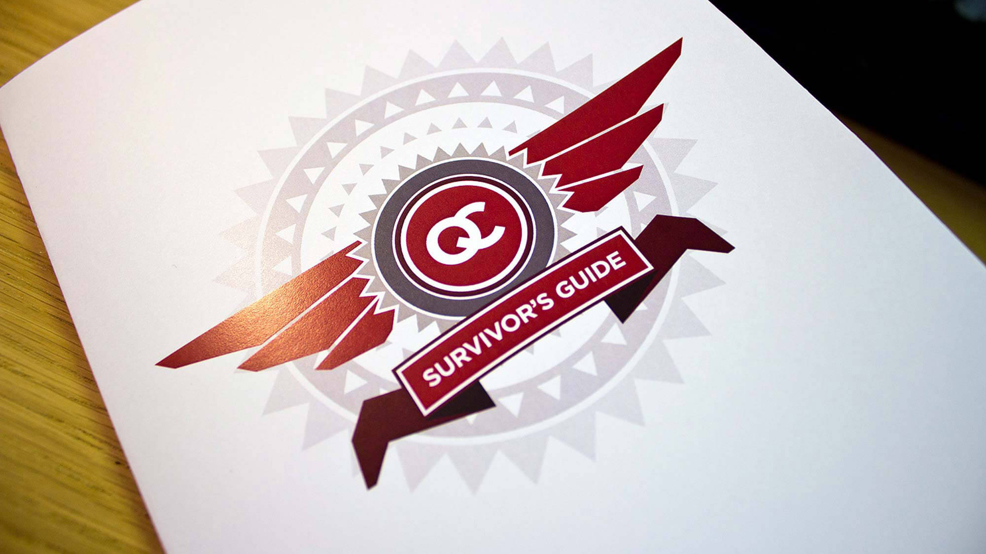
And the QC lettermark I designed is still being used today.

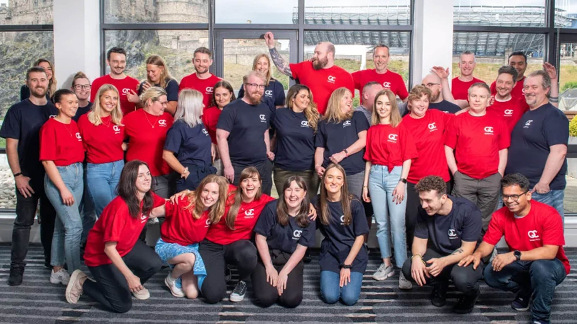
A recent QC team photo.

Give me the blank page.

Looking back, QueryClick was one of the first times somebody gave me one.

There was no design team to join, no established identity to maintain and not much definition around what a Head of Design at a small SEO agency was supposed to do.

So we figured it out as we went.

I built the brand, designed and built websites, created campaigns, wrote copy, worked with clients and generally tried to make an industry drowning in acronyms feel a little more understandable and a lot more human.

It also taught me something about the kind of designer I was becoming.

I didn't particularly care whether the problem belonged to branding, web design, development, copywriting, marketing or something else entirely.

If there was something useful I could make, I'd work out how to make it.

Apparently that approach stuck around too.

QueryClick

More stories
From the blank page to the data platform

QueryClick was one of my first chances to define what design could mean inside a growing company. Later, Brainnwave and Mosaic let me take that same broad approach into data products and intelligence platforms.

Read the Brainnwave story Read the Mosaic story Back to all work